
Welcome to the Specialty Coffee Association platform celebrating inspirational design in coffee.

Tower Roasting Co
We wanted to achieve a look and feel that would make coffee lovers feel the value of the what is inside the bag or pod.
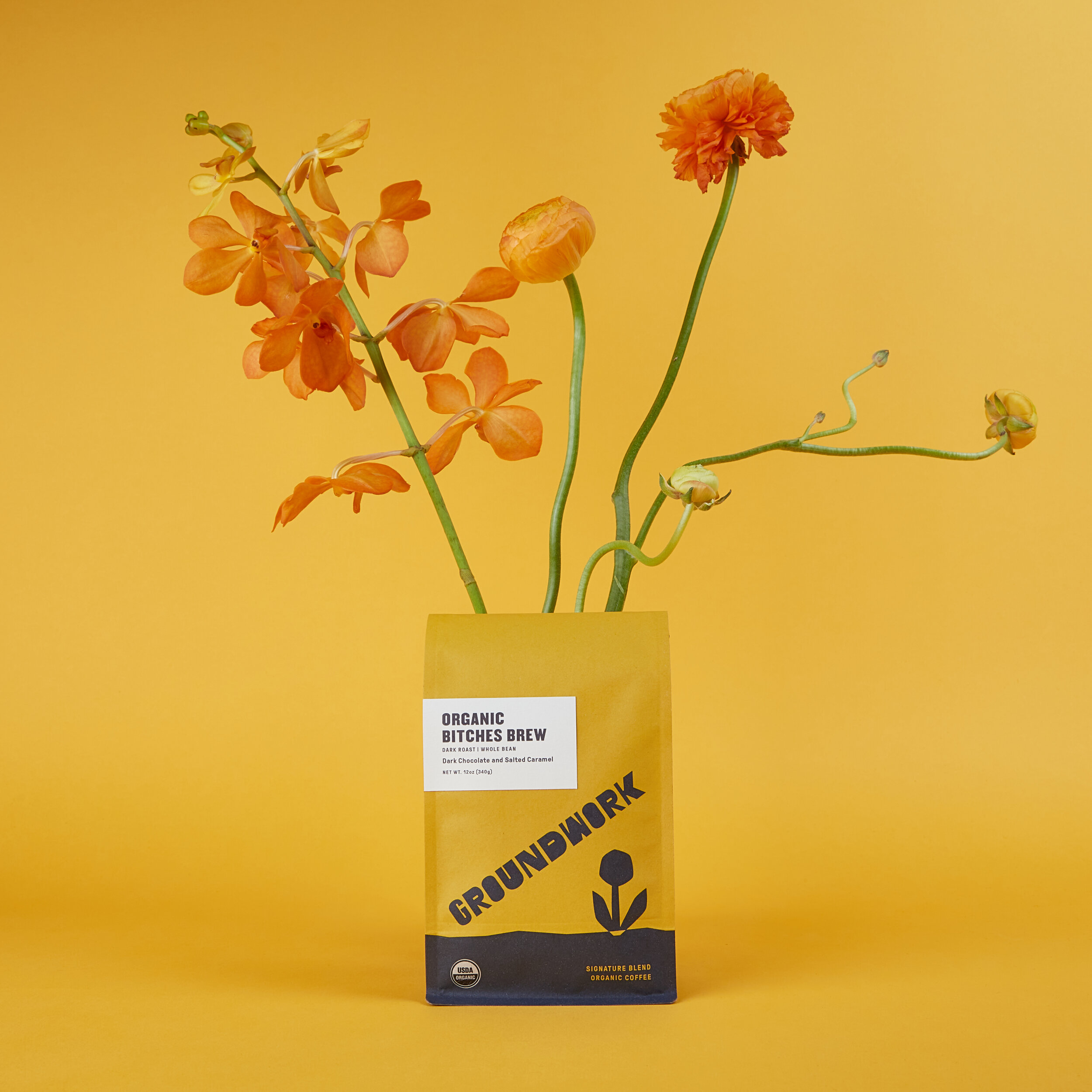
Groundwork Coffee
Through the rebranding process, we continually returned to the image of “dirt under fingernails” after a long day of tending the earth.

Cool Coffee Clique
The Cool Coffee Clique team aimed to create a superior coffee-drinking experience by considering both function and aesthetics in the creation of the signature coffee mug.

Pine Coffee Supply
Pine Coffee Truck is a decommissioned 1989 Mercedes Fire truck.
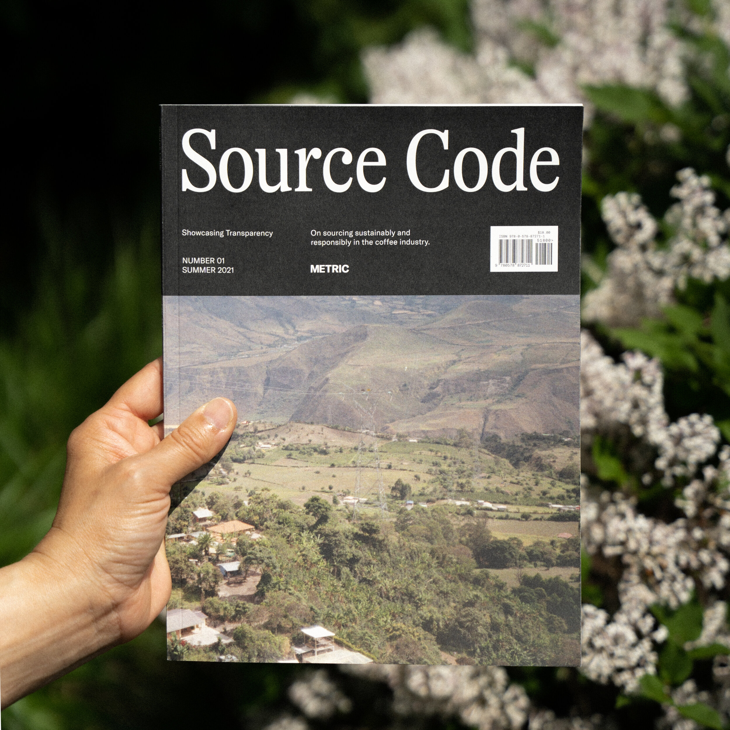
Metric - Source Code Magazine
We wanted to achieve a visually attractive consumer friendly publication with a focus on sourcing and sustainability.

Manifesto Coffee Ltd (UK)
The design of our new packaging was dictated by a drive to create a coffee package that was 100% recyclable.

Sunday Coffee Project
We started sunday coffee project out of a desire to share what has long been our family’s favorite day.

Silverbird Roasting Co.
The brand takes inspiration from 60s and 70s musical culture as well as automotive, aviation, and electronic design of the era.

Pine Coffee Supply
It’s surprising what a pandemic shakeup can bring about or inspire. We weren’t planning a redesign but it naturally evolved during difficult times.

Barrie House Coffee
We wanted to create a product that was appealing and eye catching on the shelf. We also wanted the consumer to easily be able to identify the four unique flavors based on packaging colors and be able to imagine the type of espresso they would get from the color of the box.

Rêve Coffee Lab
We just really wanted to create a unique space with all custom seating and design. It was also just as important to create a space that flowed well for customers and our team.

Grand Single Origin
We wanted to change the status quo for the roasted and ground coffee market in Serbia.

Metric's Modicum Box
The exterior Modicum box uses natural, recycled paper, instead of using flashy colored foils. Text is only used for essential information, and is debossed so it doesn’t become dirty or illegible after handling the box.

Mission Coffee Works
We wanted to achieve a positive experience for the coffee drinker, as well as demystifying specialty coffee and making it more accessible for everyday coffee drinkers, without sacrificing ethics or taste.
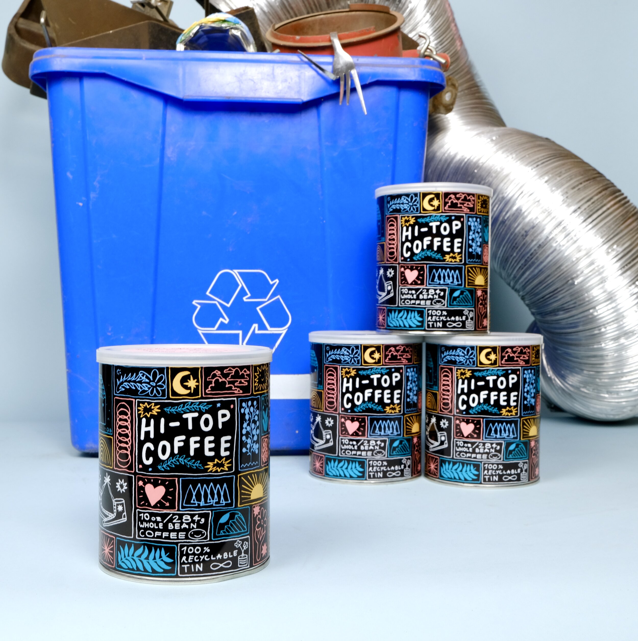
Hi-Top Coffee
We believe in altruism. We are consequentialists really. Seeking the greatest possible solution with the least amount of impact.
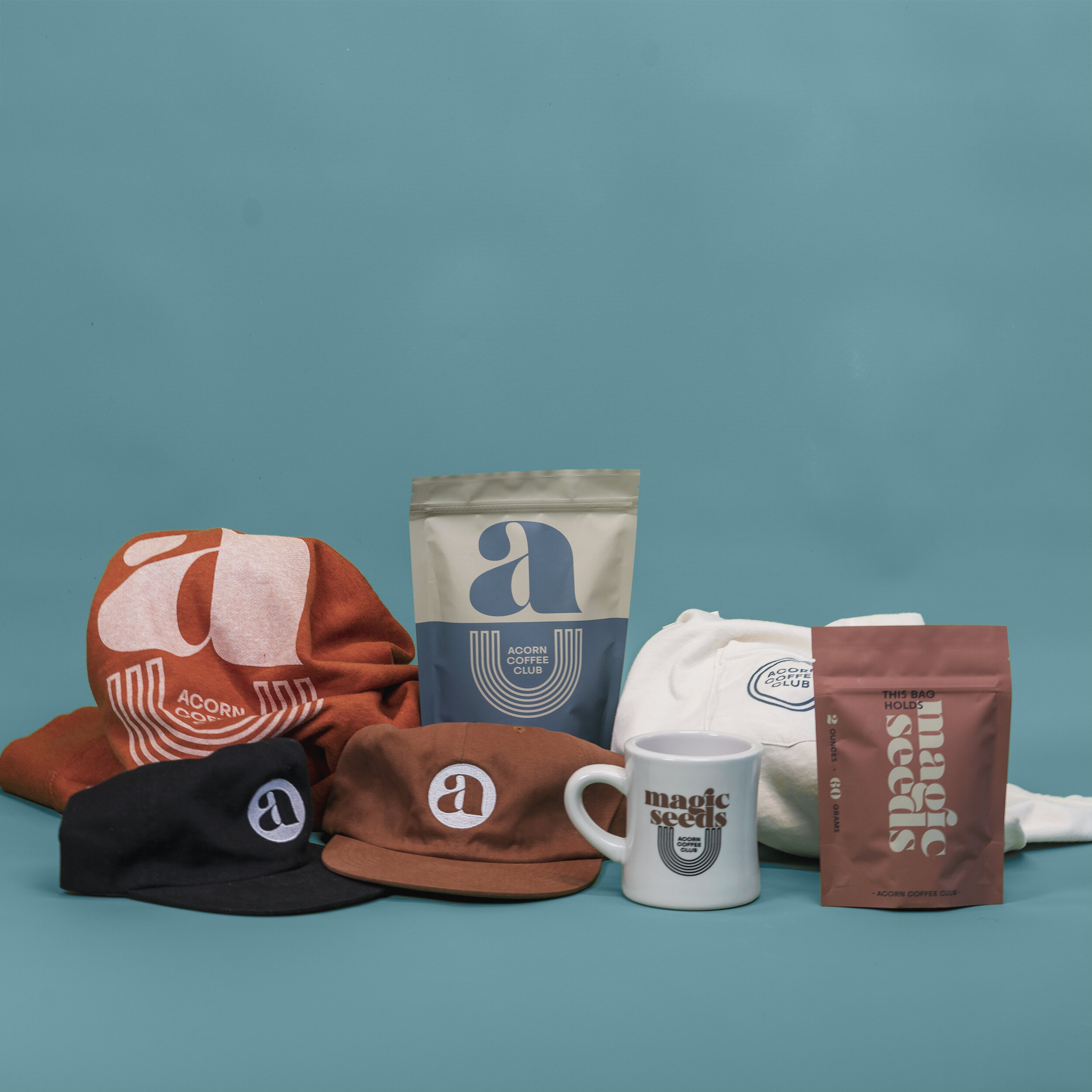
Acorn Coffee Club
The brand direction was to evoke the comfort of the musical culture coming out of California's Laurel Canyon days along side nods to Italian Art Deco.

TRUESDAY Specialty Coffee
TRUESDAY provides whole coffee beans in reusable milk bottles. The packaging design supports the circular economy by giving bottles a second life.

Landed Coffee Roasters
When we were deciding on what Landed Coffee Roasters as a brand would look like and communicate, we narrowed it down to 3 things: quality, sustainability (economic, social and environmental) and broadening your horizons.
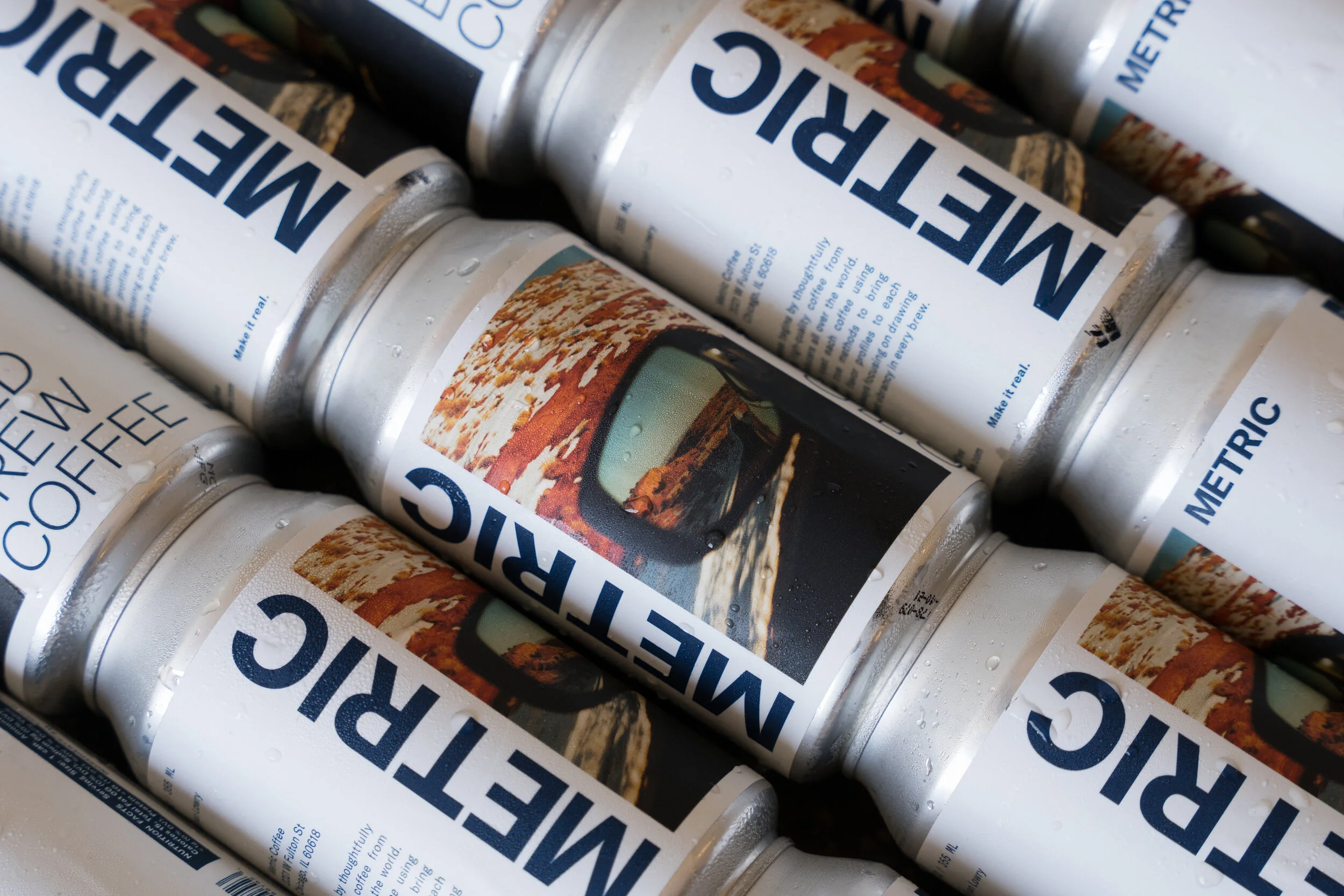
Metric Coffee Cold Brew
Our cold brew stands out, and stays cold, in standard aluminum cans.

Compass Coffee
We wanted to achieve a design that clearly communicated the product -- boxed cold brew -- in a beautiful way that did justice to the delicious product. We used the "compass" motif to inform the design and the striking pattern.