Welcome to the Specialty Coffee Association platform celebrating inspirational design in coffee.
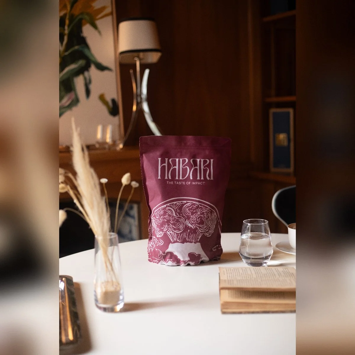
HABARI
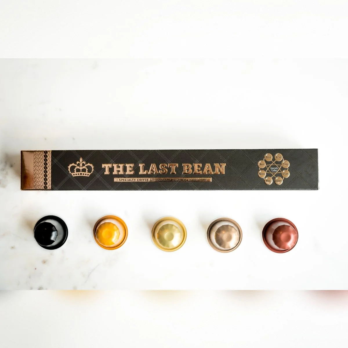
The Last Bean
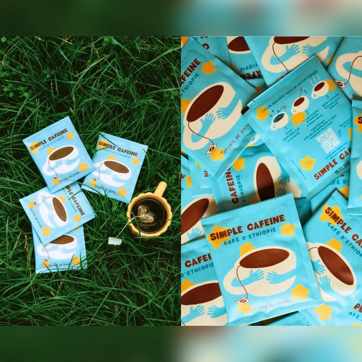
Simple Cafeine

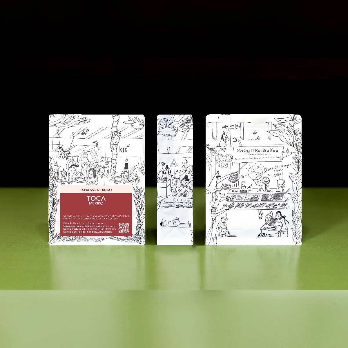
praziarenrydze

HABARI
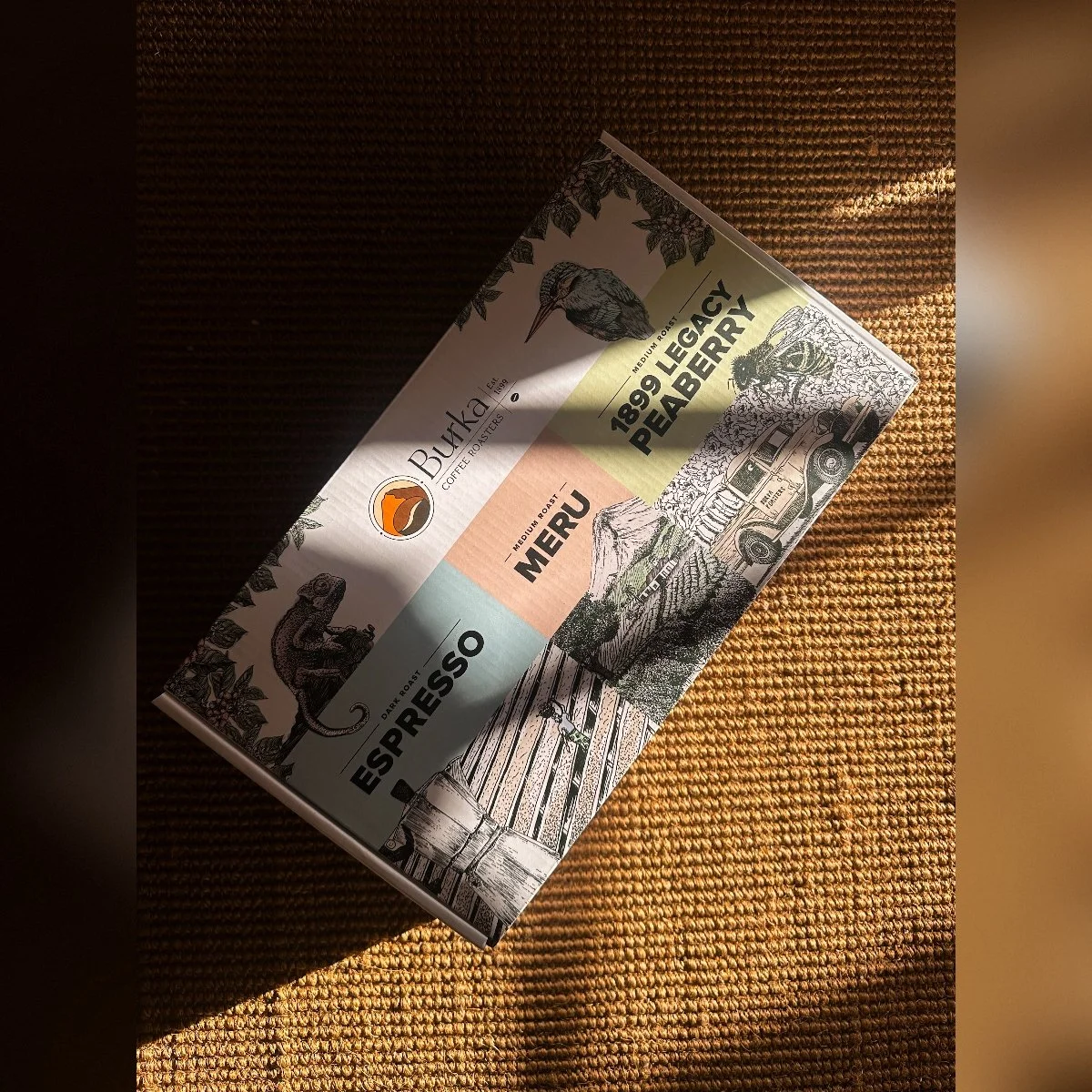
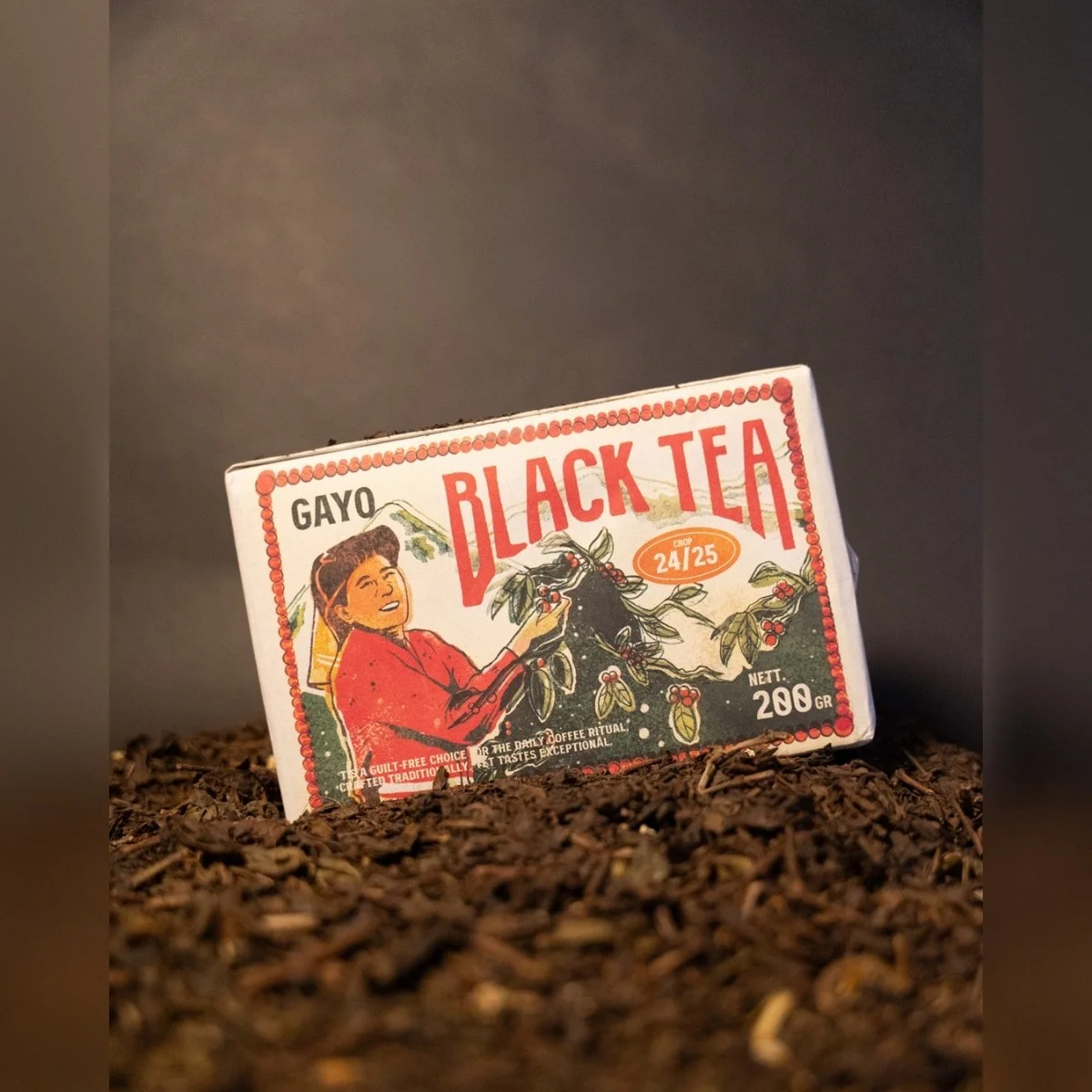
Burka Coffee Estates

Cafeñito P&R
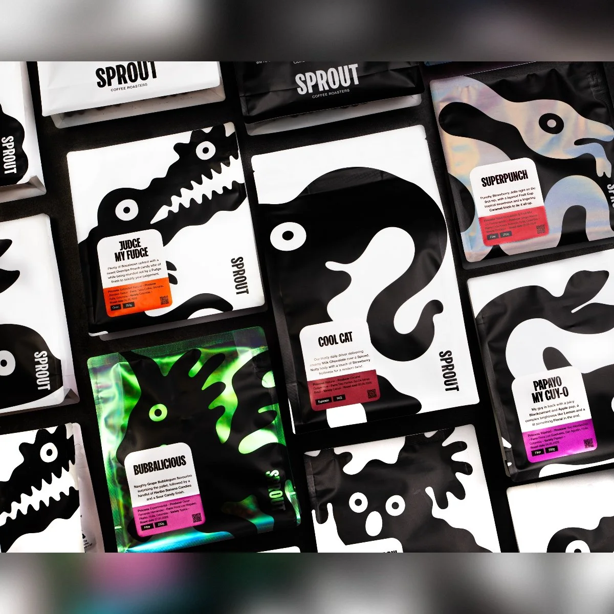
Sprout Coffee Roasters
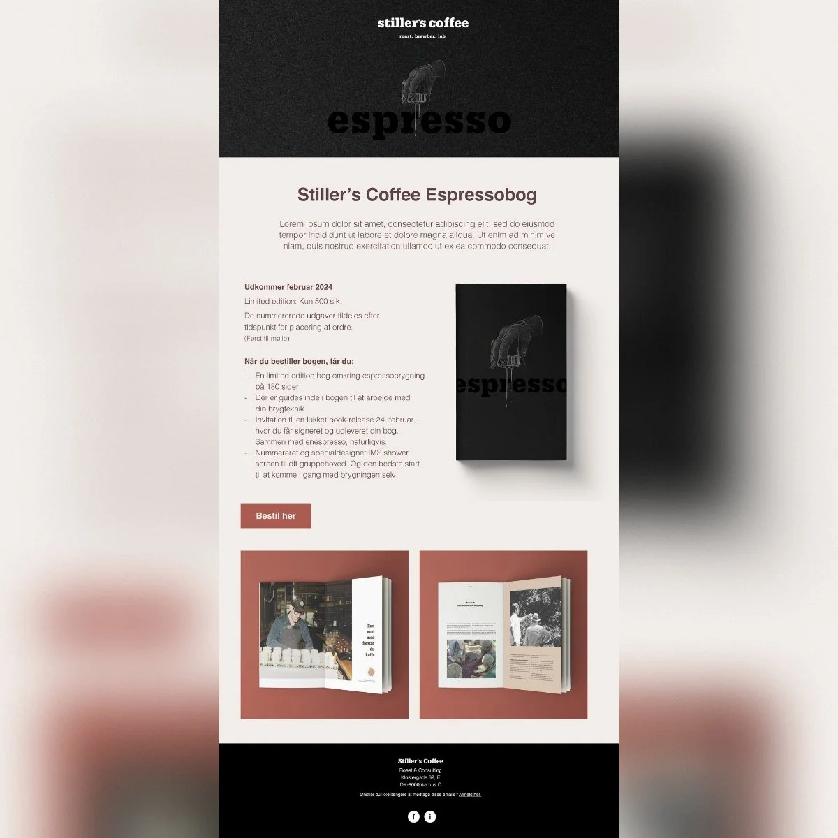
Stillers coffee
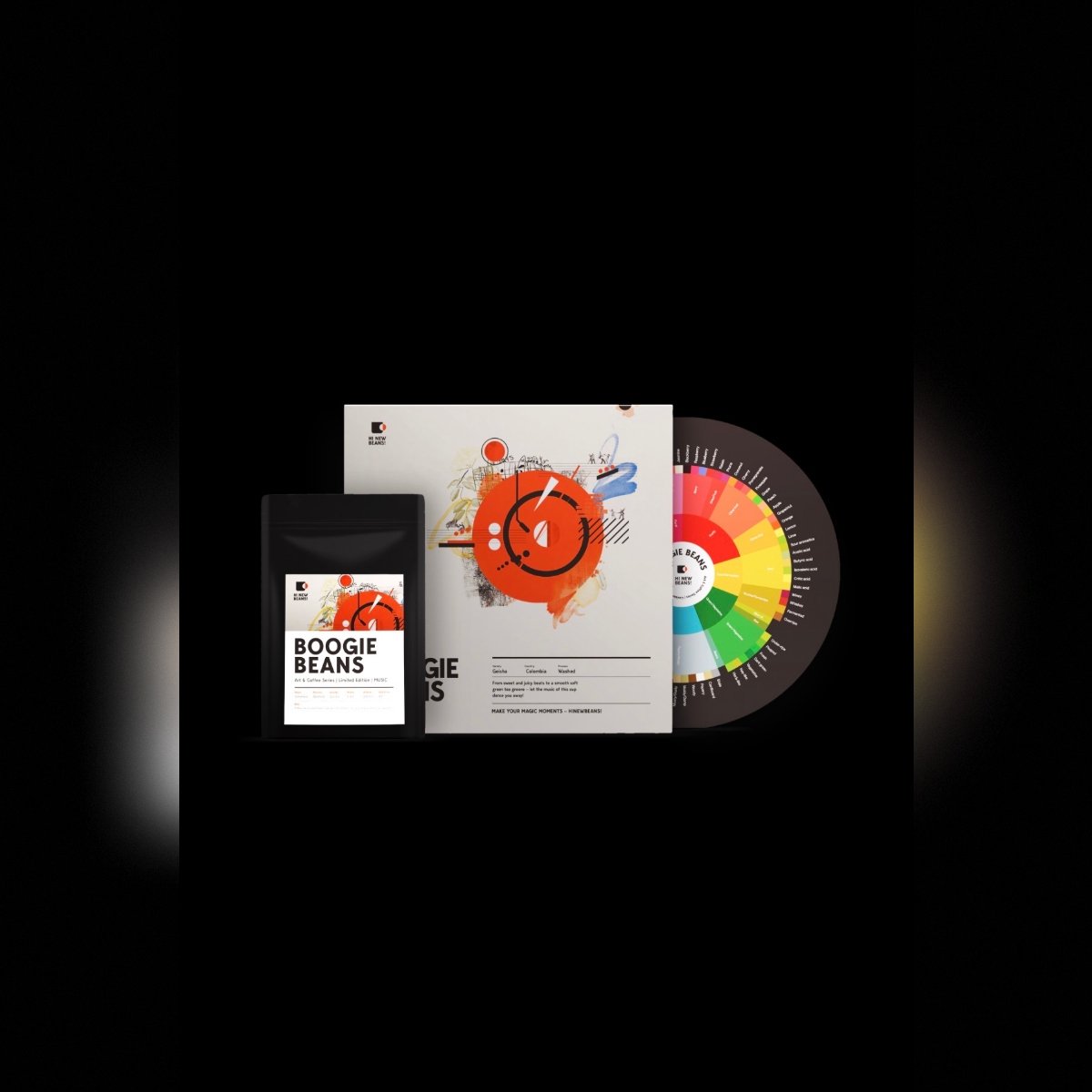
Hi New Beans!
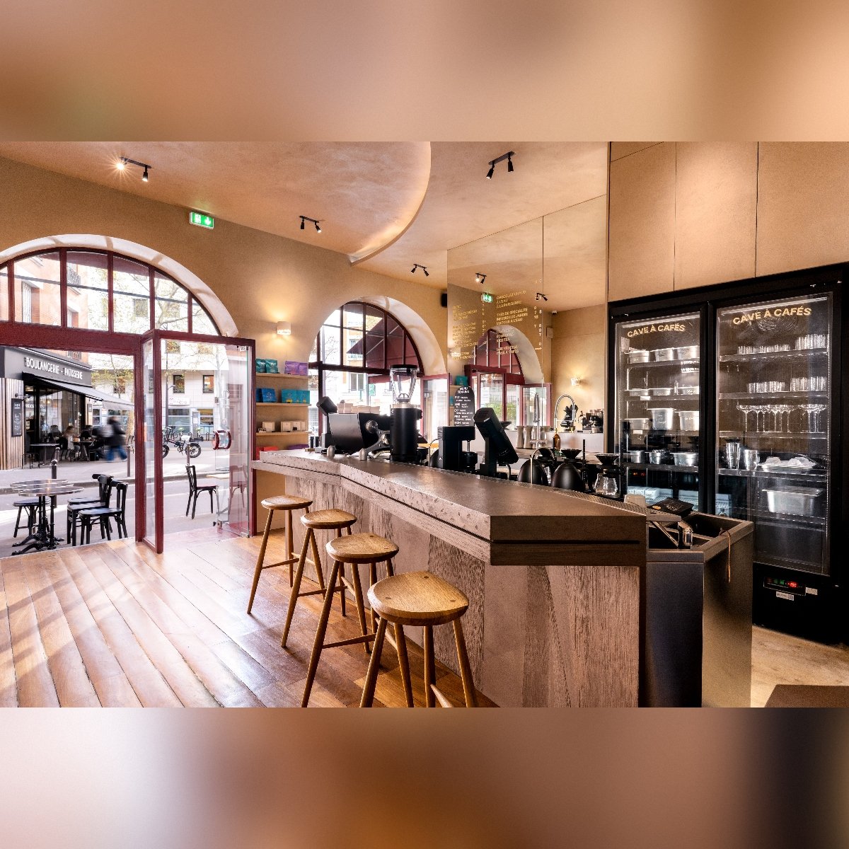
Tactile Café
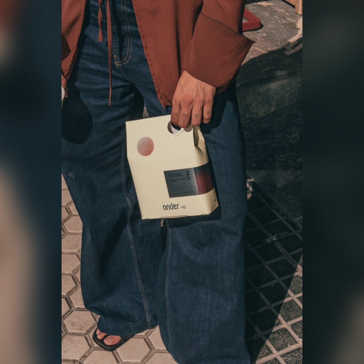
ander cacao
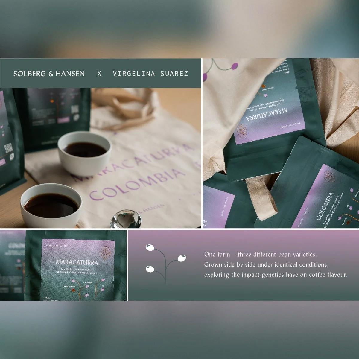
Solberg & Hansen
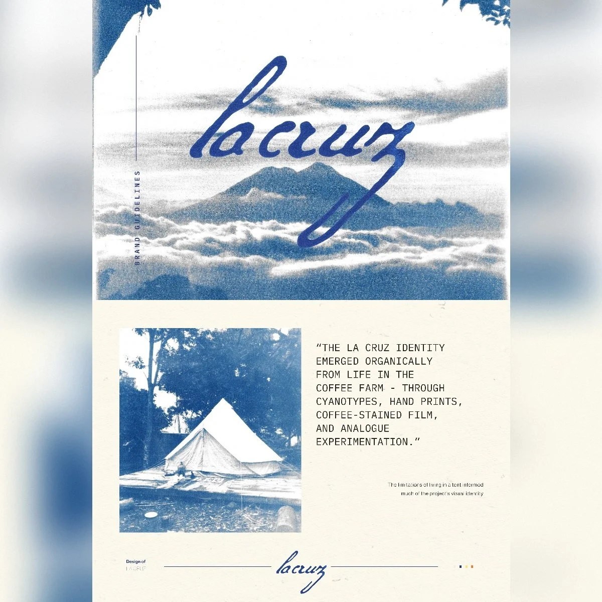
La Cruz
Space Roastery
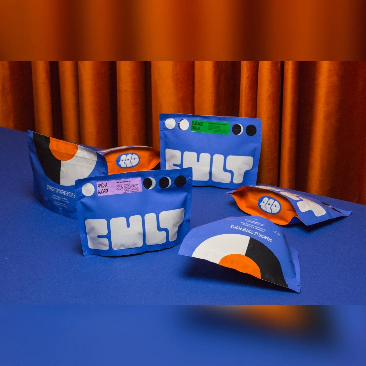
Cult Coffee Roasters
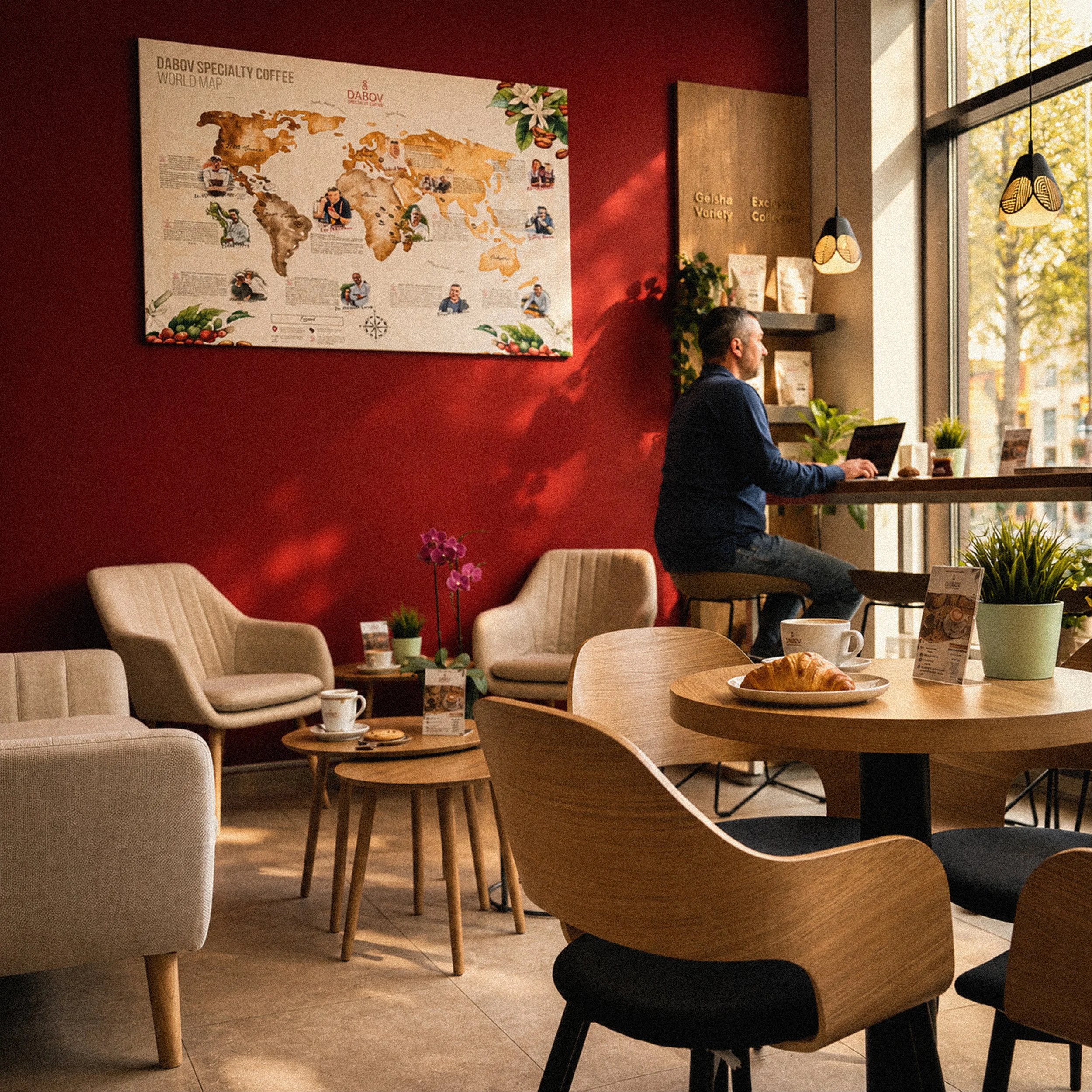
DABOV Specialty Coffee
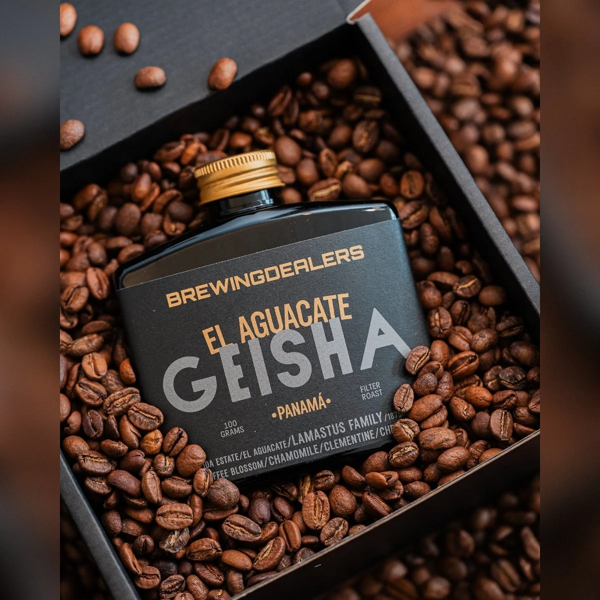
Brewing Dealers
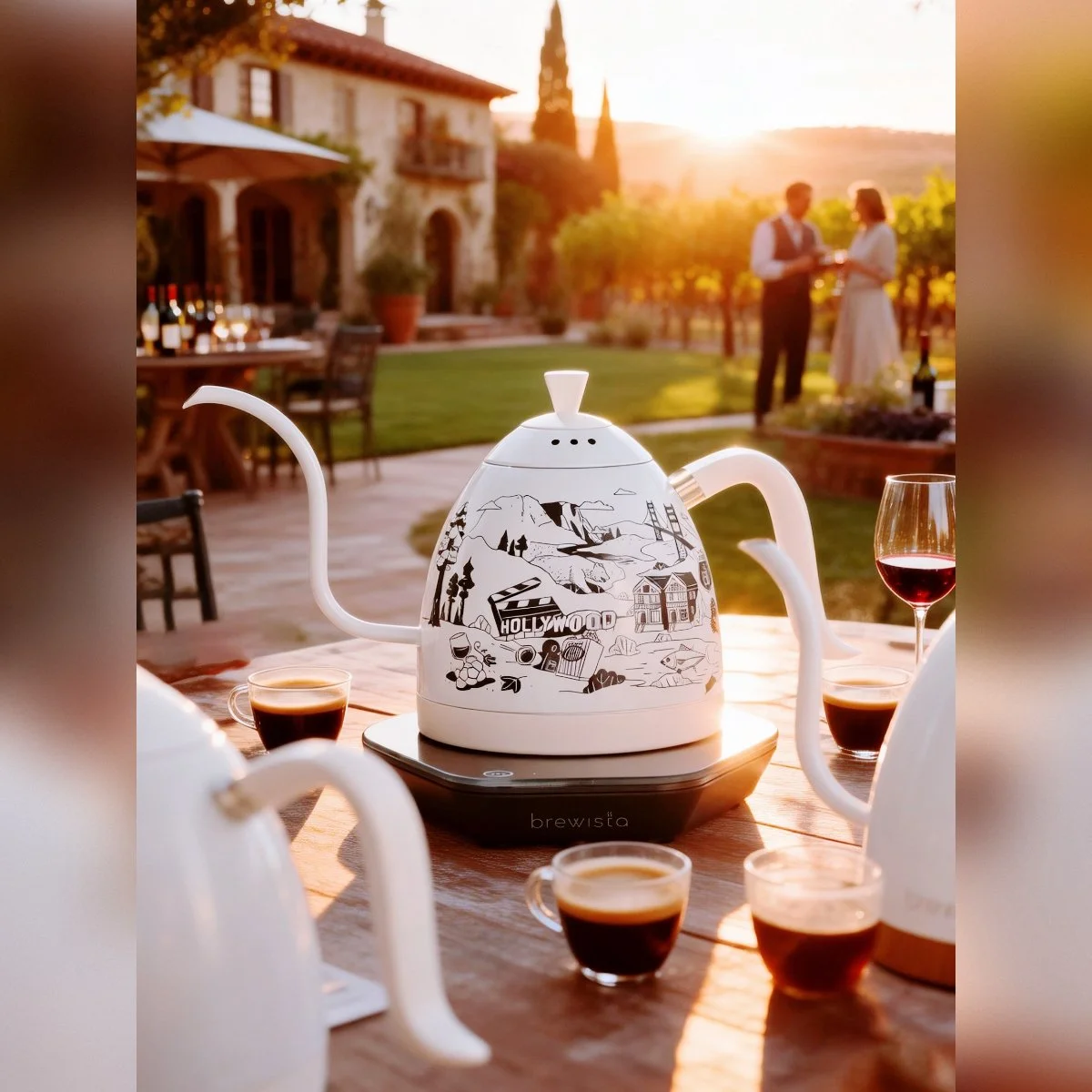
Brewista