
Palace Coffee Company
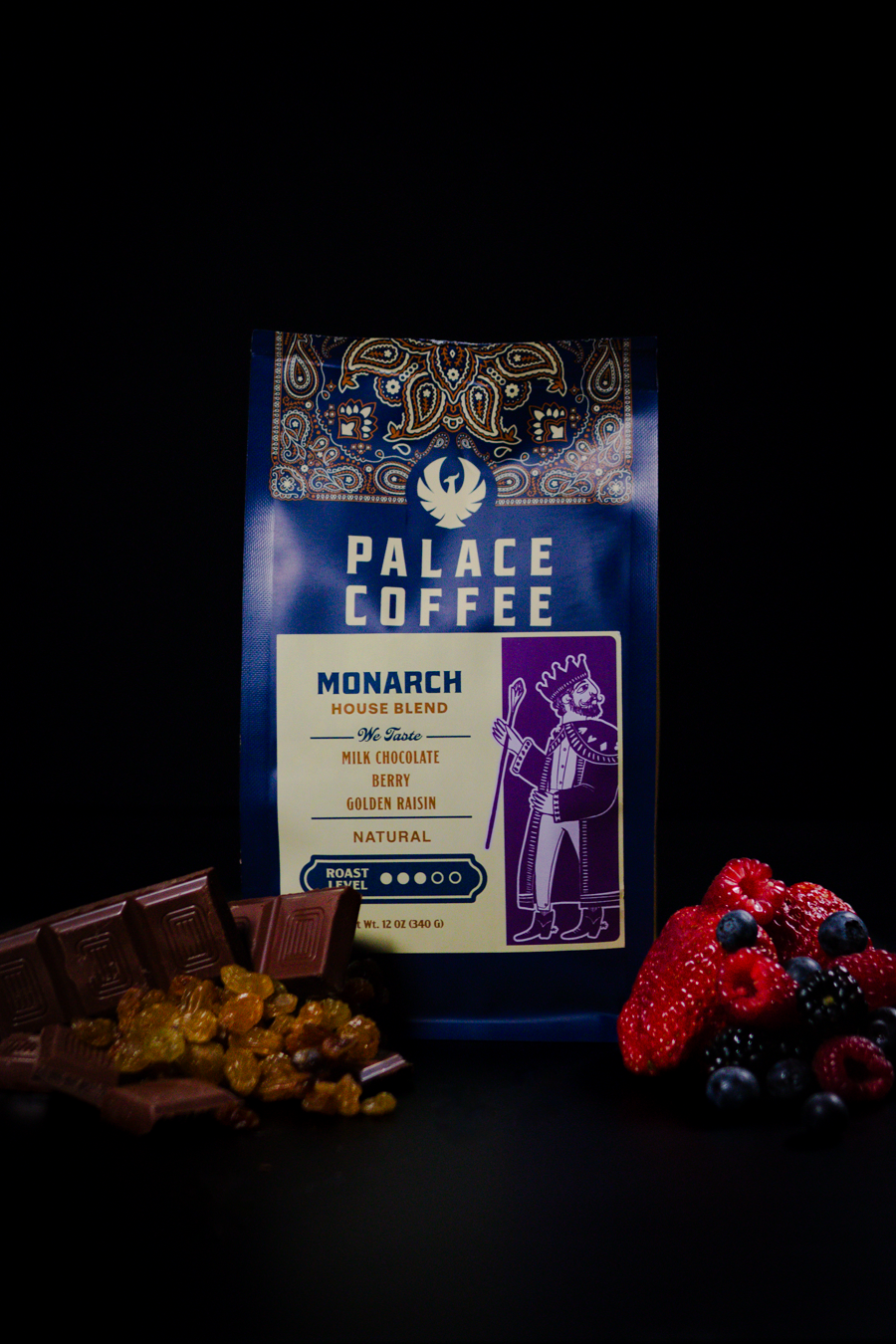
Rooted in the Texas Panhandle, our packaging was designed to honor where we come from while reflecting who we are now. We wanted the bag to feel familiar and storied, not trendy or disposable, something that belongs on a kitchen counter as much as it does on a café shelf.
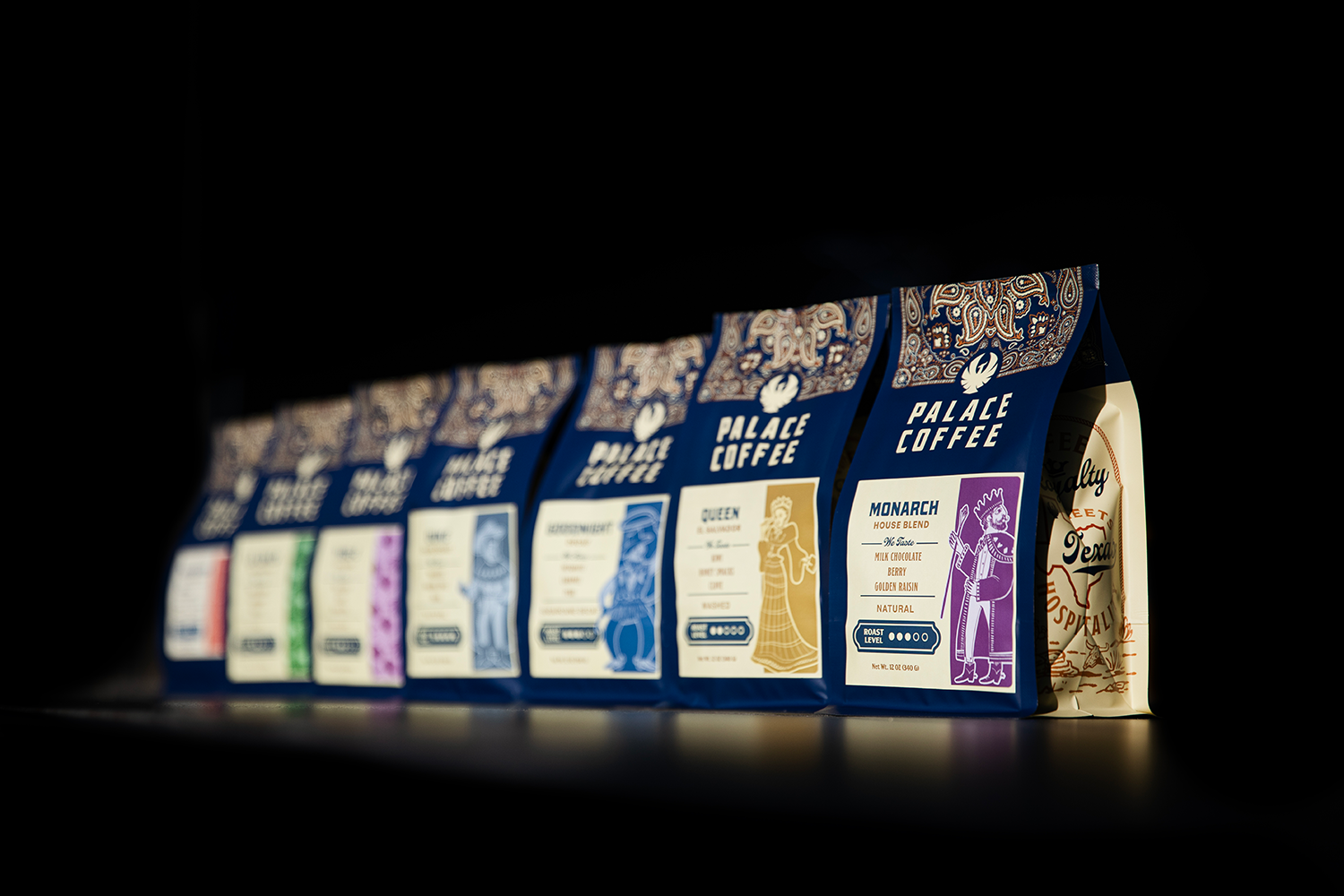
The design draws from Victorian-era fashion and graphic ornamentation, which historically overlaps with the American “Wild West.” These two worlds share a visual language: rich color palettes, detailed iconography, and a strong sense of narrative. That intersection became the foundation of the design system.
We leaned into bold but restrained color choices, illustrative elements, and structured layouts to create a sense of heritage without nostalgia for nostalgia’s sake. Each element is intentional, supporting storytelling, clarity, and warmth, while remaining minimal enough to let the coffee itself remain the focus.
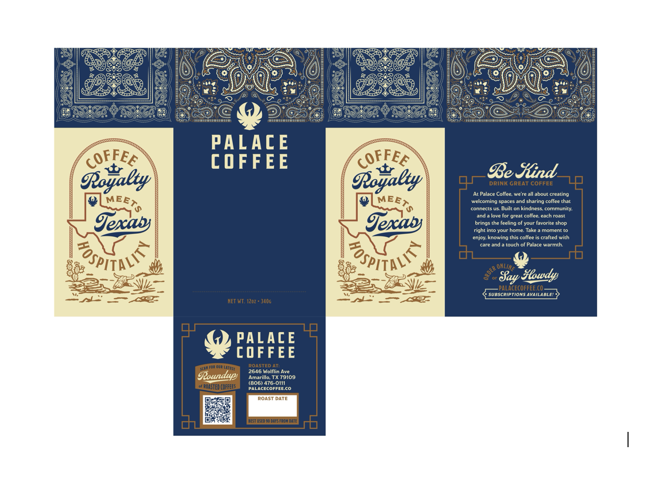
Ultimately, the goal was to create packaging that reflects Palace as a whole: grounded, welcoming, and quietly confident. It’s a design meant to invite people in, tell a story without pretension, and carry a sense of place, one rooted in hospitality, craftsmanship, and care.