
Portland Coffee Roasters

For Portland Coffee Roasters, the primary goal behind the design of their cold brew cans was to create a bold and approachable identity that would stand out on crowded shelves while remaining true to the brand’s essence. The packaging design system was developed with the future in mind, designed to scale easily for future SKUs while maintaining a cohesive brand identity. This flexibility allowed the design to stay unified as new products are introduced, each with its own distinct personality.
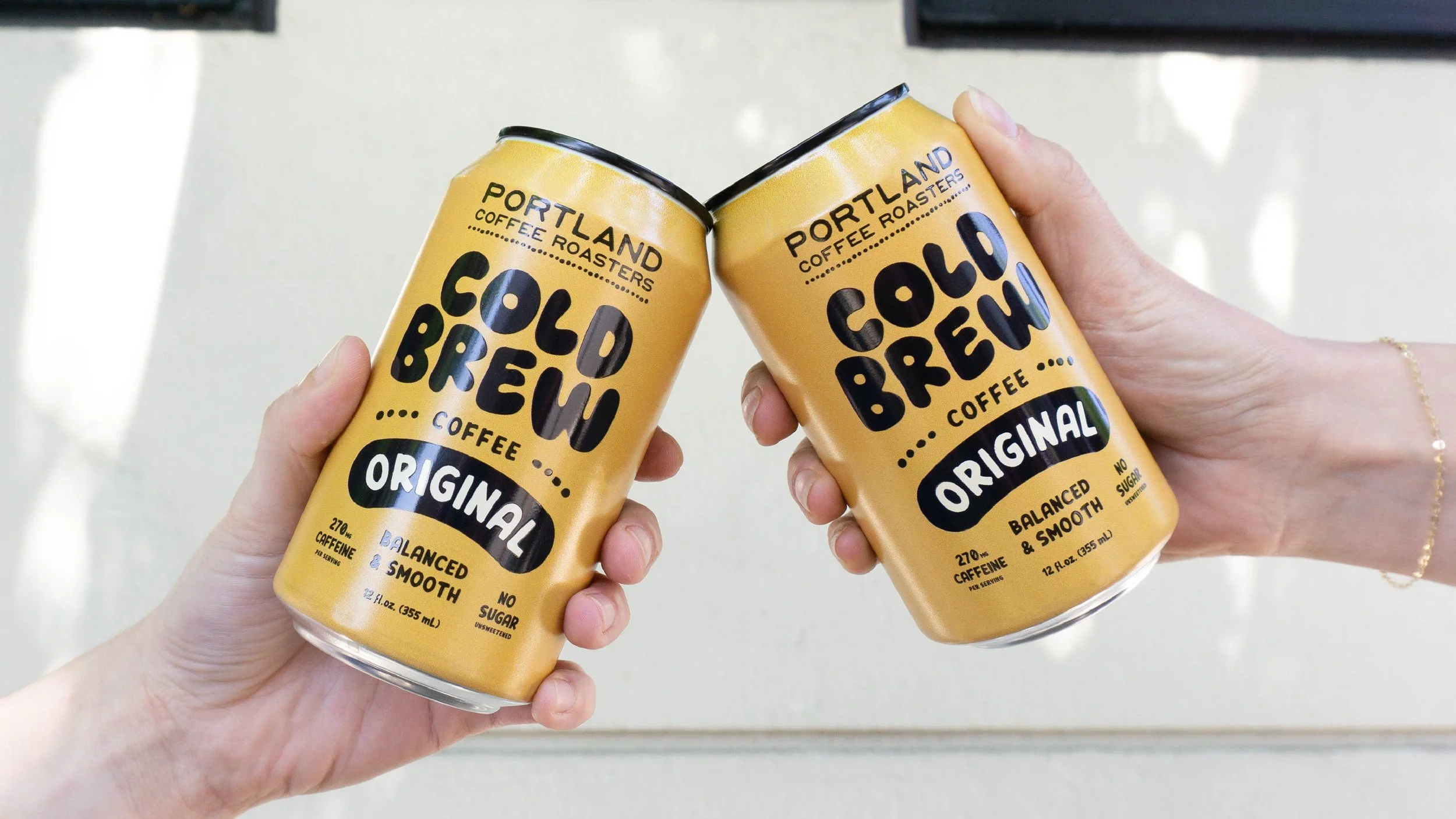
The yellow-and-black color scheme builds on Portland Coffee Roasters' existing brand identity, evoking energy and warmth while remaining true to their established color palette. This bold contrast not only highlights the rich, energizing qualities of coffee but also reinforces a sense of familiarity and tradition.
A focal point of the design was the custom-illustrated typography. The organic forms of the letters bring a sense of fluidity and playfulness to the overall aesthetic. Each letterform was crafted to feel lively, with curves and unique characteristics designed to stand out while ensuring legibility, giving each SKU a distinct identity that remained unified under the Portland Coffee Roasters brand.
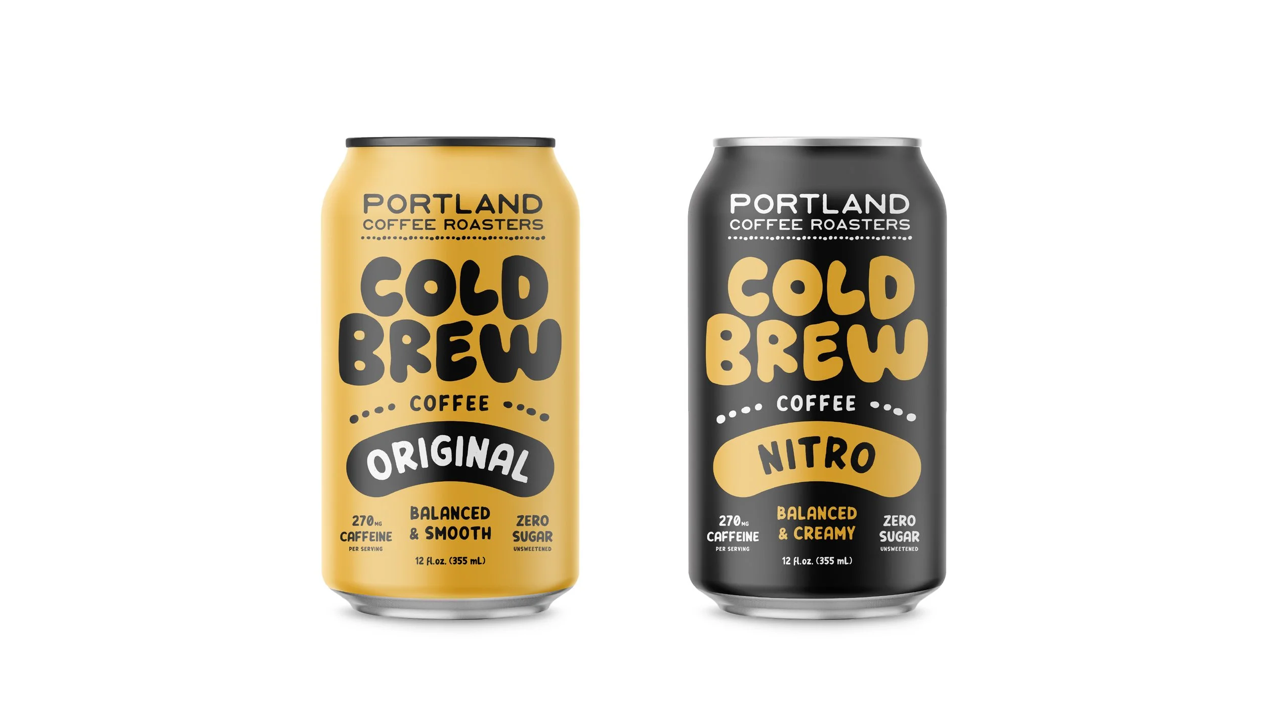
The playful typography, combined with vibrant color choices, resulted in packaging that feels both fresh and nostalgic. The design captures the essence of Portland Coffee Roasters' spirit: bold yet approachable, modern yet rooted in tradition, and ensures the brand is impossible to miss on the shelf.