Java Republic

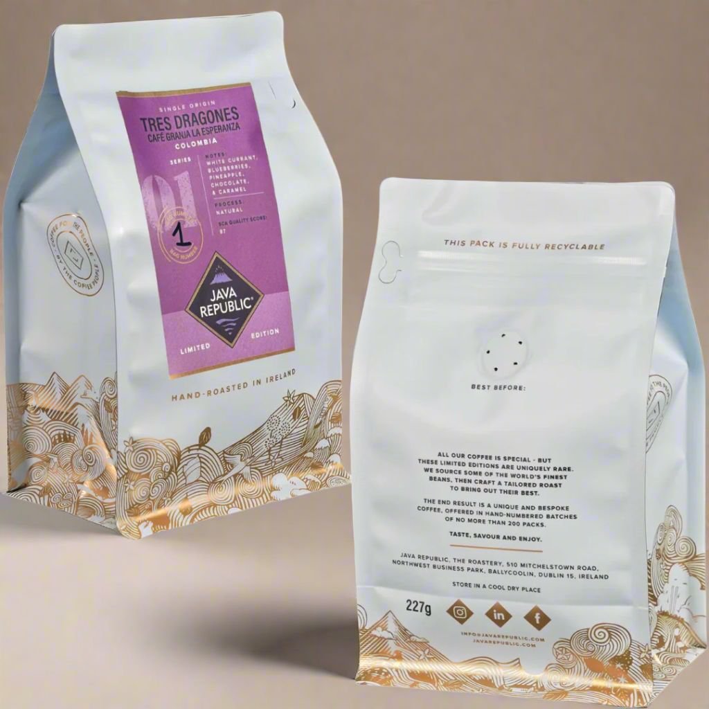
We set out to create a packaging design that felt as special and unique as the coffee inside — something that would signal rarity, quality, and care. Each bag is designed to stand out not just as a product, but as an experience: collectible, gift-worthy, and emotionally engaging. The design needed to balance beauty with function, while telling a meaningful story. We drew inspiration from the world of fine wine and artisanal goods, where limited editions, hand-numbering, and tactile finishes convey craftsmanship and exclusivity. Each of our Limited Edition bags is hand-numbered in batches of just 200, adding a personal, human touch that highlights the rarity of the product. The soft blue colour was inspired by colour psychology, chosen for its associations with calmness and sophistication — a fresh departure from the more expected kraft or black tones. Beyond the visual appeal, the packaging incorporates rich storytelling through intricate gold foil illustrations. Hidden within the artwork are subtle nods to the coffee’s journey — from farmers at origin to roasters at work — all the way to the final brewed cup. These details invite the drinker to slow down, discover, and connect with the people and places behind their coffee. The result is a design that feels both premium and personal, fusing artistry, narrative, and function in every detail.