Welcome to the Specialty Coffee Association platform celebrating inspirational design in coffee.
Standart
With Standart’s new design, we wanted to improve the overall reading experience and give photography and other imagery a more prominent role.
Manantial Coffee
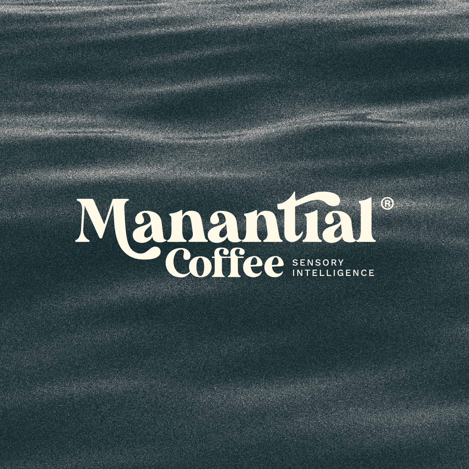
Our intention is to honor the elements of nature, focusing on water as a way to enhance our name: Manantial, which literally means "source of water" in Spanish.
Röstbar
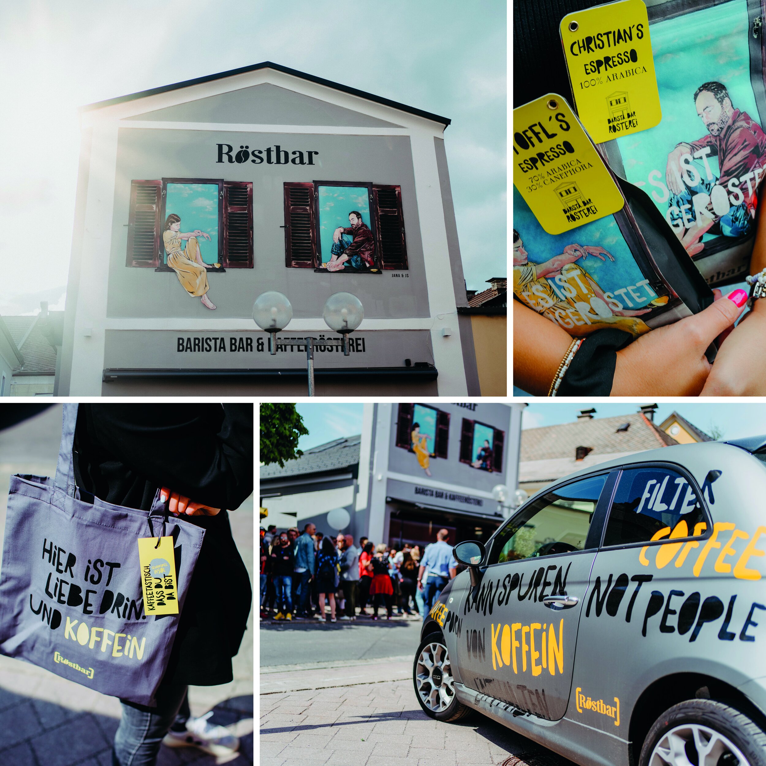
The flagship of our design is the newly designed, eye-catching facade, as well as the striking fonts used.The facade, which faces the main street, was designed by the Austrian-French street art artist JANA & JSand–due to its noticeable design is well known far beyond the city limits of Villach.
ROCKET BEAN
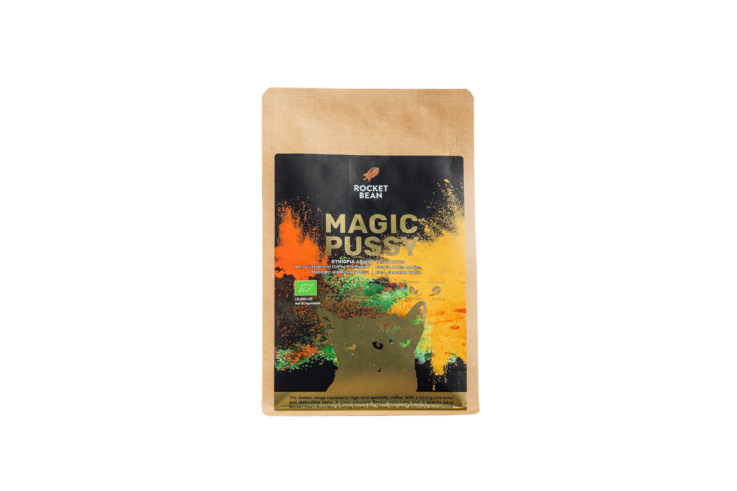
Good design can make products and services more functional, intuitive, and appealing to users.
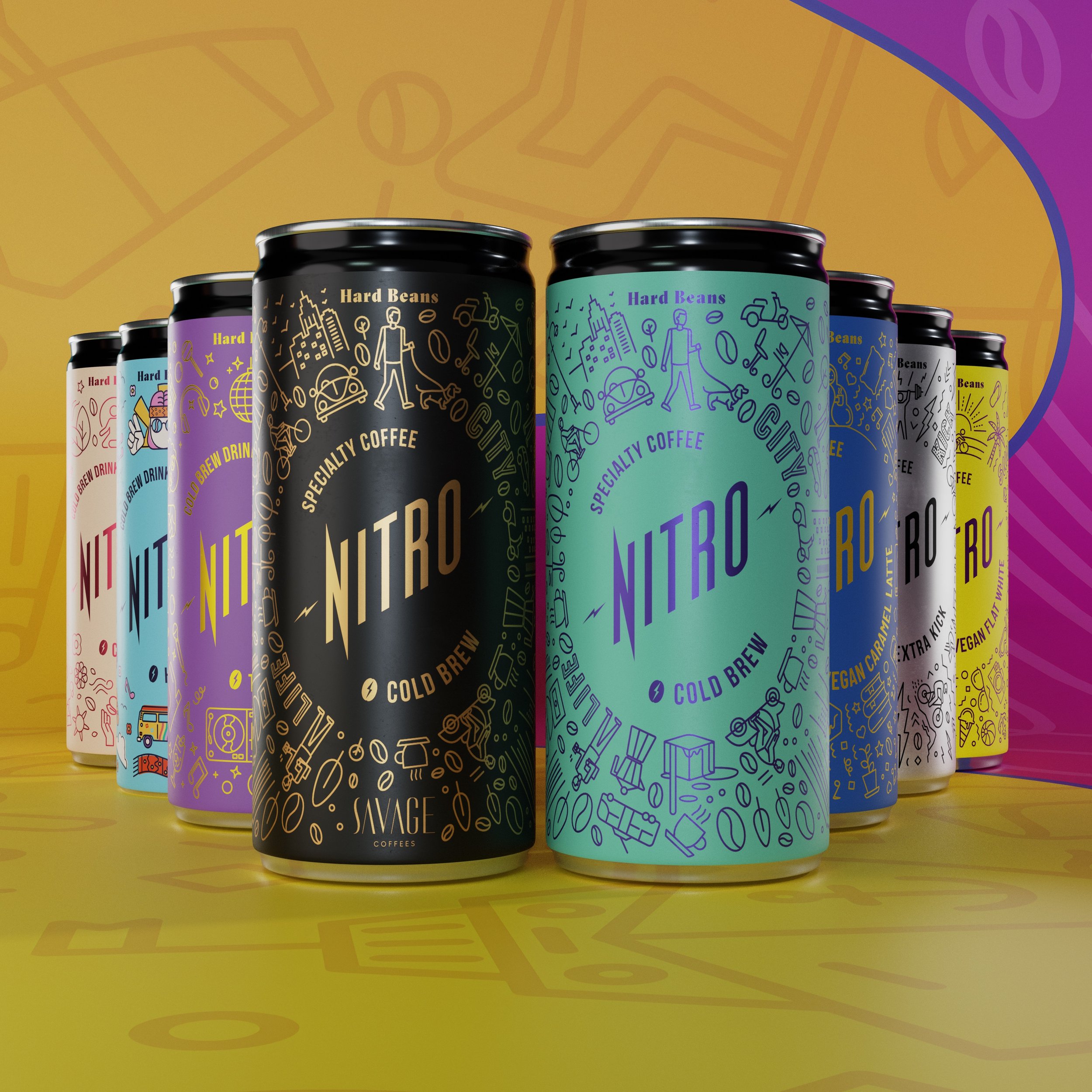
Hard Beans
Nitro brand has been designed in a modular way - it allows to create multiple variations for different products within a single brand. Each product receives its unique identity combining colors and graphic elements.
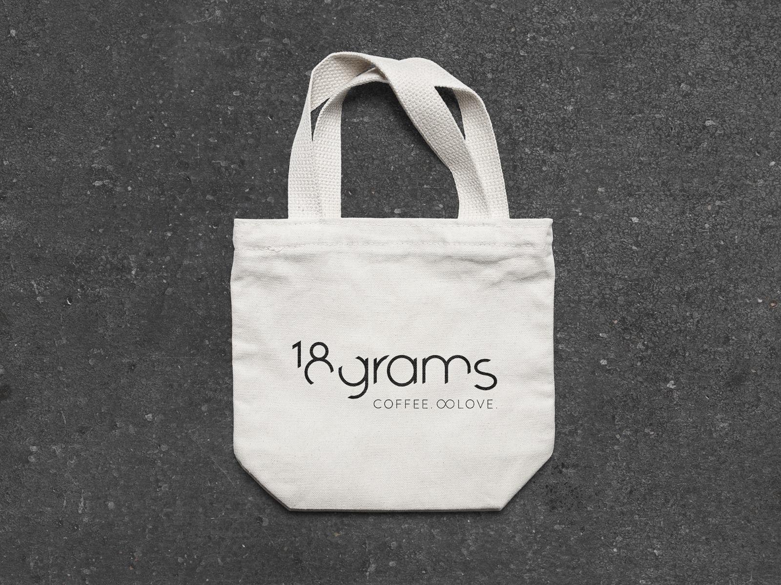
18grams Coffee. ∞ Love
Through this design concept we wanted to transmit our passion for coffee in a glimpse and to develop a brand language that is unique and memorable.
Coffee Planet
Our re-brand culminated in a launch event on Thursday, 4th May where we announced a new identity in-line with our evolving business.
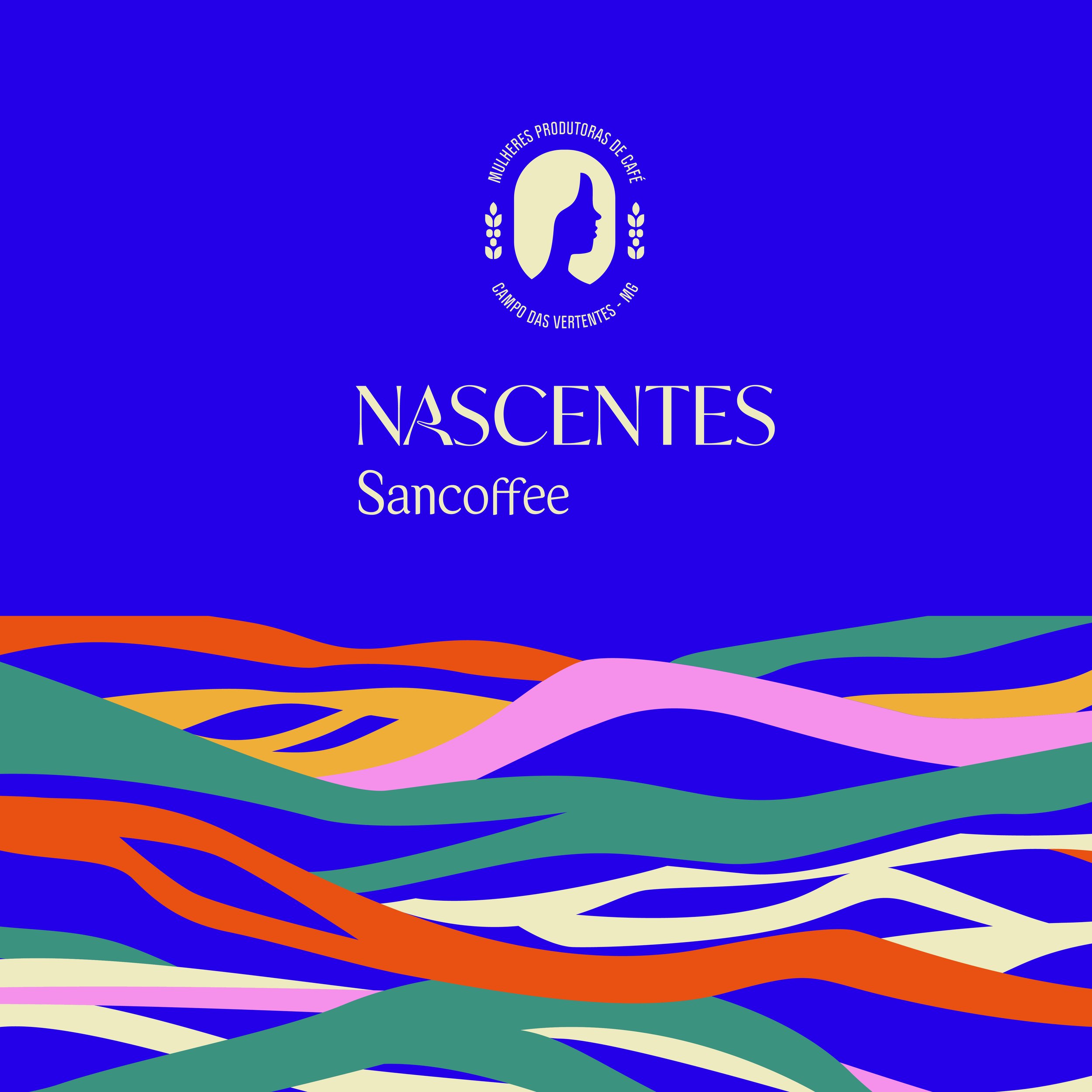
Nascentes by Sancoffee
Nascentres is a brand that has a big message: it stands for women in coffee. Nascentes is a project introduced by Sancoffee (a specialty coffee cooperative in Brazil) that unites female producers in the region Campo das Vertentes, Minas Gerais, Brazil.
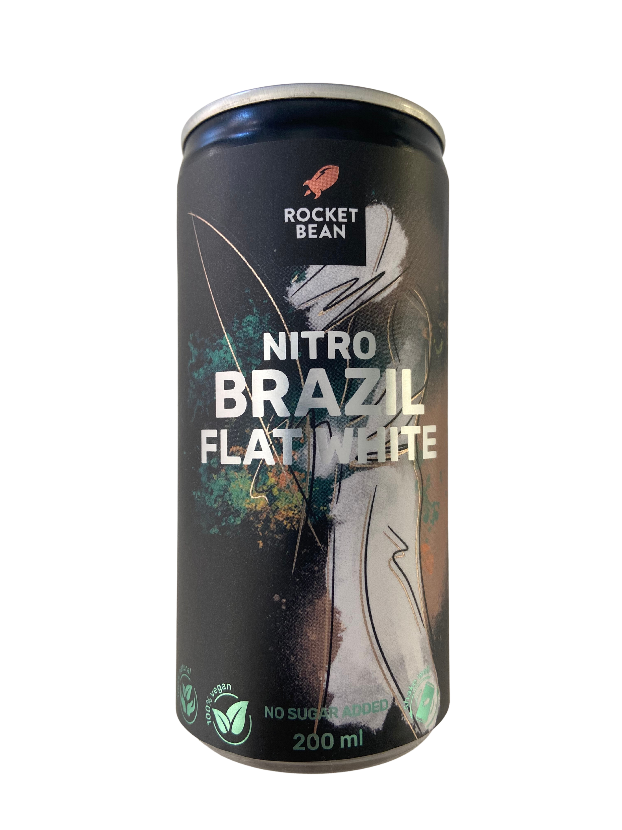
ROCKET BEAN
Ultimately, the goal of design is to create a product that is not only aesthetically pleasing but also useful, effective, and meaningful to users.
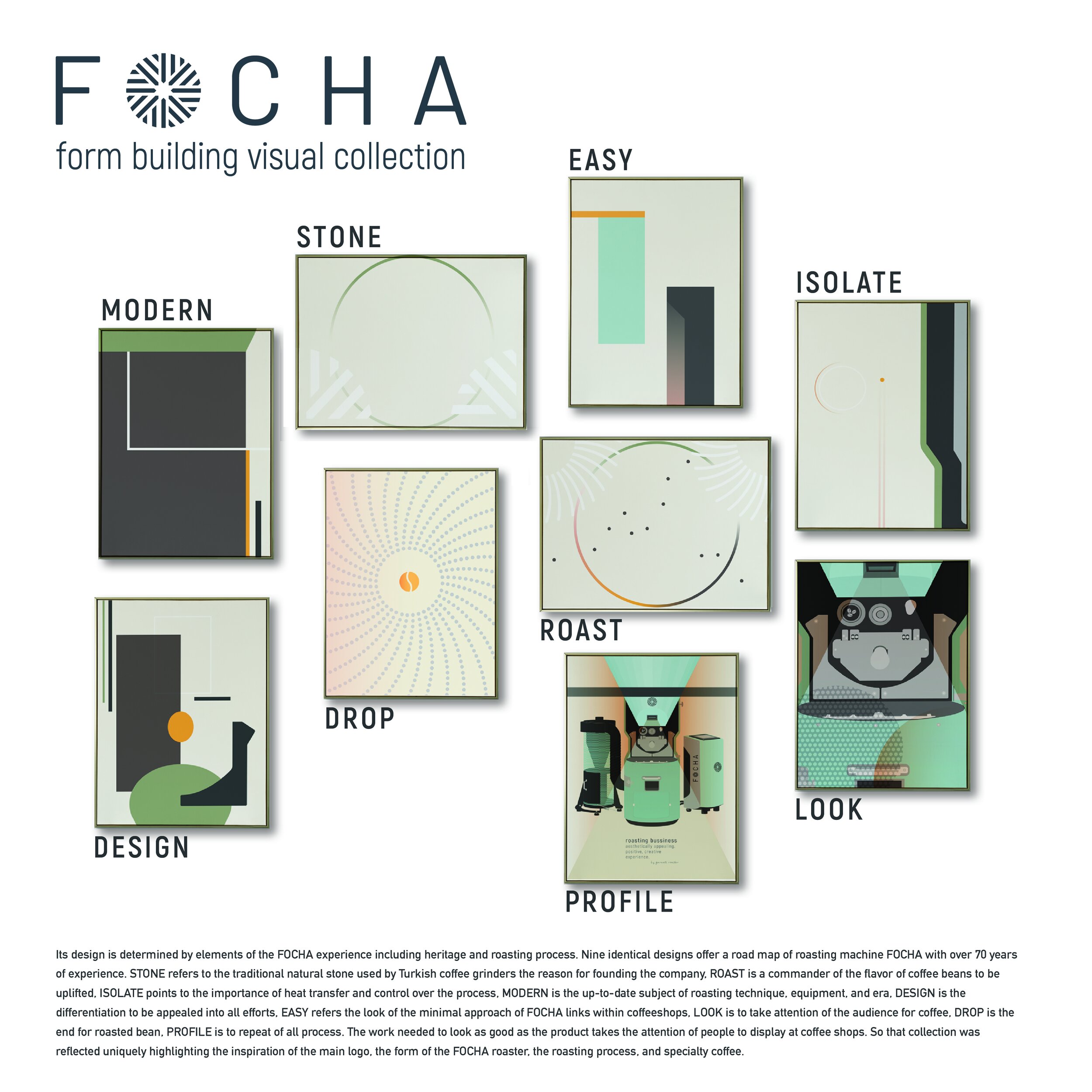
Garanti Roasters - FOCHA Form Building Collection
Tansel Ünal, and the team of Garanti Roasters carefully analyzed the main characters, scenes, conflicts, and images and captured the theme by creating an experience that is simple, intuitive, and engaging.
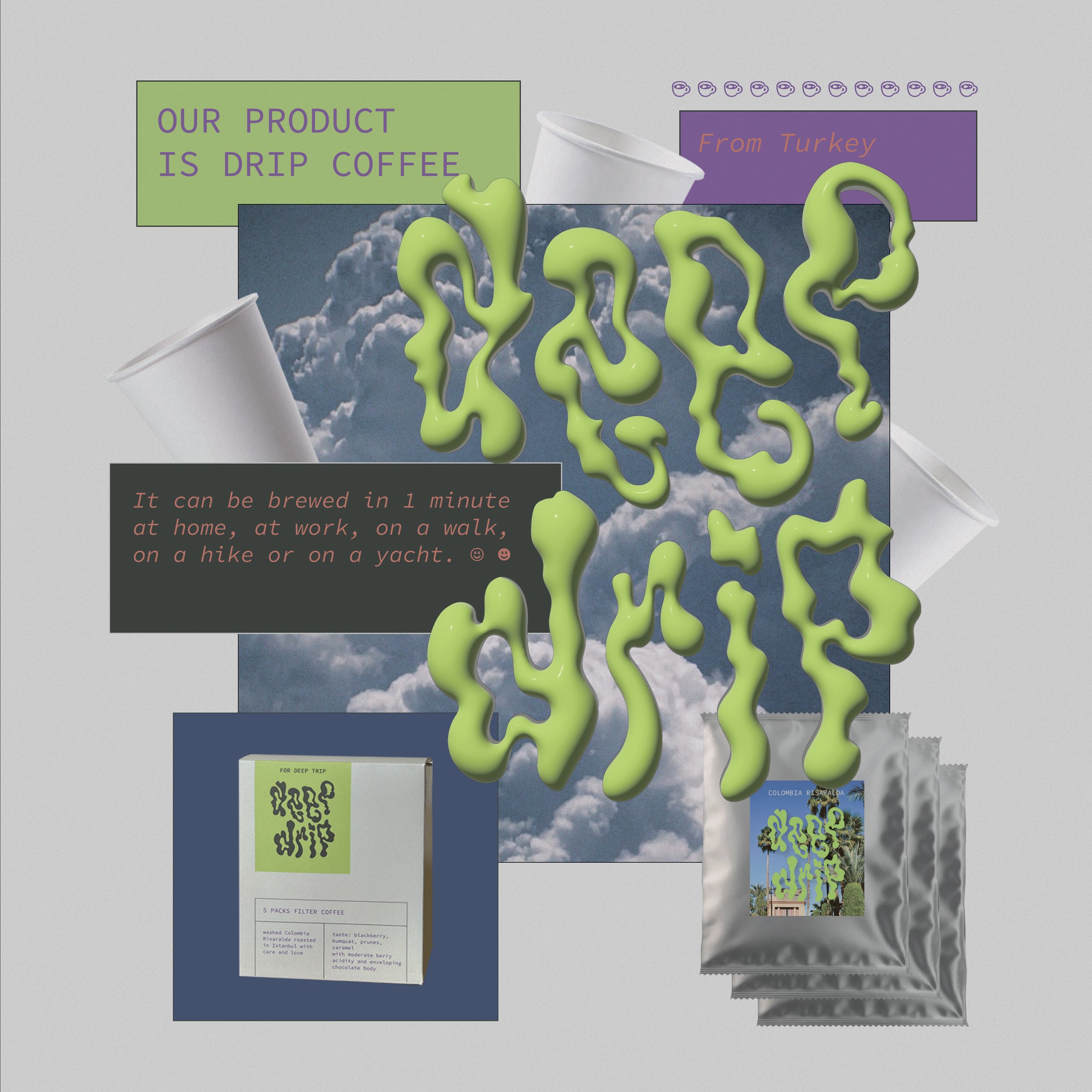
deep drip
Our logo refers to the stains in the water from drops of coffee from the drip bags.

Lavazza - La Reserva de ¡Tierra! CUBA
La Reserva de ¡Tierra! is the collection dedicated to baristas of finest sustainable coffees, featuring the Lavazza Foundation projects, selected, blended, and crafted to offer a flavor journey around the world.

Mokha 1450
Mokha 1450 has been the first and only brand to define the Luxury Specialty Coffee space.

Meka Innofood Co Ltd.
This design conveys the product itself. SQUEAKY the air blower designed for the coffee grinder.

ROOT OF COFFEA
We wanted to create an artwork dedicated to the art of coffee making.
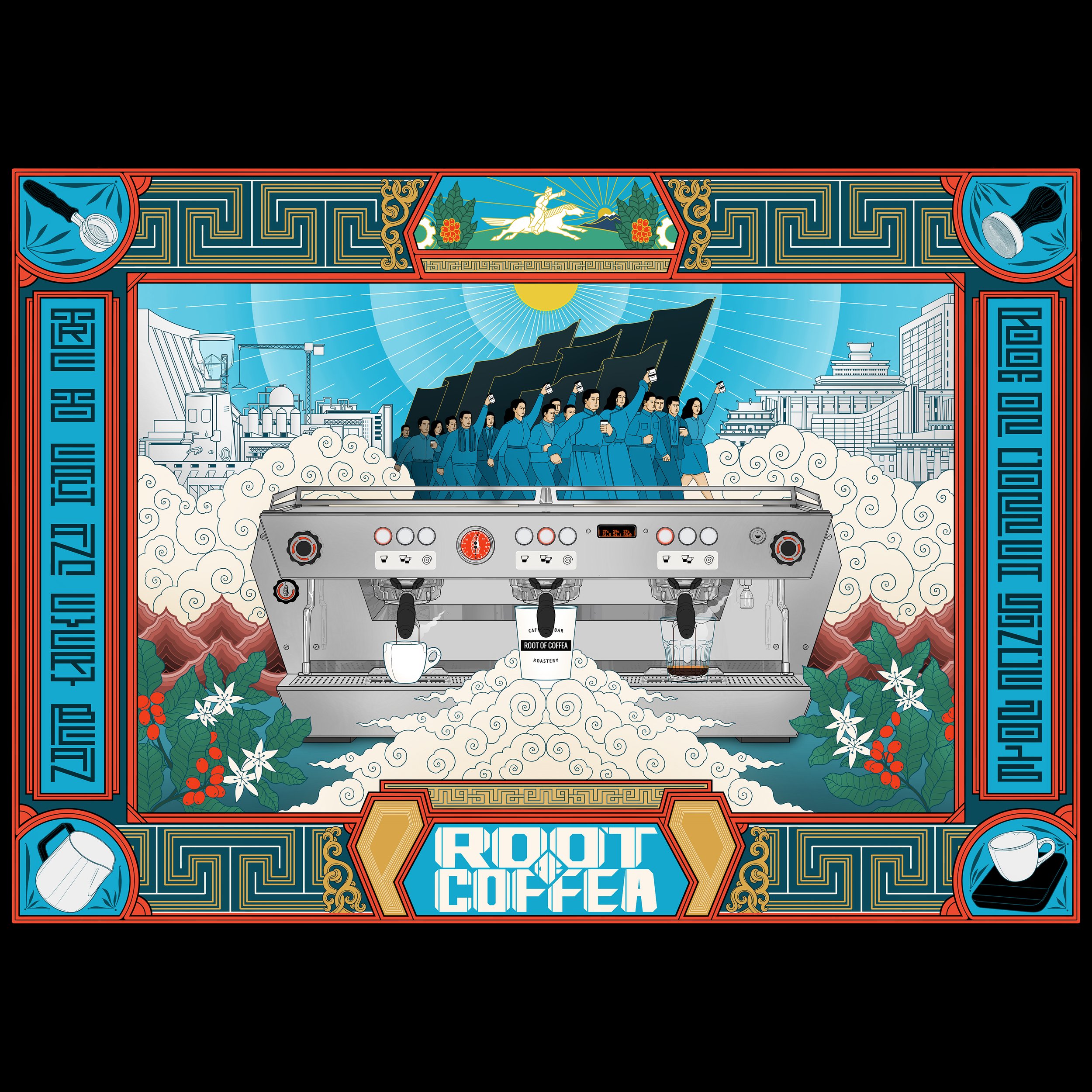
ROOT OF COFFEA
We wanted to create an artwork dedicated to the art of coffee making.

Foundation Coffee Roasters
We wanted to show that we are a well-established brand that follows the path of sustainable development and is ready to develop together with modern realities.

Every Half Coffee Roasters
That's why our brand is more than just a logo - it's an entire system of illustrations around the half bean that capture the essence of each unique coffee bean profile.

Bean & Bean
The rebrand was led by co-founder Jiyoon Han, who wanted to bring the brand’s core values to the forefront through design.

Liberté Coffee LLC
To develop and define Liberté Coffee’s Visual Identity, we considered that through all the communication pieces the brand could represent the agro-coffee culture and the Guatemalan culture; therefore, we re-interpreted and adopted various elements from the coffee farms as well as the communities, making them a fundamental part of the brand’s identity.
