Welcome to the Specialty Coffee Association platform celebrating inspirational design in coffee.
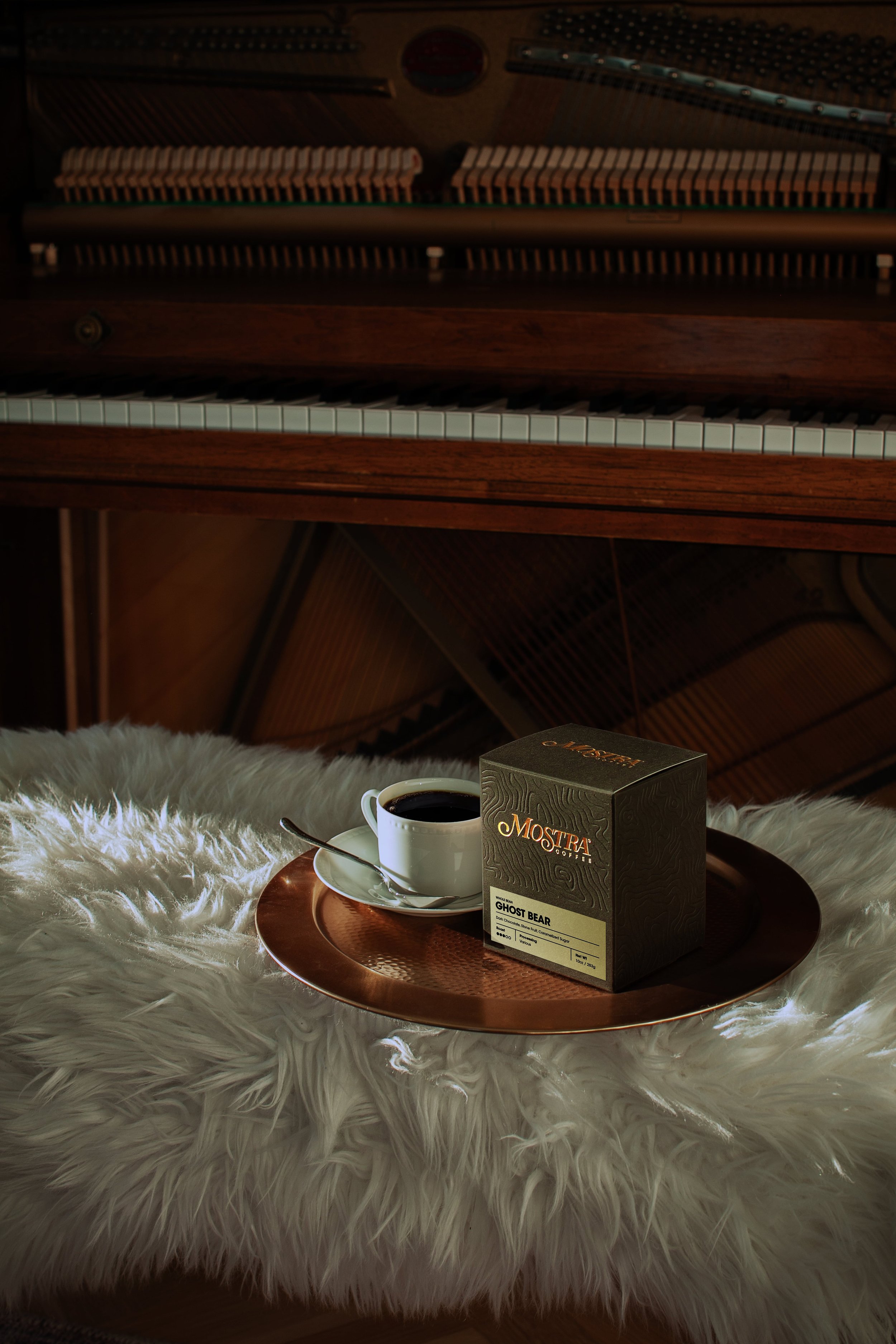
Mostra Coffee
We sought to dignify the work of our farmers and give their beans the attention they deserve.

Deseado brewing co.
We aimed to create a modern, disruptive design that breaks away from traditional coffee packaging. Instead of brown and green tones, we chose pure, vibrant colors to evoke excitement and exploration—just like our cold brew takes you on a journey with every sip.
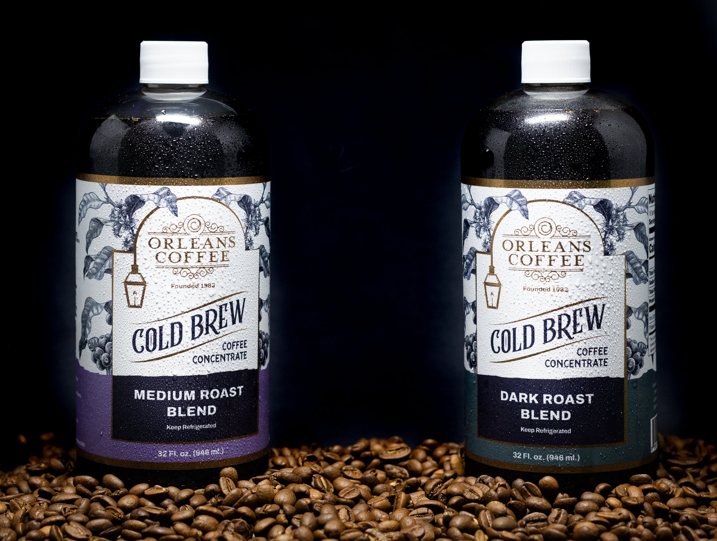
Orleans Coffee
Our goal is to create a new cold brew that embodies the spirit of New Orleans while delivering a sense of refreshment.

ICONIK COFFEE ROASTERS, LLC
The textures of our cafes are unique: re-purposed, re-used, and restored elements from New Mexico.
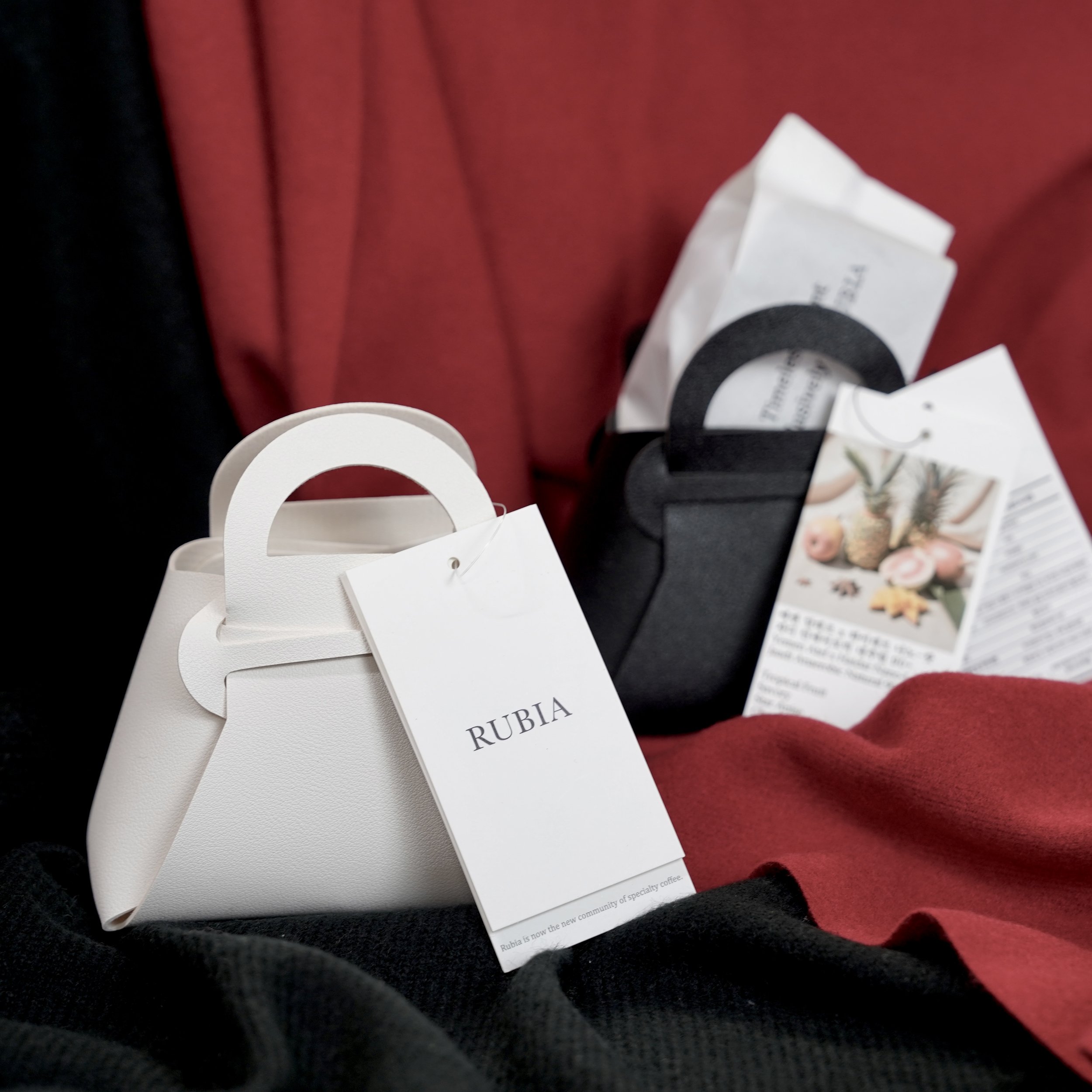
RUBIA
Like finding a gift wrap, this package satisfied all the existing conditions. It also facilitated seasonal product planning, with various variations possible
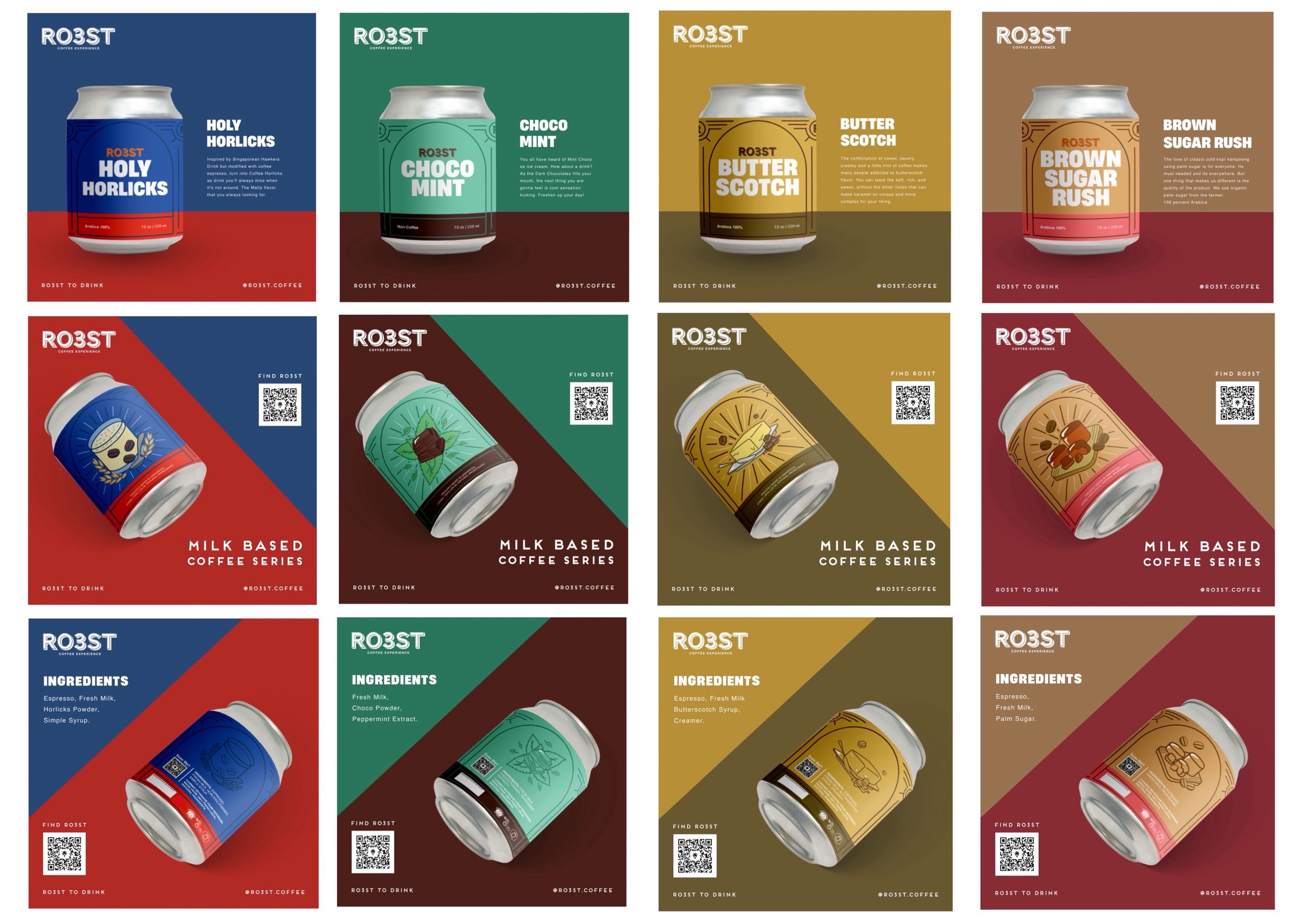
RO3ST
The design conveys the unique characteristics of flavors offered by our brand. Through the use of graphics resembling tasting notes, it embodies our brand identity: friendly, minimalist, and approachable.
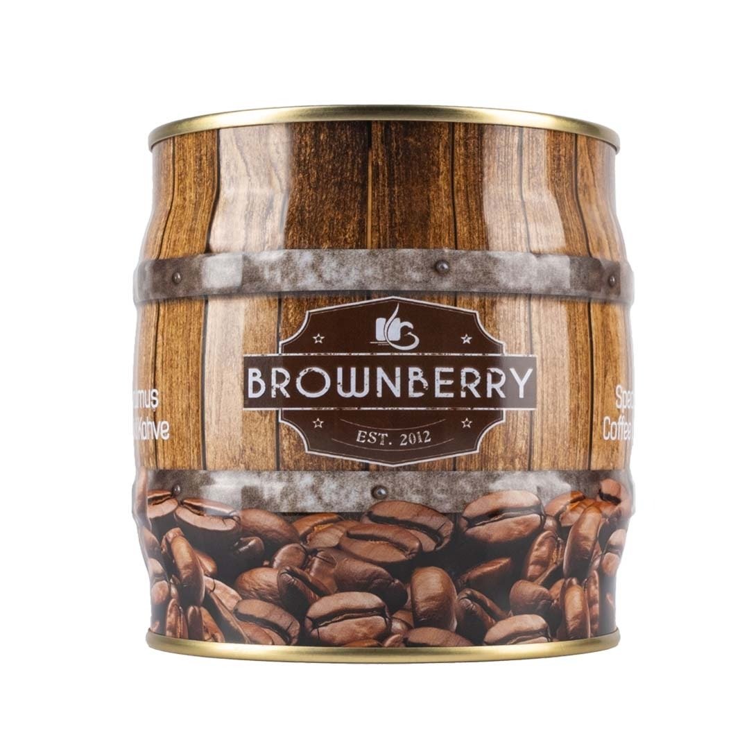
Brownberry Coffee Turkiye
We paid our respects to the packaging industry and its employees by choosing tin packaging, which requires a more qualified labor force
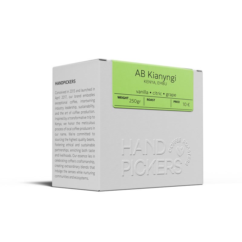
Handpickers
we think it is quite attractive and beautiful, clean lines and a sense of supreme quality
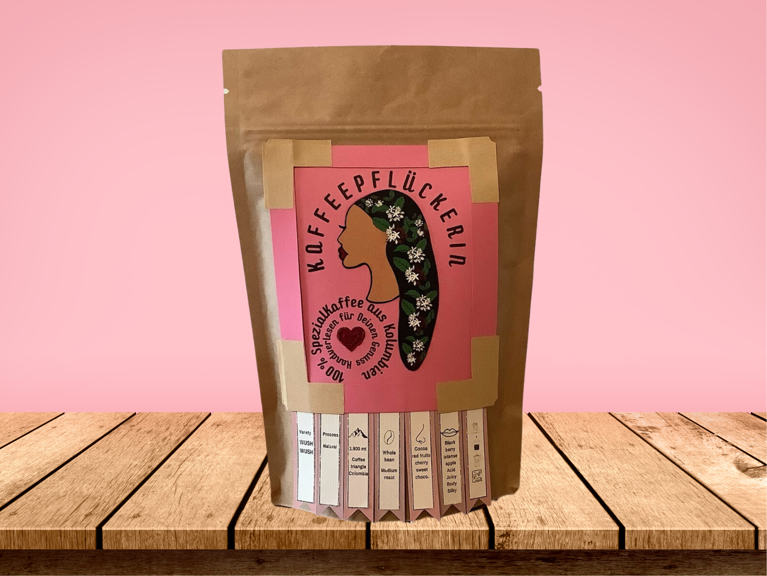
Adriana Gonzalez Kaffeepflückerin - Quindigoods
We have deliberately chosen the company responsible for producing our ecological pouches due to our steadfast commitment to supporting small and medium-sized family-owned businesses.
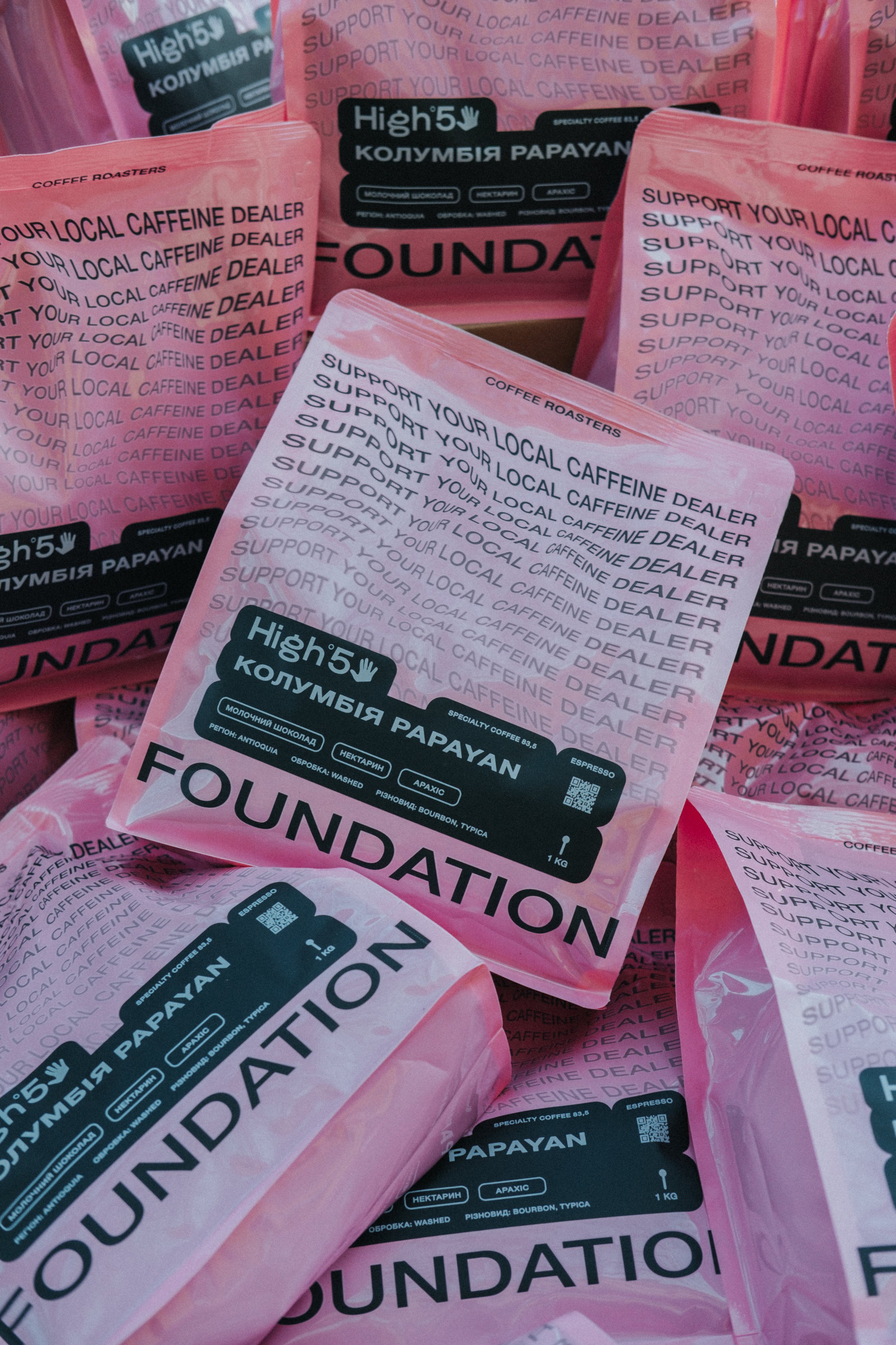
Foundation Coffee Roasters
The main message in the design is support your local caffeine dealer. We emphasize this as much as possible throughout the design and try to convey to the end consumer that it is not necessary to chase well-known brands from other regions and countries when you have a local manufacturer of a tasty product.
BUSINESS INTELLIGENCE SRL
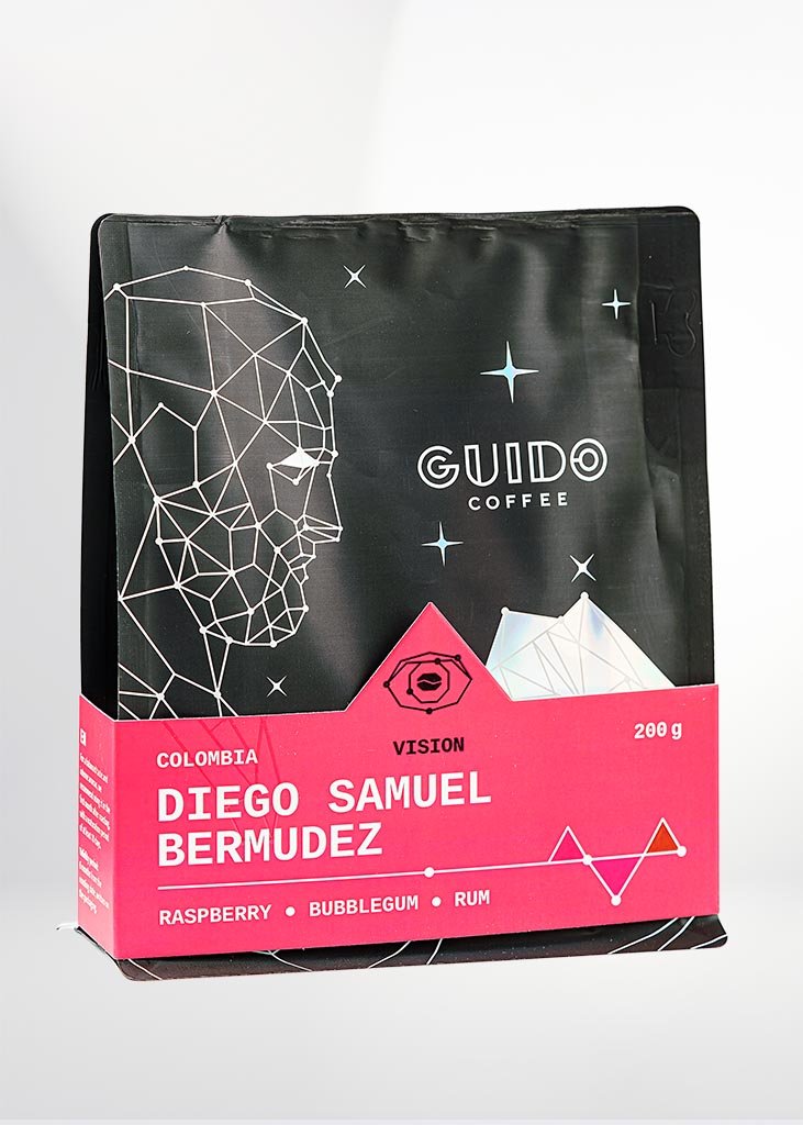
The new packaging features a colorful sleeve that offers more than just eye candy.
TB ELITEGROUP LTD
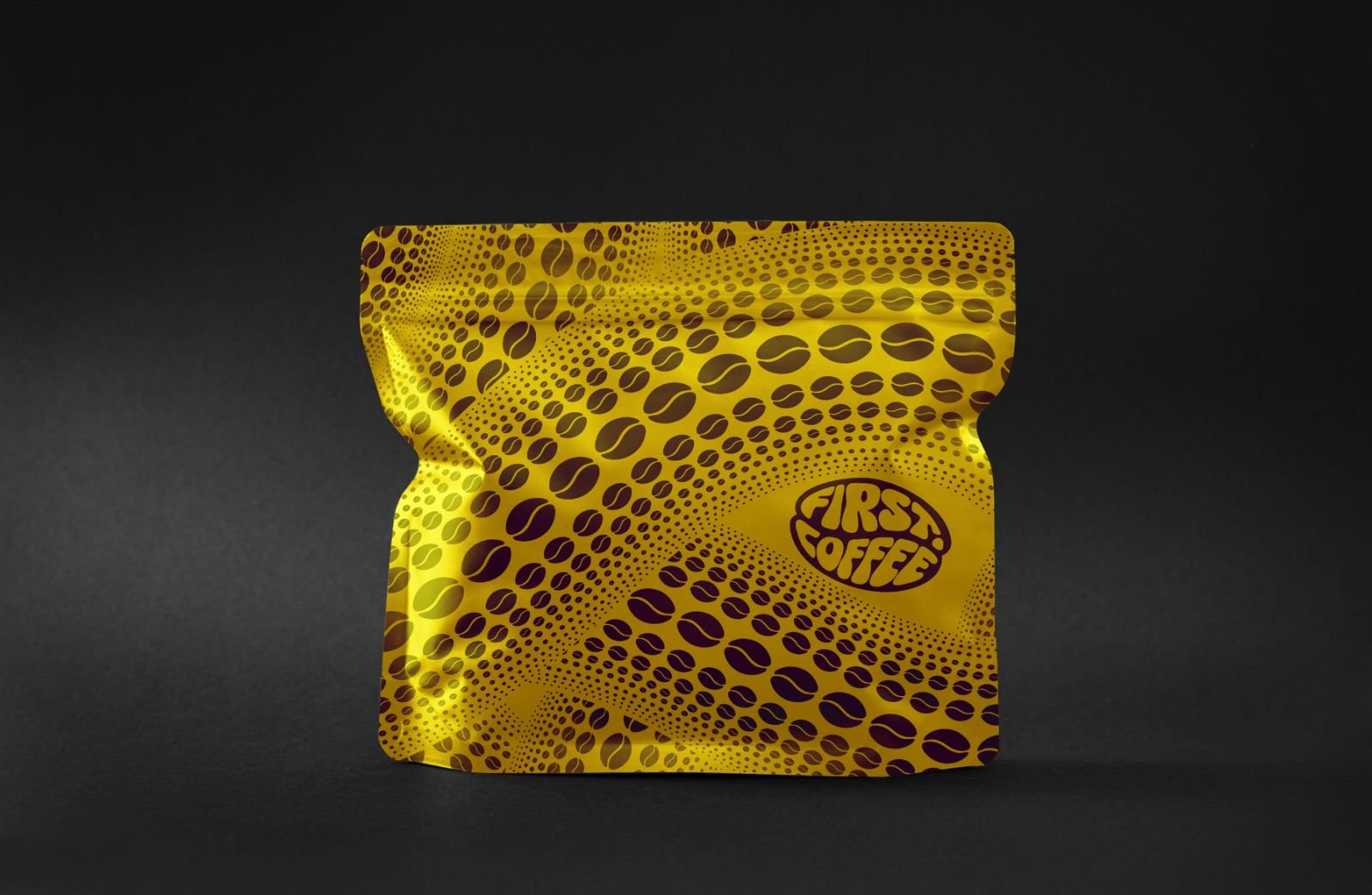
The design represents the road of the coffee symbolized like the tentacles of an octopus.
Roasting house
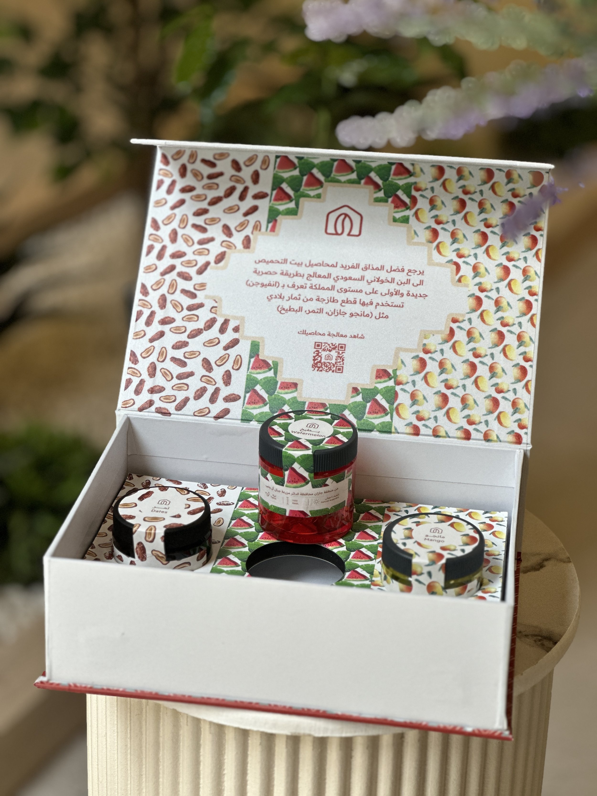
Through this design, our goal is to introduce a fresh treatment crafted from locally sourced fruits. The design has been meticulously tailored around these fruits to enhance their visual appeal, aligning perfectly with the client's preferences.
KAFFA
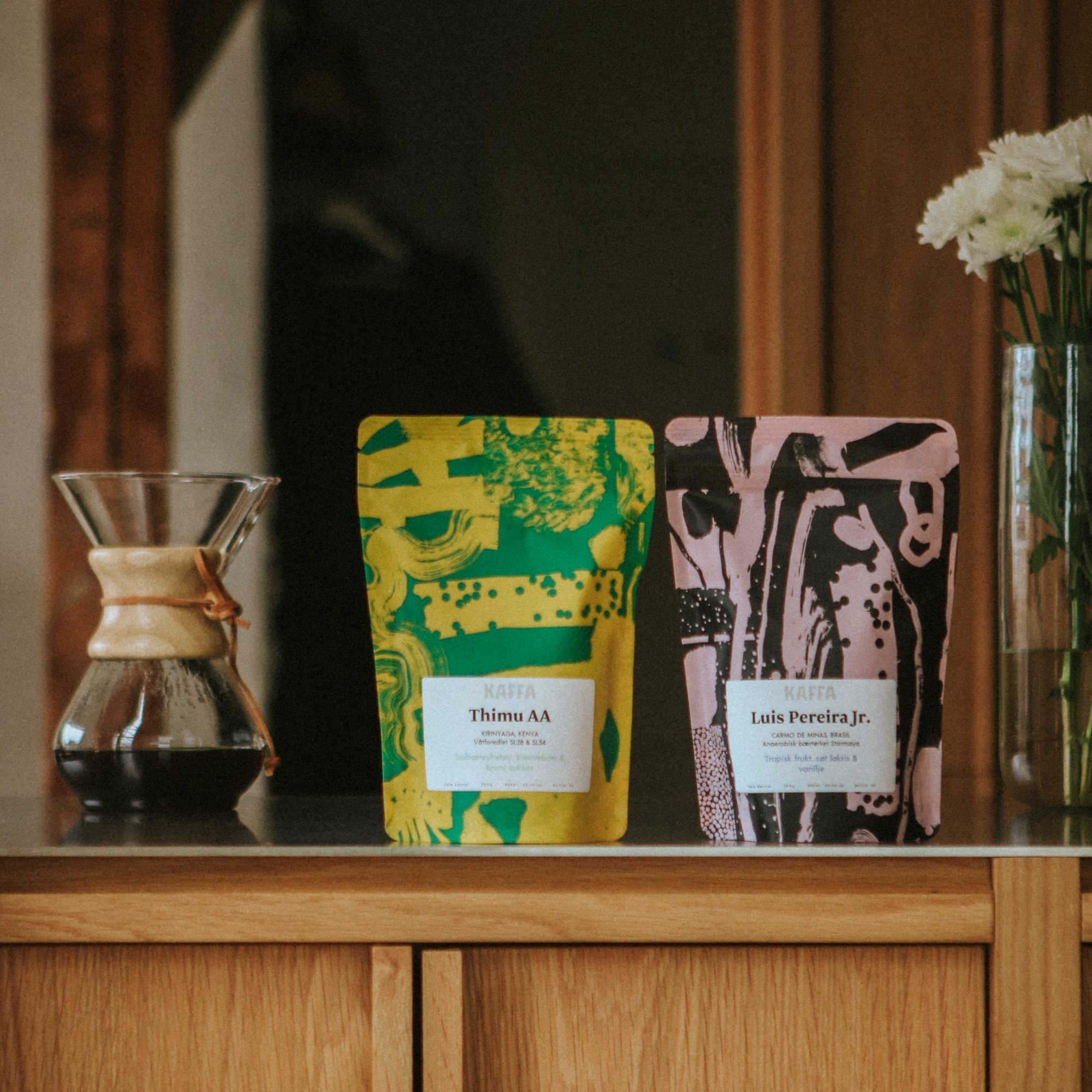
With our newest designs, we wanted to highlight the complexities of the flavors in coffee through visual expression, as well as offer aesthetically appealing works of art to enjoy both in your local coffee shop and on your shelves at home.
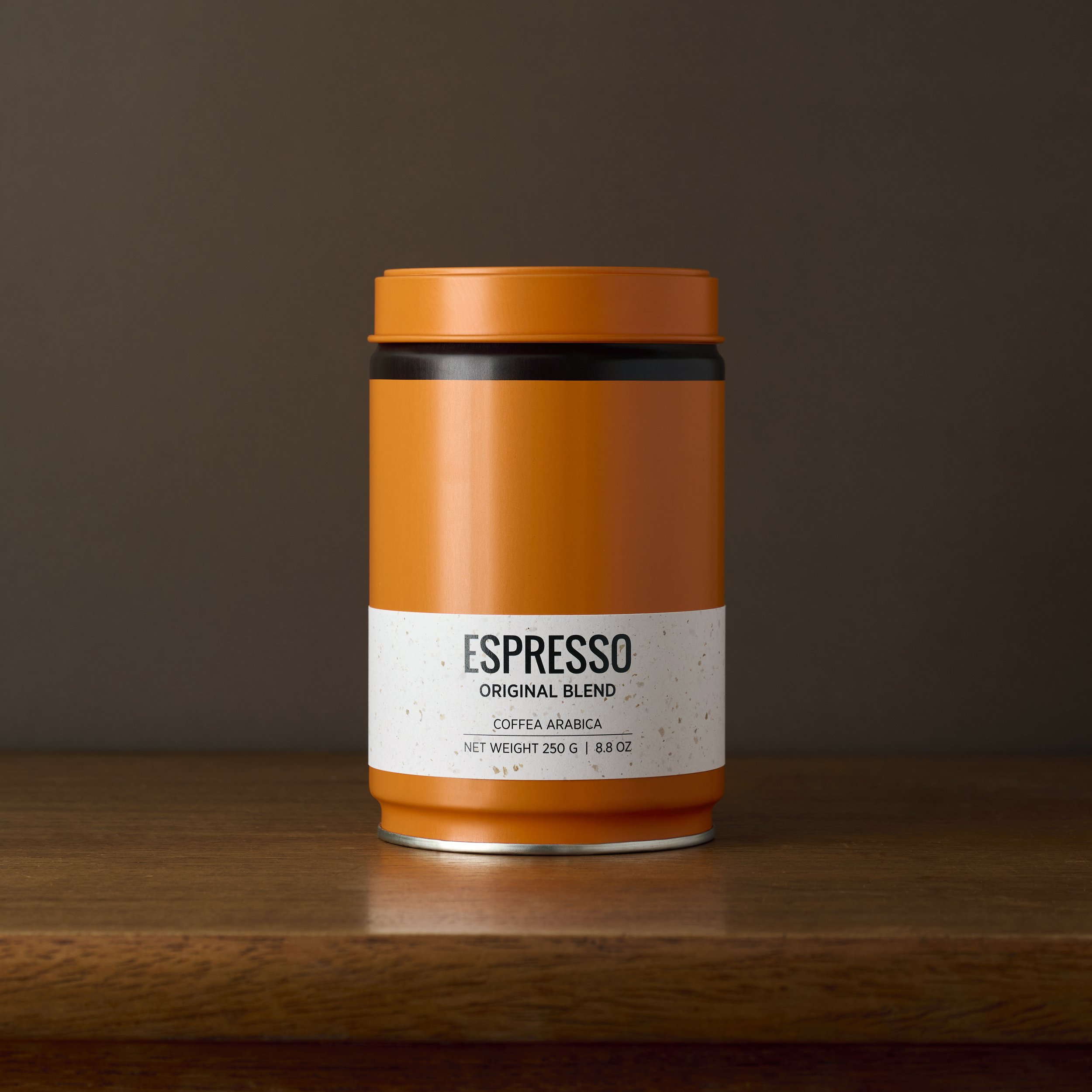
Herz & Son GmbH
The primary goal with the design was to create a visually striking and environmentally responsible packaging solution for our coffee product.
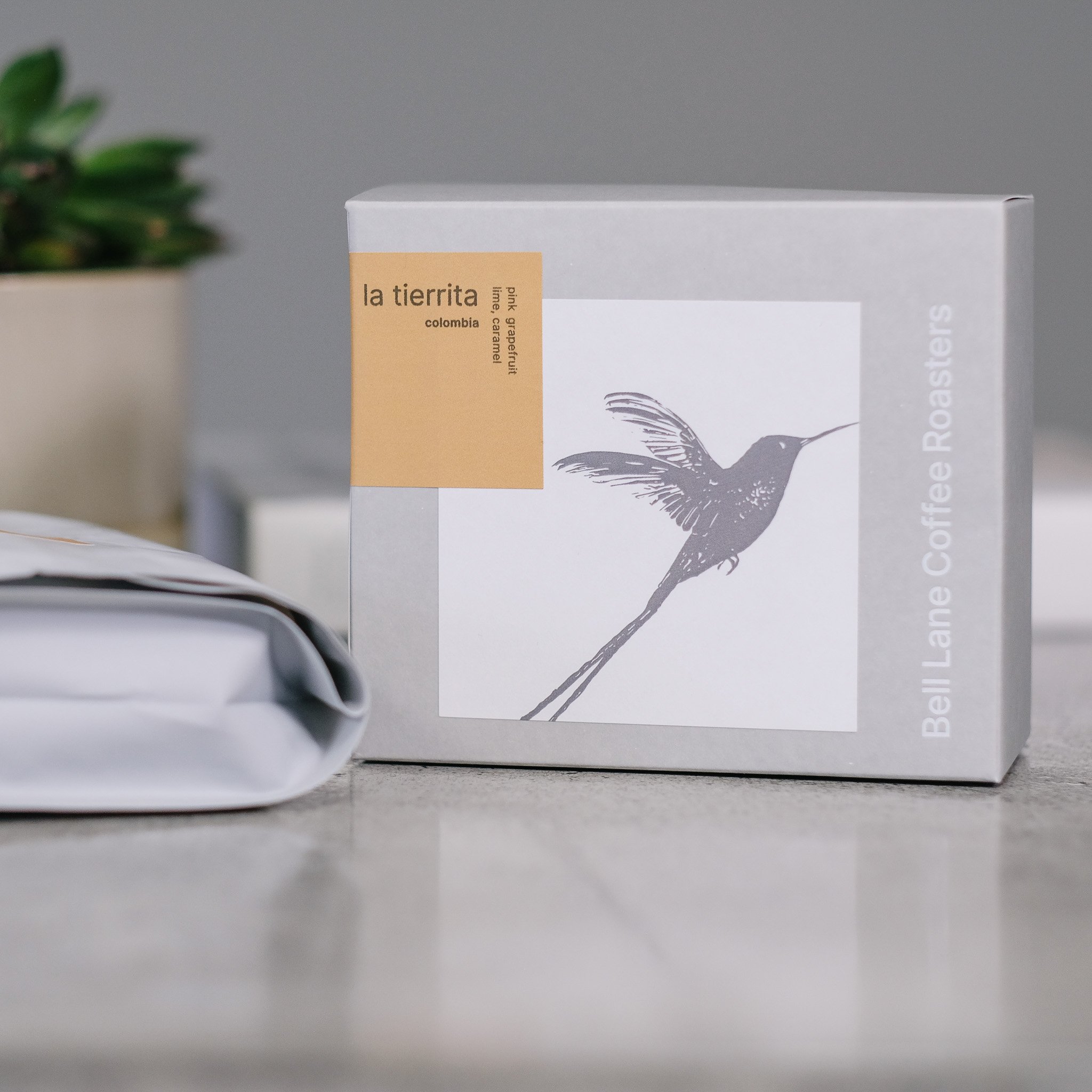
Bell Lane Coffee Ltd
Our packaging redesign was a culmination of a year-long journey, reflecting our commitment to stripping back to our core values and rediscovering our purpose.

DISTINTO
In this process, we wanted to do things differently and steer clear of t”
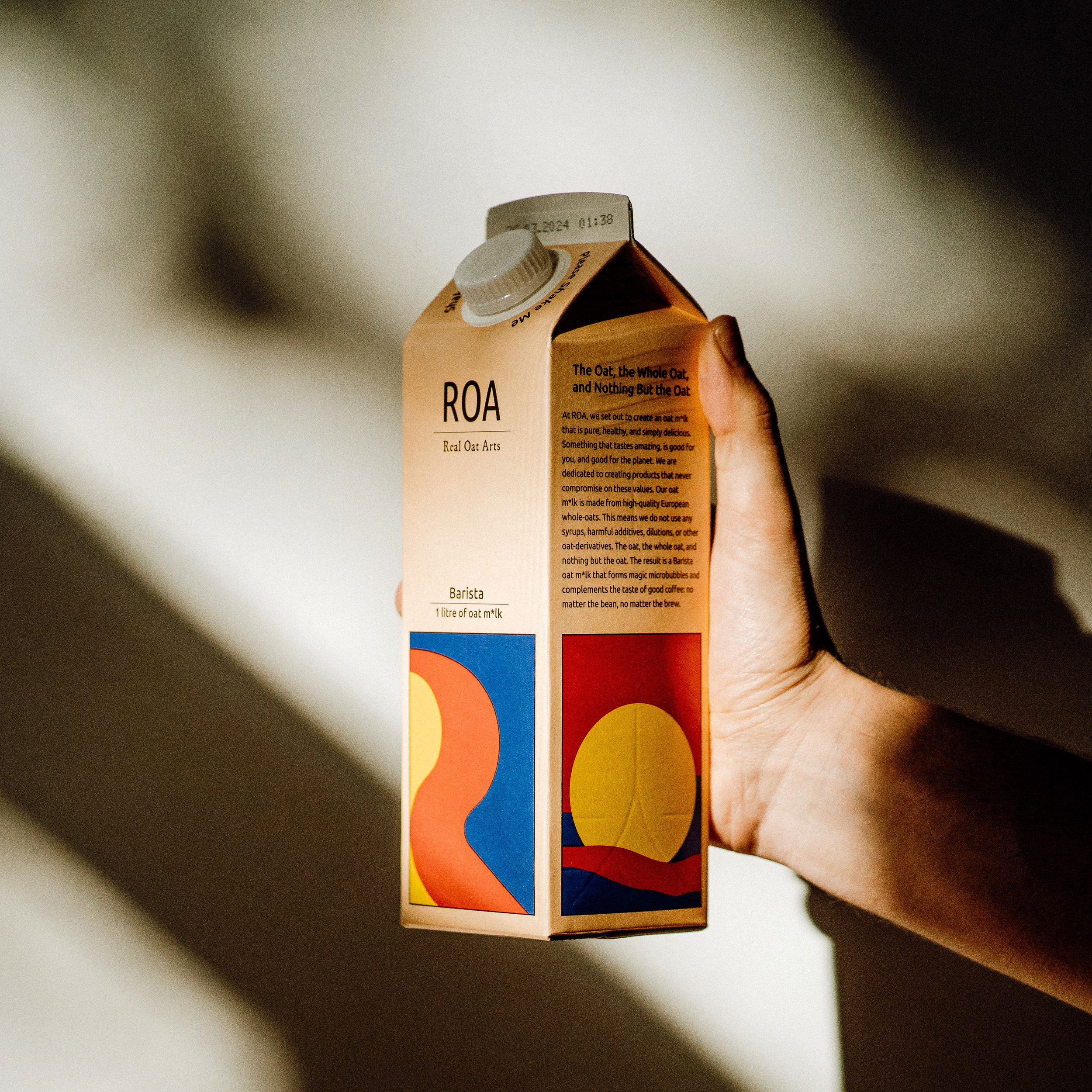
ROA | Real Oat Arts
In this process, we wanted to do things differently and steer clear of the sea of sameness.
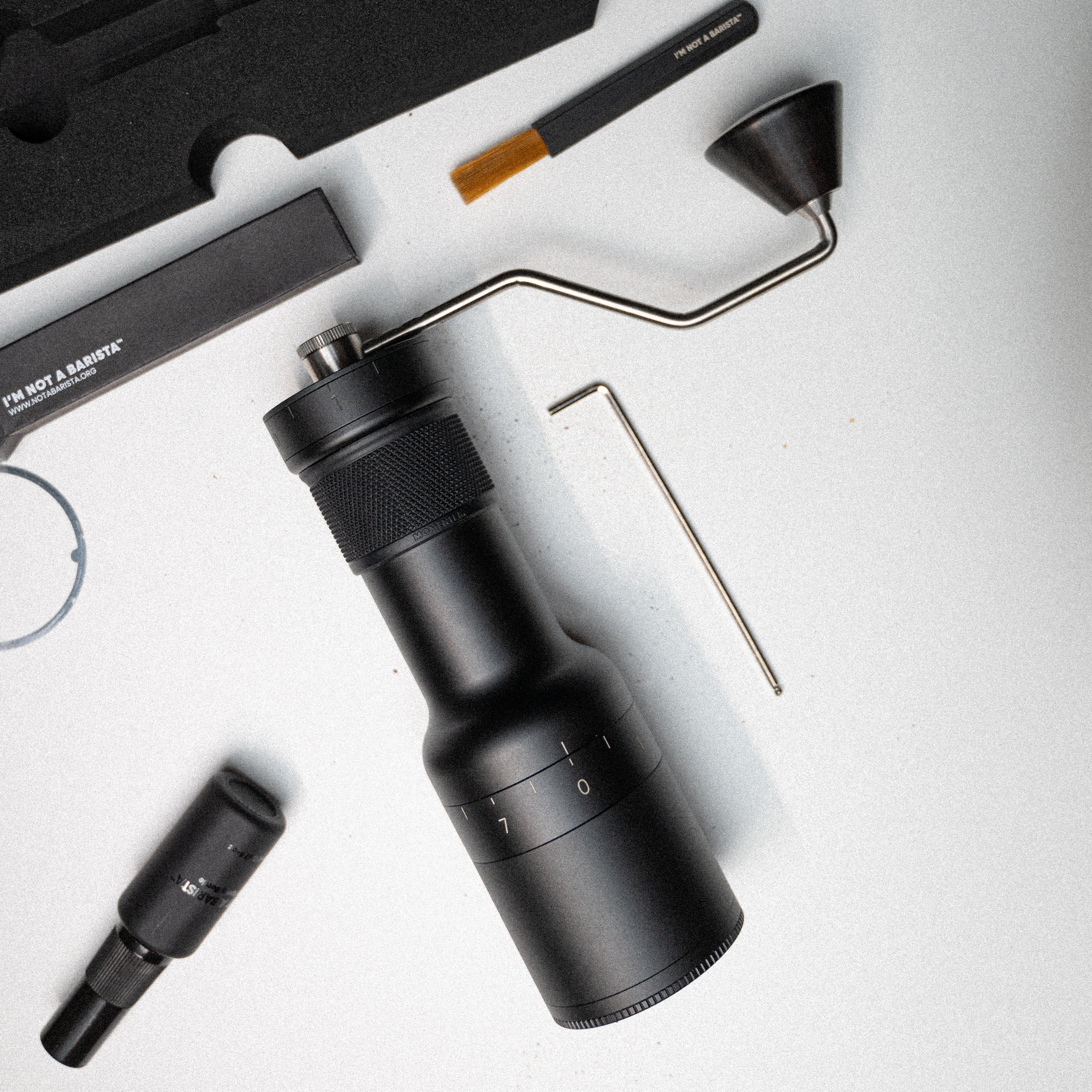
I'M NOT A BARISTA
Our goal was to craft a grinder that not only enhances the coffee brewing process but also serves as a piece of art in any place.
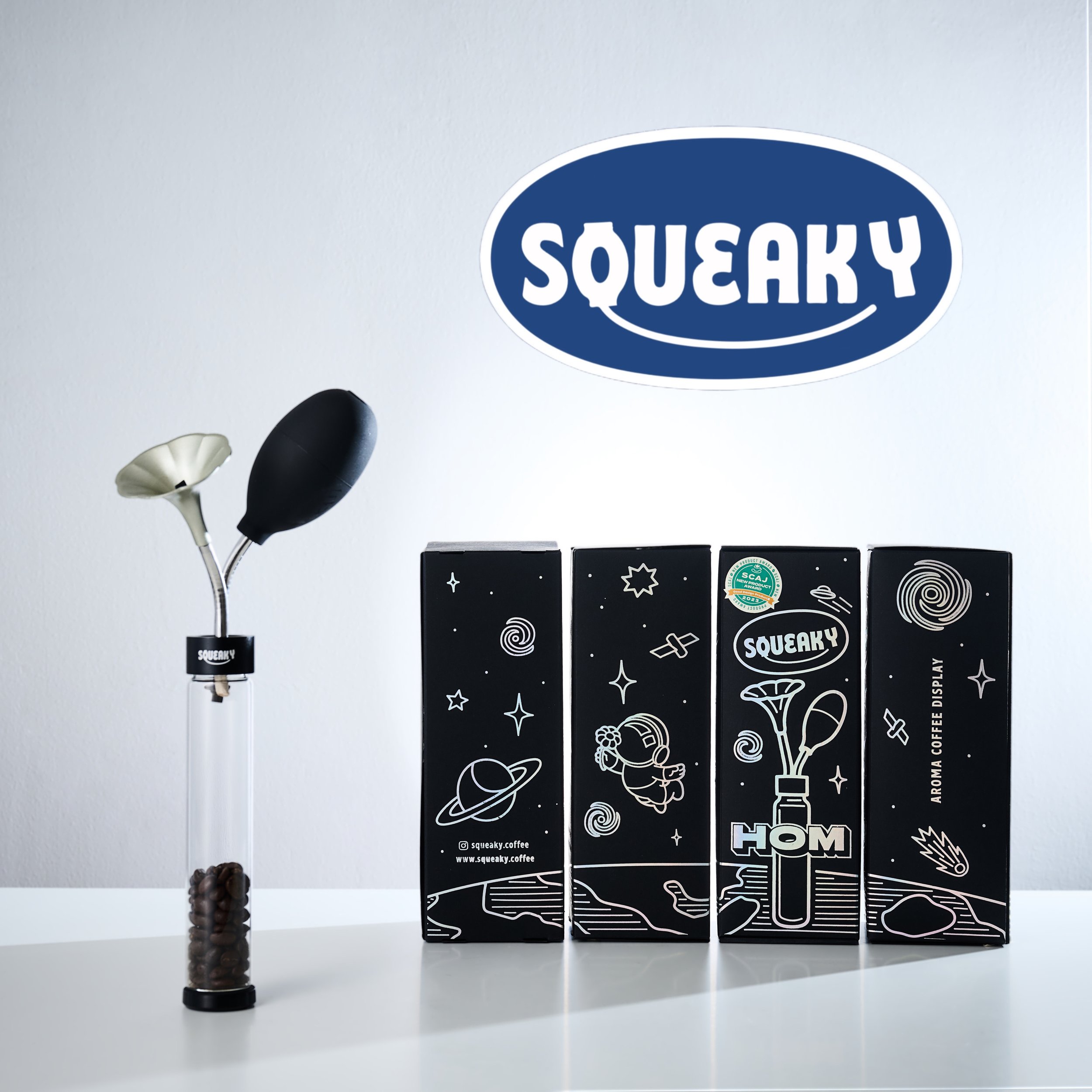
SQUEAKY
Guiding consumers to the product worldwide
