SQUEAKY
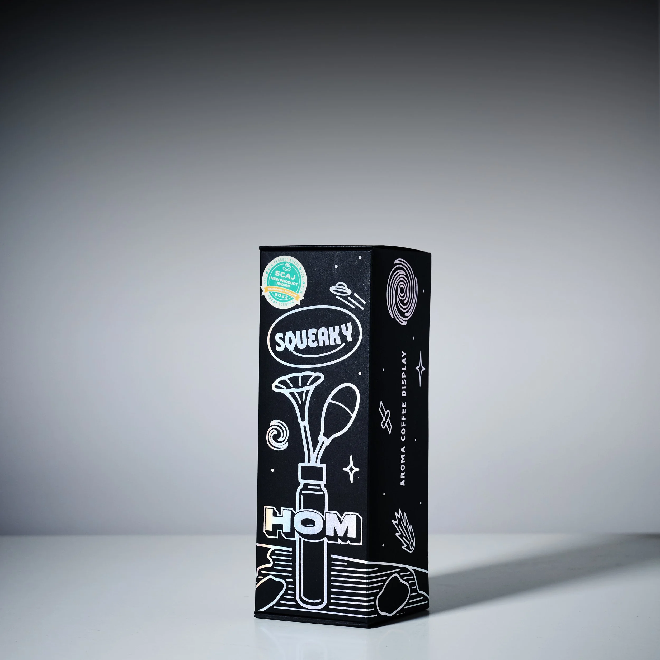
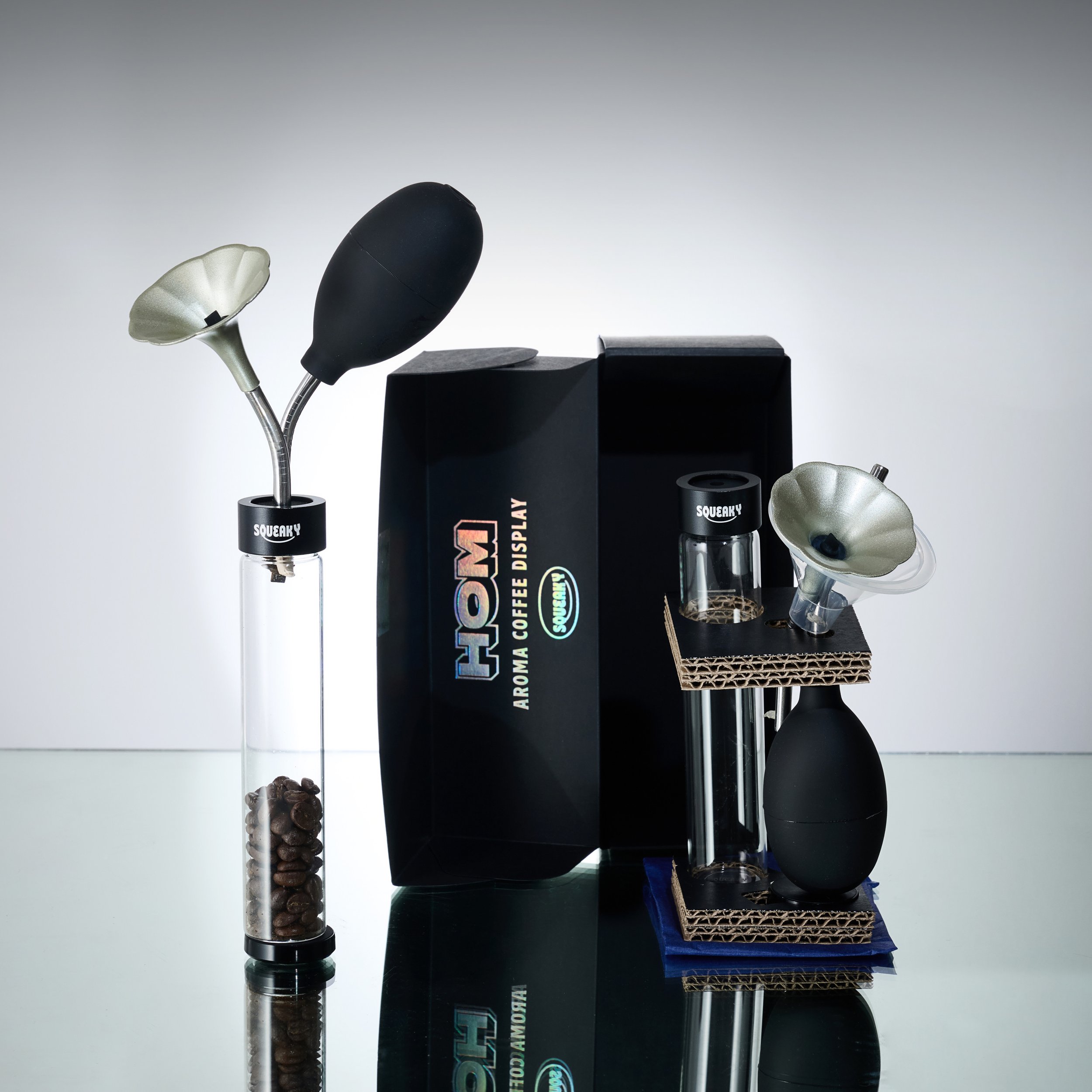
The packaging design uses product images to communicate how the product can be used. It also includes space and astronaut imagery to reflect the brand's identity and modernity, Furthermore, it incorporates captivating space-themed elements, such as astronaut imagery and cosmic motifs, to not only mirror the brand's distinct identity but also to imbue it with a sense of contemporary allure and futuristic appeal. guiding consumers to the product worldwide. making it appealing and accessible to consumers.
We use ECF paper for packaging and avoid printing logos directly on it to facilitate recycling. The separate stickers for logos make waste separation easier, contributing to sustainability, internal partitions minimize product collisions, reducing material use, and ensuring the product's safety during transportation. Efficient Transportation: The rectangular packaging shape allows for efficient transportation, reducing carbon emissions from multiple rounds of transportation. Specific references that informed the design of our brand identity is inspired by the concept of space, with an astronaut serving as our representative.
To maintain our brand's uniqueness, we have space-themed elements in our packaging. These stars symbolize shining bright, serving as guiding lights for people. We utilize stars to convey the brilliance of our product, lead coffee enthusiasts worldwide to unite and The design aims to captivate and impress consumers, establish brand and environmental sustainability, and become a memorable and trustworthy brand in the coffee industry. Furthermore, we include a "shooting star" associated with good luck and positive change. It is believed to bring good fortune to those who see it. Therefore, we chose to incorporate a shooting star in our package design, aiming to convey positivity and good fortune to our consumers featuring an astronaut holding the product, serving as a visual cue to demonstrate product usage for consumers. The design is playful, friendly, and easily accessible to align with the brand's ethos. It portrays a young boy astronaut with a playful personality, making it relatable and appealing to people. Additionally, the packaging is designed to be user-friendly and approachable.


