
Underberg America
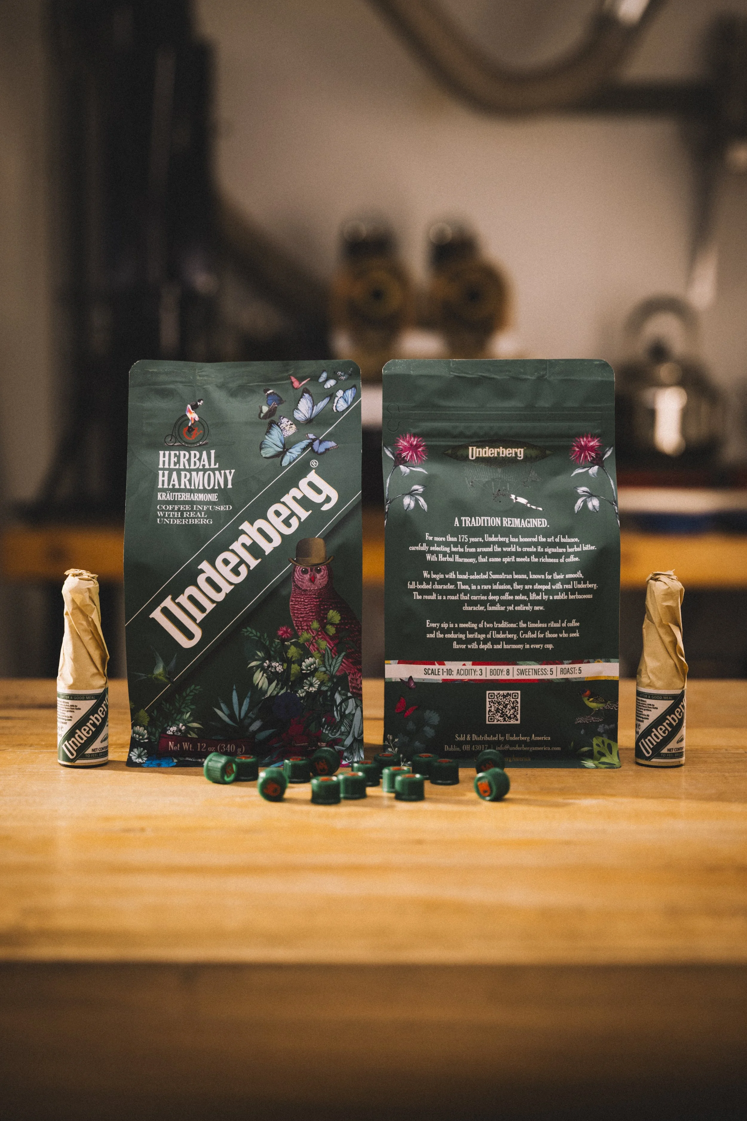
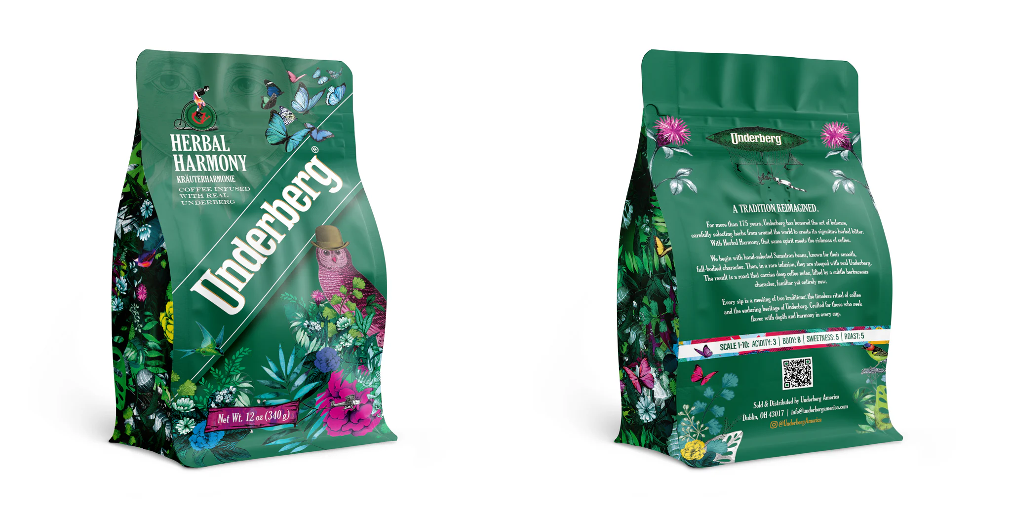
We wanted the design to announce Underberg Herbal Harmony as a bold but authentic evolution of the brand—our first U.S. innovation in 165 years—by visually uniting Underberg’s herbal heritage with the energy and creativity of modern specialty coffee. The goal was a pack that immediately reads as Underberg, yet feels fresh, premium, and intriguing enough to attract a younger, design-conscious coffee consumer and spark curiosity at shelf.
The key reference was Underberg’s new “Pop Art Meets Tradition” brand world, created for the 175th anniversary. We drew from its mysterious herbal flora, iconic Underberg green, and graphic pop-art/abstract elements to build a “magic world of herbs” on the coffee bag—anchoring the design in heritage while pushing it confidently into a new category.
At its core, the design concept for Underberg Herbal Harmony is about opening a portal between two worlds: the deep-rooted, almost mythic herbal heritage of Underberg and the vibrant, exploratory culture of modern specialty coffee.
Concept: “Explore the Magic World of Herbs” in a Cup
Herbal Harmony is the first Underberg innovation in the U.S. in 165 years, so the design had to announce that moment. The pack is conceived as an invitation to “EXPLORE THE MAGIC WORLD OF HERBS”—a visual journey that starts with the iconic Underberg identity and then steps into a newly imagined universe where coffee, botanicals, and ritual converge.
The design treats the bag as a storytelling surface, not just a container. Every visual element is there to communicate that this is not just another flavored coffee, but a rare intersection of two crafts: specialty coffee and a 175-year-old herbal tradition.
Inspiration: Pop Art Meets Tradition
We drew directly from Underberg’s new “Pop Art Meets Tradition” brand world, created for the 175th anniversary:
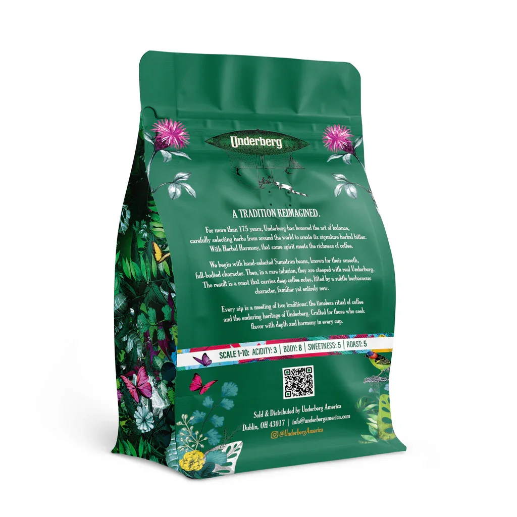
Tradition: The design nods to five family generations in Rheinberg, the secret SEMPER IDEM® process, and herbs sourced from 43 countries since 1846. This heritage is reflected in the anchoring Underberg green and recognizable brand cues that convey trust, depth, and ritual.
Pop Art: Layered over that foundation is a bold, graphic, almost dreamlike world of herbs—abstracted botanicals, unexpected color pops, and playful compositions influenced by pop and abstract art. This visual language speaks to a younger, design-aware audience and reframes “bitters and herbs” as something imaginative, energetic, and contemporary.
The inspiration was the idea that Underberg doesn’t just flavor; it transports. The design therefore feels like a visual hallucination of the herb world—mysterious but inviting, grounded in nature yet heightened through color and form.
Philosophy: Heritage as a Launchpad, Not a Constraint
The philosophy behind the design is that heritage should be a springboard for innovation, not a restraint. We wanted to respect 175+ years of Underberg history while proving that the brand can confidently live in new categories and new rituals.
Three guiding principles shaped the design:
Continuity with Courage
The design maintains clear continuity with the Underberg brand—so loyalists instantly recognize it—while boldly venturing into a new aesthetic territory that feels at home on a specialty coffee shelf. It’s a visual statement that says: Underberg is evolving, but it’s still unmistakably Underberg.
Ritual Elevated to Experience
Underberg and coffee both have ritual built in. The design philosophy was to elevate that ritual into an experience: every time a consumer reaches for the bag, they’re reminded that they’re brewing something unusual—Sumatran beans that have spent days soaking in real Underberg, absorbing its herbal character.
Story First, Product Second
Rather than lead solely with functional cues (origin, roast, tasting notes), the design leads with story and emotion. The magical herbal world, the interplay of pop art and tradition, and the sense of discovery all work together to make the product feel collectible, giftable, and conversation-worthy—perfect for a limited, premium innovation.
In short, the concept, inspiration, and philosophy come together to do something very specific: visually translate 175 years of herbal mastery into a modern, coffee-forward language, inviting both loyal Underberg fans and curious coffee lovers to step into a new, magical daily ritual.
There is a sustainability value embedded in the design, but it is expressed quietly and implicitly rather than as a primary message.
Underberg as a brand is fundamentally rooted in nature and herbs, and that near‑natural positioning informed the visual world of Herbal Harmony: a rich, botanical universe that reminds consumers the product ultimately depends on the environment and on careful sourcing. As Hubertine Underberg-Ruder notes, the company is “very aware of our dependence on the environment and nature,” and the design reflects this by celebrating herbs and natural ingredients rather than artificial cues or gimmicks.
While the pack does not foreground sustainability copy, it aligns with Underberg’s broader values:
A focus on natural, high-quality ingredients (herbs from 43 countries, no artificial additives) visually echoed in the herbal, flora-inspired artwork.
A clean, premium coffee bag format designed for efficient shipping, shelf use, and portion control, supporting responsible consumption of a high-value product rather than disposable novelty.
In short, the design’s sustainability message is subtle but consistent: it visually reinforces Underberg’s long-standing, nature-conscious philosophy without turning the package into a sustainability manifesto.