
PCKG X California Tribal Trading Company
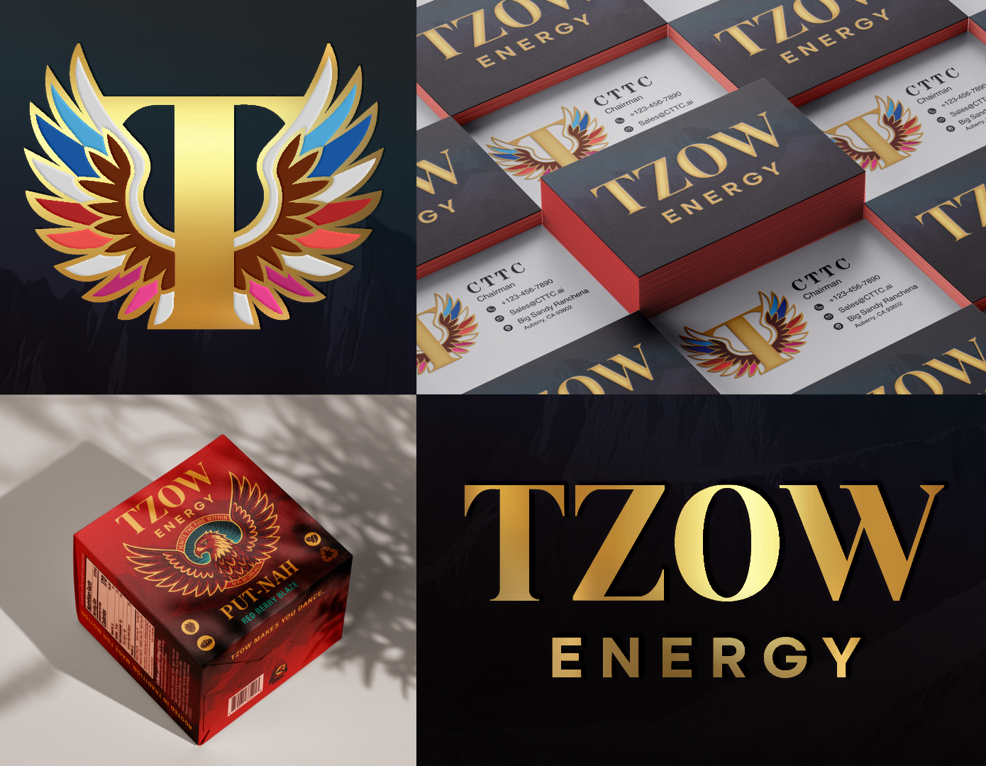
Designer | Elaina Nelson, PCKG
Location | Big Sandy Rancheria, Auberry, California USA
Launch Date | July 1st, 2025
With TZOW Energy, we set out to build more than packaging. We wanted to create a brand that could energize a community while preserving language, culture, and pride. When the Tribal Chairman of Big Sandy Rancheria approached us, there was no name or concept in place. The goal was to introduce a cleaner, coffee-backed energy drink alternative to brands like Monster and Red Bull, but one that felt authentically Native and inclusive to all tribes on the reservation.
Our primary objective was unity. Multiple tribes coexist within the reservation, each with distinct colors, traditions, and identities. The design needed to honor those differences without favoring one over another. Through collaboration, we identified two universal cultural threads: sacred birds and dance. These became the foundation of the brand.
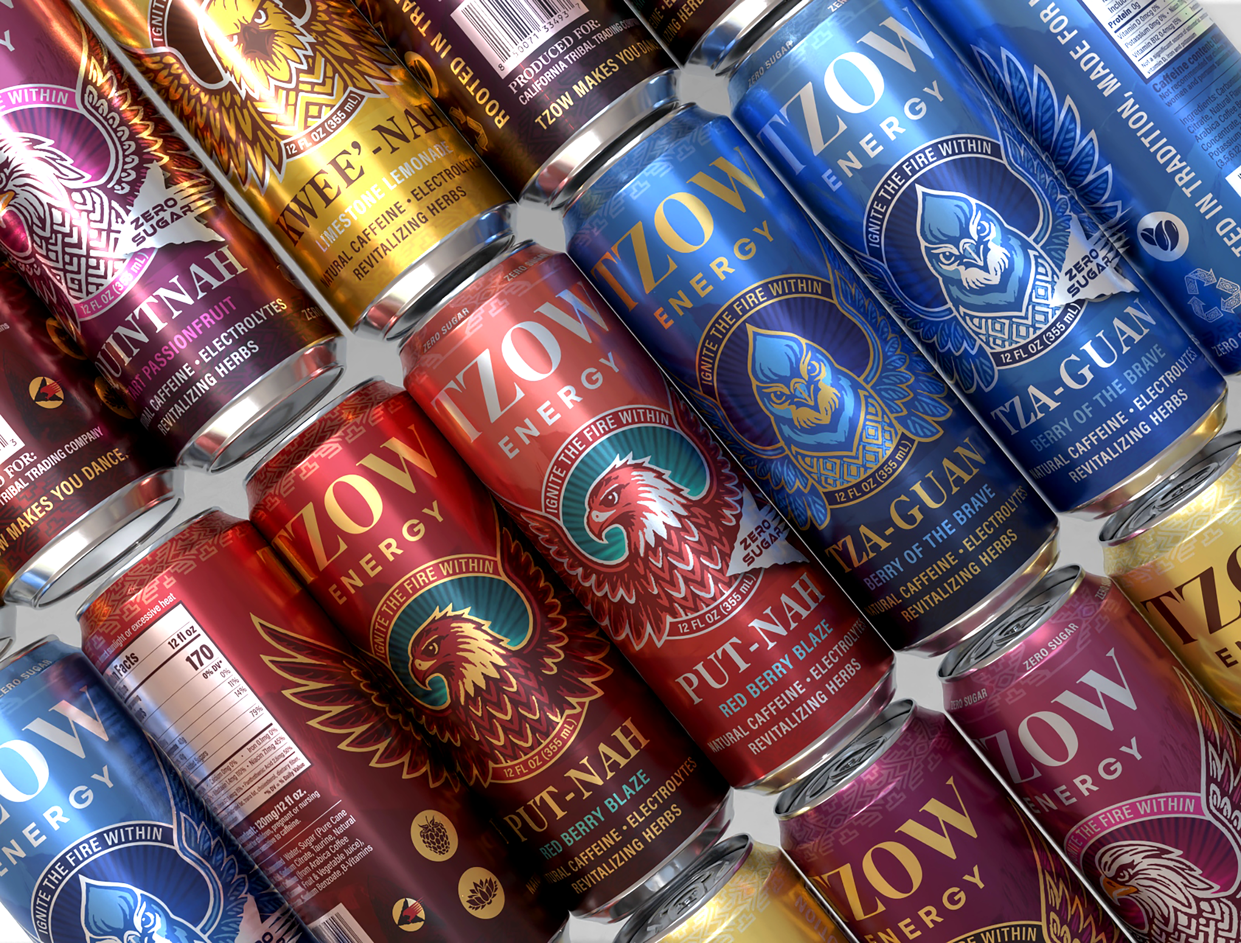
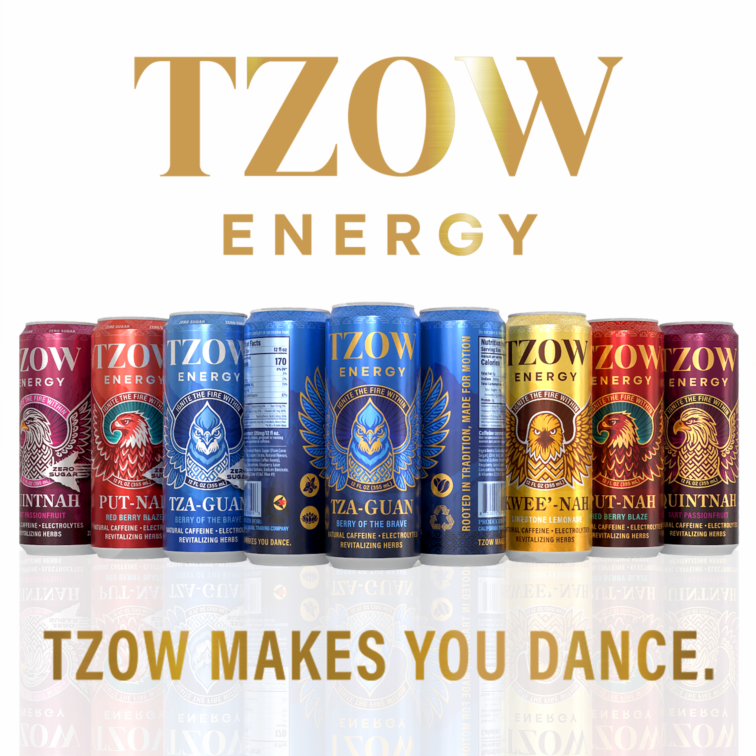
We referenced traditional regalia, tribal color palettes, basket-weaving patterns, and the geography of the land itself, including Mount Whitney, which appears as a subtle background element. Each flavor features a sacred bird and uses its Mono language name, preserving and celebrating linguistic heritage through everyday interaction.
We also studied the structure and hierarchy of mainstream energy drink brands to ensure TZOW could compete nationally. The tall, slim can symbolizes growth and pride. Matte, metallic, and gloss finishes create depth and dimension. A serif wordmark conveys strength and heritage, while contemporary sans serif typography signals modern performance.
The result is a brand that feels culturally rooted yet commercially powerful. Our goal was simple: create something the community could be proud of and that could confidently stand on any shelf in the country.
TZOW Energy is packaged in a fully recyclable aluminum can, reinforcing both sustainability and longevity. Aluminum was selected not only for its high recyclability and lightweight efficiency, but also for its permanence. The material reflects the brand’s values of resilience and strength while aligning with responsible production practices.
We chose direct print on the can rather than shrink sleeves or applied labels to maintain material integrity and ensure clean recyclability. This approach also allowed for greater control over detail, finish, and alignment of the artwork.
The form factor was equally intentional. We selected a tall, slim can instead of a standard profile to symbolize growth, pride, and upward momentum. The vertical silhouette reinforces strength and presence, allowing the cans to stand taller on shelf both physically and metaphorically. When merchandised together, the height amplifies the wingspan alignment of the birds, creating a striking and unified visual wall.
Finish played a critical role in reinforcing dimension and hierarchy. The primary body of the can is matte, creating a grounded, tactile surface that feels refined rather than overly commercial. Against this matte foundation, metallic gold and silver knockouts highlight key typography and design details. These metallic accents catch light in motion, subtly reinforcing the energy concept while elevating perceived quality.
Selective gloss varnish was applied to specific design elements, including the sacred birds, background halos, and traditional basket-weaving patterns. This layered finish system creates depth. As the can moves in hand or on shelf, light interacts differently across matte, gloss, and metallic surfaces, bringing dimension and movement to the artwork without clutter.
Color development was rooted in traditional tribal garments and regalia rather than typical energy drink neons. The hues are vibrant but culturally anchored, ensuring authenticity while maintaining strong retail impact.
Classic flavors feature darker gradient bodies paired with gold accents, conveying richness, heritage, and strength. Zero sugar variants use lighter tonal expressions paired with silver accents for a sharper, cleaner signal. The system is intentionally inverted: the lightest tone in the classic line becomes the darkest tone in the zero sugar line. This creates cohesion across the portfolio while ensuring immediate differentiation at shelf.
Sustainability was considered both materially and visually in the design.
TZOW Energy is packaged in a fully recyclable aluminum can, one of the most efficiently recycled beverage materials in the world. Aluminum can be recycled repeatedly without degrading in quality, which aligns with the brand’s values of longevity, resilience, and respect for resources.
We intentionally chose direct print on the can rather than shrink sleeves or applied labels. This eliminates additional materials and simplifies the recycling process. With no secondary substrate to separate, the consumer can place the can directly into recycling without confusion.
To further reinforce this behavior, we developed a custom recyclable symbol placed clearly on the side of the can. Rather than hiding the recycling mark in small regulatory text, it is intentionally visible and integrated into the design language. This makes the sustainability cue easy to recognize and encourages responsible disposal.
Beyond materials, the sustainability message is tied to place and community. The brand draws inspiration from the land, sacred animals, and Mount Whitney — visual reminders of environmental stewardship. By grounding the design in geography and heritage, the packaging communicates respect for the natural world that supports it.