George Howell Coffee
Designer | Proportion Design/Vervaine Design Studio
Location | Acton, Massachusetts USA
Launch Date | November 12th, 2025
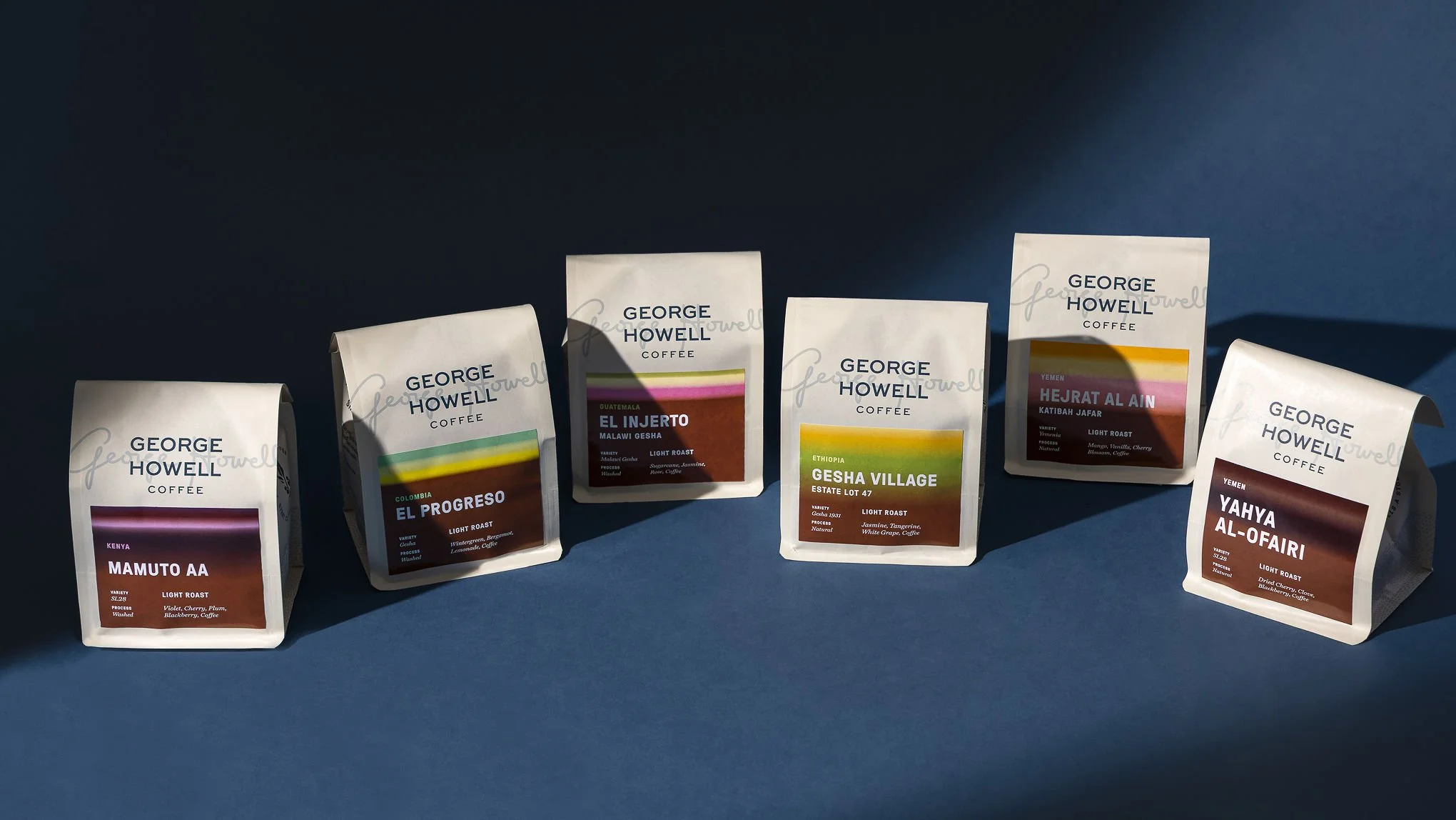
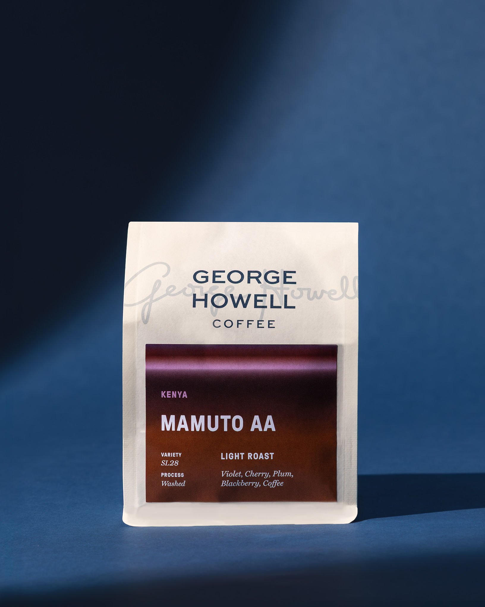
We wanted to evolve how people experience coffee while honoring the 50-year legacy that built our brand. Our primary goal was clarity. Specialty coffee can be complex, and traditional tasting notes can feel abstract or inaccessible. We wanted to create a system that translates flavor into something instantly graspable. The Coffee Palette system allows customers to see flavor before tasting it, choosing coffee intuitively.
At the same time, we aimed to balance innovation with heritage through our refreshed logo, pattern, font, and brand colors.
Both artistic and agricultural references shaped the system.
The Coffee Palettes were inspired by an artist’s palette and George’s love for the “rainbow of flavors” in coffee. George opened his first cafe in 1975, but before that he collected and displayed indigenous Wixárika art, which is still proudly displayed at our cafes today. His sensitivity to composition and color continues to inform his work. We were also inspired by watercolor techniques. The gradients on each bag allow colors to blend organically, reflecting how flavors flow and evolve in the cup.
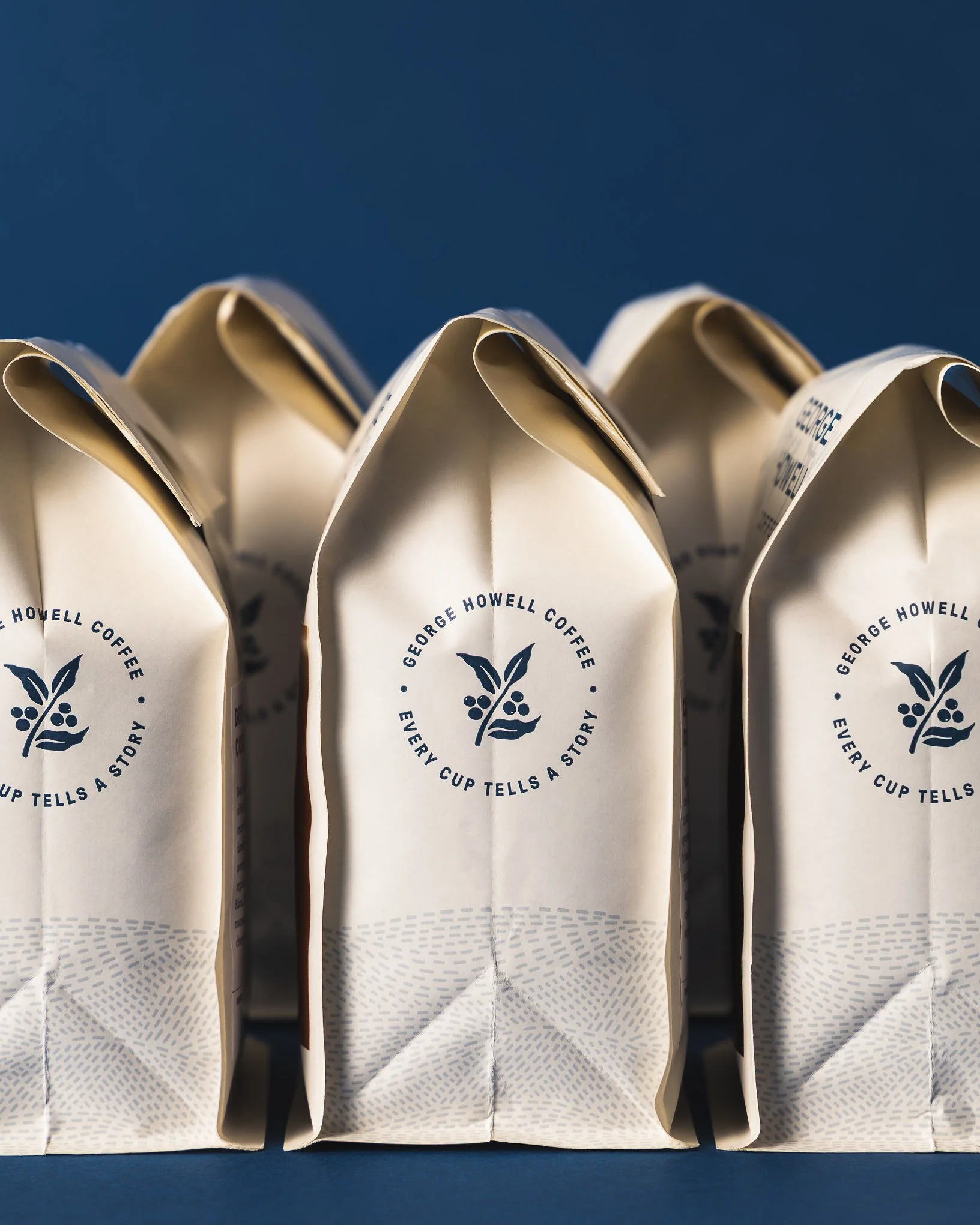
The new “hills” pattern references the mountainous landscapes where coffee is grown, inspired by photographs taken by George during his travels to origin. It serves as a quiet reminder that terroir shapes everything.
Finally, we looked inward at our own history. The refined logo retains George’s signature as a watermark, preserving familiarity. A softened heritage blue and new cream base reference our long-standing brand tones while modernizing them.
The result is a system informed by art, landscape, and legacy.
Sustainability is embedded in both our messaging and our visual system.
At the heart of our brand is the belief that “Every Cup Tells a Story.” That story begins with the farmer, the land, and the terroir that shapes each coffee. Our packaging reinforces George’s 50-year commitment to elevating farmers who produce exceptional, terroir-driven coffees by naming them and telling their stories through words as well as color. Origin and craft are central rather than secondary.
The Coffee Palette system further supports this transparency. Each color directly reflects tasting notes tied to origin, variety, and process. By visually foregrounding flavor and a sense of place, we shift the focus from branding dominance to product integrity. The design literally gives space to the story of the land.
The restrained cream base and consistent architectural framework also support longevity. Rather than trend-driven graphics, we built a timeless system that can evolve across coffees and seasons without redesigning the structure, reducing waste and reinforcing brand durability.
Sustainability for us is not a claim; it is a commitment expressed through clarity, transparency, and respect. Each palette tells the story of a place, and ensures the people behind it are seen.