Detour Coffee
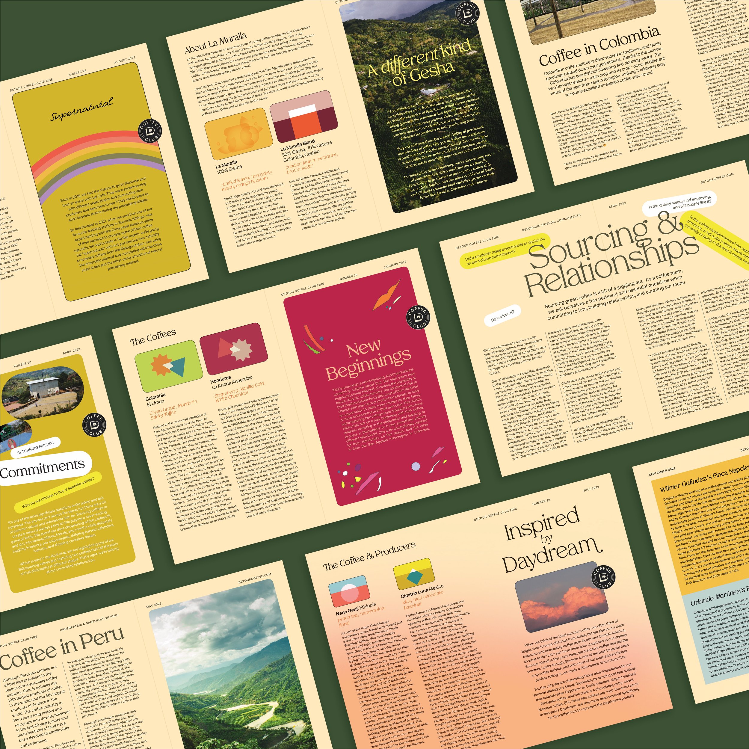
"Hi👋, we're not here to judge; we just love coffee. Coffee isn't right or wrong; it's a friendly detour along the way. " We approached our rebrand of Detour Coffee with one main objective: Make the brand's design match the openness, friendliness, and overall fun aspect of making coffee that inspires many of us at Detour. We wanted to put the days of people feeling overwhelmed and confused about specialty coffee behind us and instead focus on the simplicity and beauty of coffee, these special little moments that coffee makers and drinkers have with it every day.
+ read more
With that in mind, our creative design was built on simplicity and familiarity. We used forms that would invoke a sense of warmth and nostalgia and embraced a colorful palette that conveyed the concept of playfulness, exuberance, and comfort. We took creative inspiration from the pop culture of the 70s and early 80s, focusing on nostalgic movies, music, TV, etc. With designs built as a nod toward the "good ol' days," we've embraced the warmth and authenticity of the 70s color palette and the friendliness and familiarity of old TV sitcoms. We focused on a design that flowed and conveyed a sense of movement and space. We wanted customers to be drawn to the brand as if it was something they knew, something they had interacted with before, an old friend. The overall result created positivity by invoking a simple, familiar, and friendly experience, inspiring a consumer, wherever they are on their coffee journey to genuinely feel like they are just as much a part of the coffee process as us. Because when it comes down to it, good coffee means something different to everyone. We want to source and roast friendly coffees that have the potential to transform a daily routine into moments to look forward to. Making coffee is fun🙂


