
Sally Morrow Creative
Designer | Sally Morrow
Location | Los Angeles, California & Portland, Oregon USA
Launch Date | October 4th, 2025
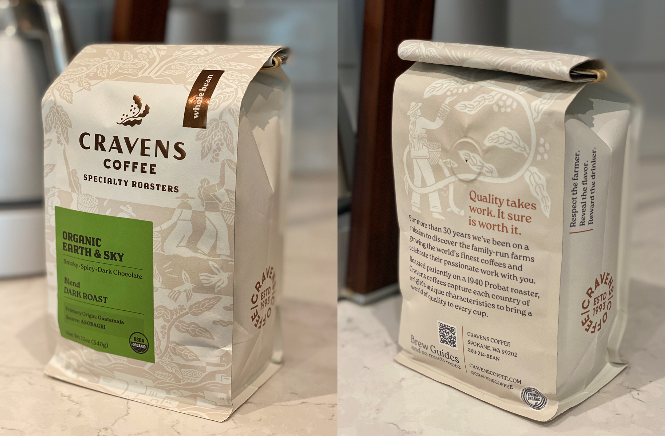
The packaging concept was focused on a celebration of the families and hard workers who expertly grow and produce the coffee. The Cravens promise "From Farmer, to Roaster, To You" is a through-line of their close 30-year relationships with farmers and the care and mastery they put into roasting and delivering their incredible coffee to consumers. We created a packaging system through materials, branding, illustration, and messaging that brings this story of this relationship to every bag. The main messages of Quality and Respect for the Farmer are also supported with discoverable copy on all sides of the packaging.
Our design was fully considered as a 360-degree storytelling experience from finishes to typography to the illustration and writing. The labeling system encompassed 80+ different coffee variations and multiple categories. The illustration tells the story of coffee's growth and cultivation while celebrating the pride and hard work that go into creating a great product. Our color palette centers on coffee and neutral tones with strong pops of color for the category labeling system. Copper became a central color that connects to the beans; we used metallic hot foil stamping on all the primary bags to contrast the kraft paper and elevate the quality perception.
Two key elements of the Cravens packaging storytelling are the way we crafted the illustrations and the copywriting voice. The writing is important to this packaging – it relays our messages in a tone that matches the Cravens founders...humble, optimistic, and thankful. In this way, we're able to connect authentically the people who create this coffee with the people who consume it. We added a QR code as a help (brew guides) and not an overt sales link, which supports the brand experience as a value-add. We are thrilled with the incredible response that truly supports our clients' intention.
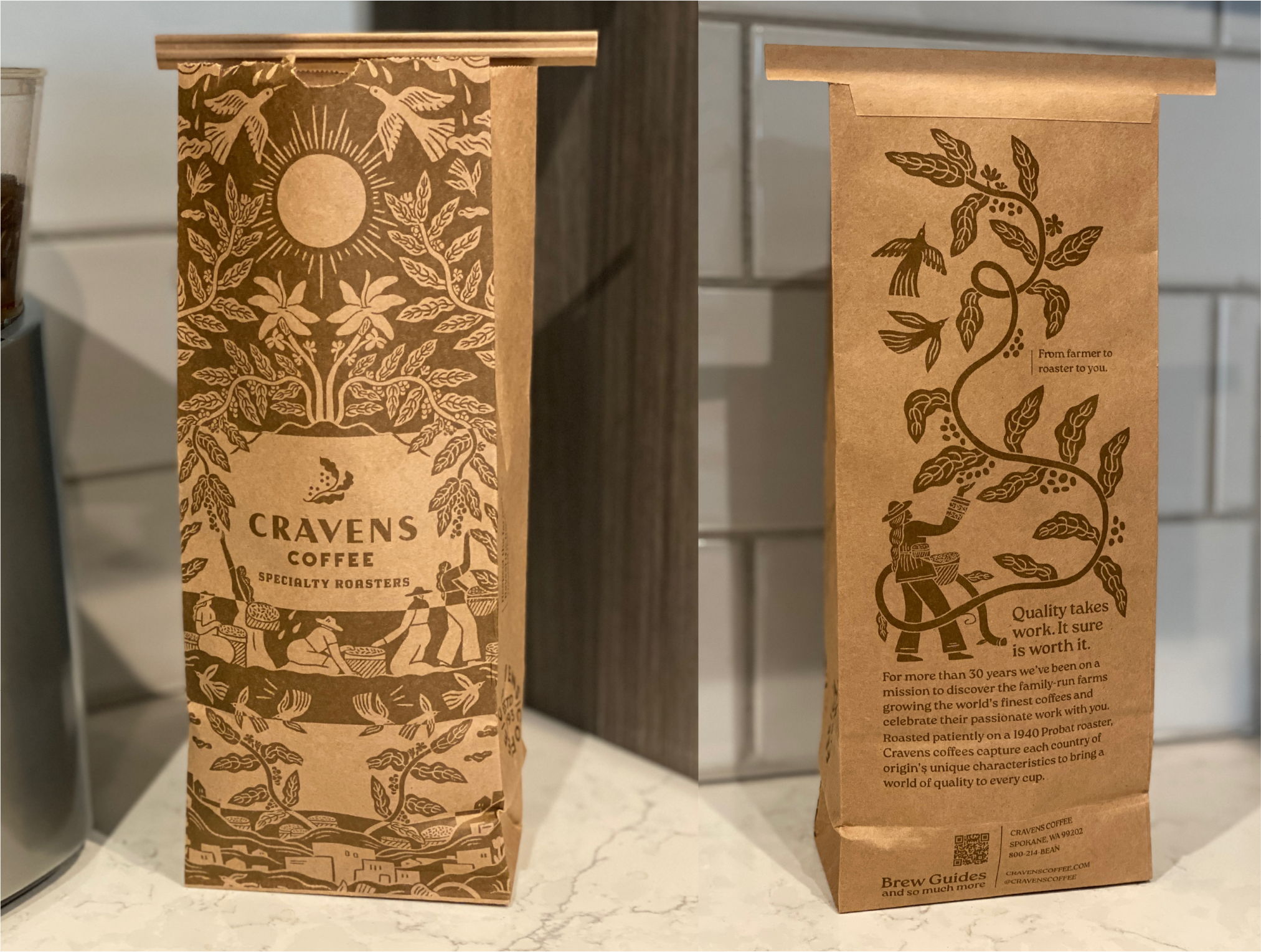
We chose bags made from sustainable Kraft paper in both white, for ink legibility on the primary bags, and Kraft color, for the to-go secondary bags. We chose the matte, rustic look to emphasize Cravens core messaging that celebrates their coffee farmers. The configuration is a block bottom bag that gives us a stand-up pouch with gusseted sides which sits narrow on the shelf, and doesn't tip over.