NORLO
Designers | Will Jones & Adrian Turnham
Location | Salisbury, England, United Kingdom
Launch date | October 1, 2020
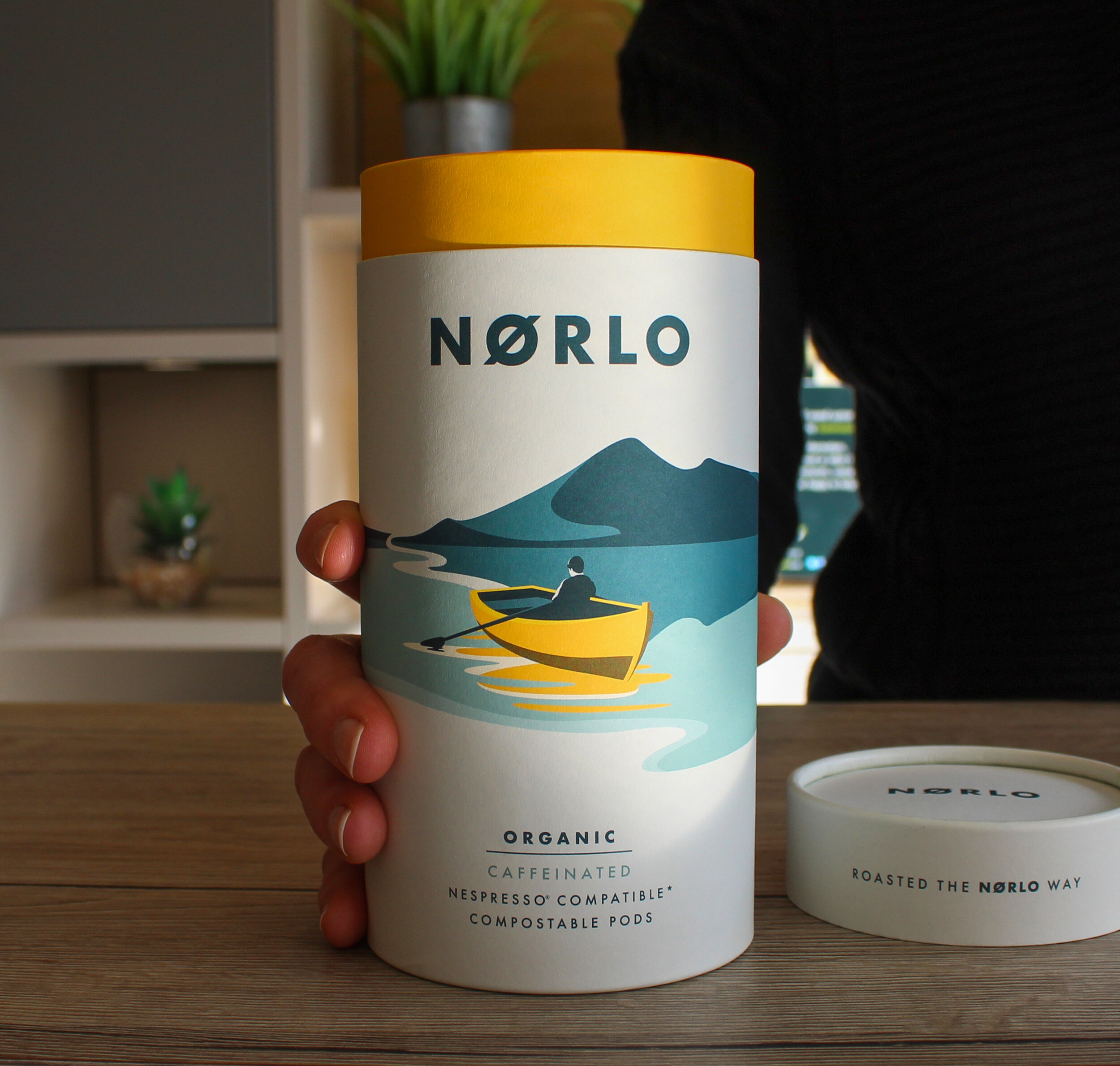
The simplicity of the design and serenity of the illustrations themselves, serve to both reflect the quality and purity of our coffee, as well as to represent Nordic coffee culture.
What lies at the very heart of our packaging design is not only a truly unique and beautiful design but a very clear brand packaging concept. Further to a clearly defined brand packaging concept, the packaging is 100% recyclable which is a very important element in its tangible creation. Our three product variants; Caffeinated, Lightly Caffeinated and Decaffeinated are each recognised by its very own tube landscape illustration. When placed side-by-side (Order: Tent- Boat-House), the tube landscape illustrations form a perfect panoramic Nordic landscape. Even when separated from each other, graphically, the tubes overlay our own extended panoramic landscape perfectly which creates a stunning visual effect. Each tube landscape wraps around the entirety of the tube, aimed to further catch the eye of the consumer and provide a unique design for the home setting.
+ read more
The decision to allocate a specific and differentiated illustration (i.e. tent, boat, house), whilst still in-keeping with the brand concept, is very important from a consumer perspective since any future products that are included within each product line can be clearly identified by its own illustrative symbol. It's also important that the brand could be distinguished, solely by the yellow icon from each tube, even if the landscape was not present.


