CAFEOTECA
Designer | Original Concept Development & Graphic System: Pupila Estudio | Packaging Redesign & Visual Refinement: Hopeful Outsiders
Location | Costa Rica
Launch Date | August 1st, 2025
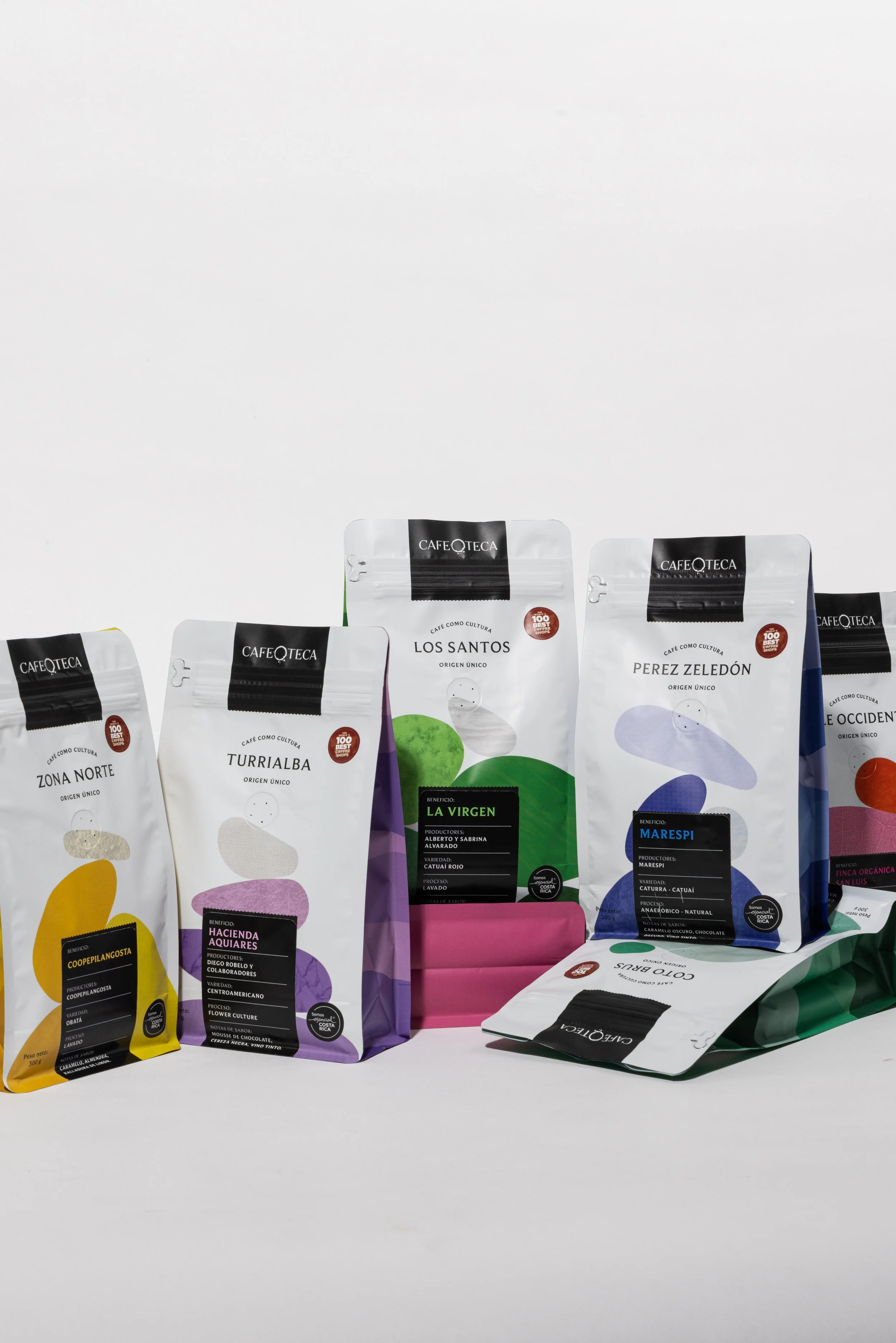
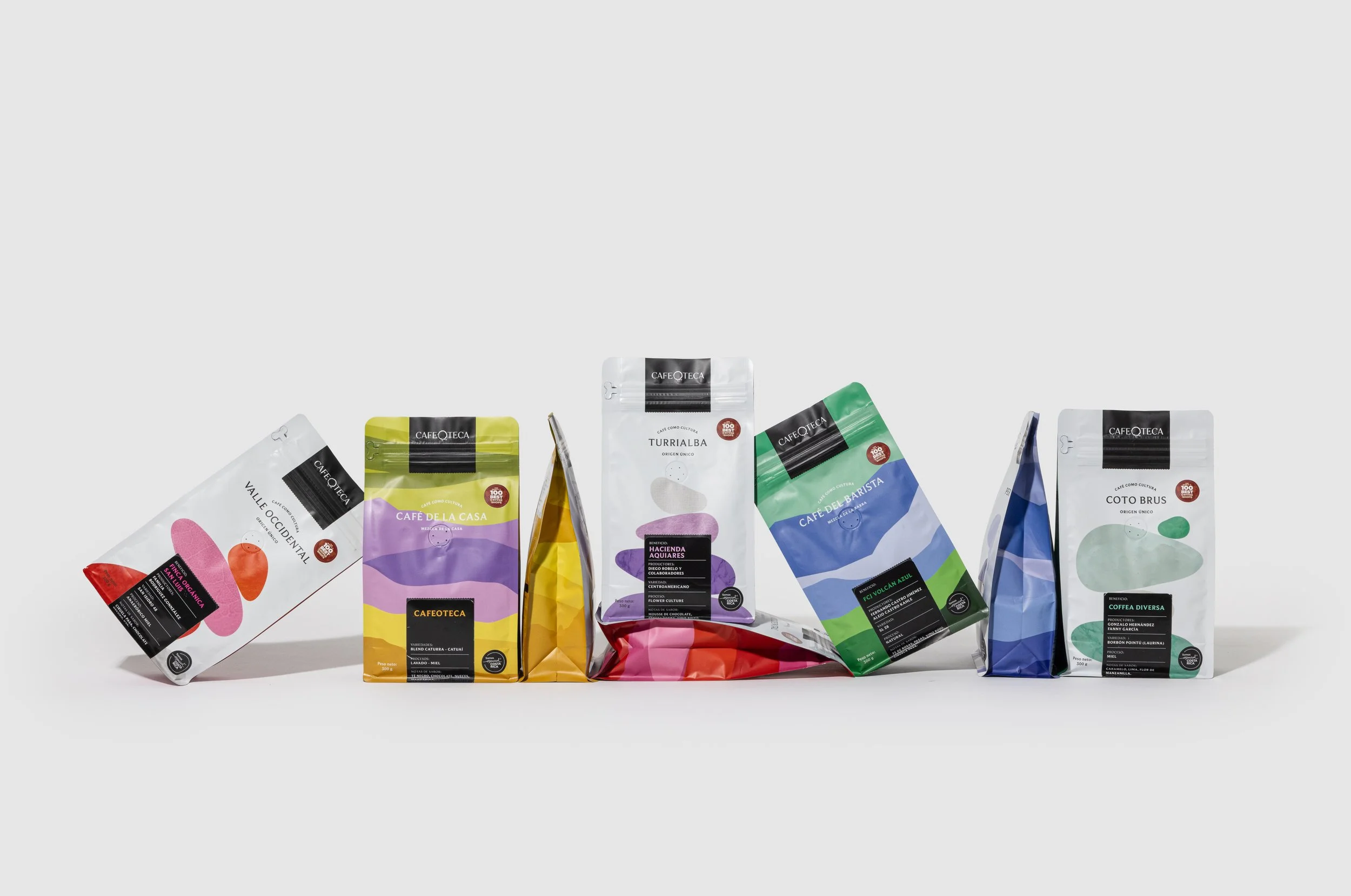
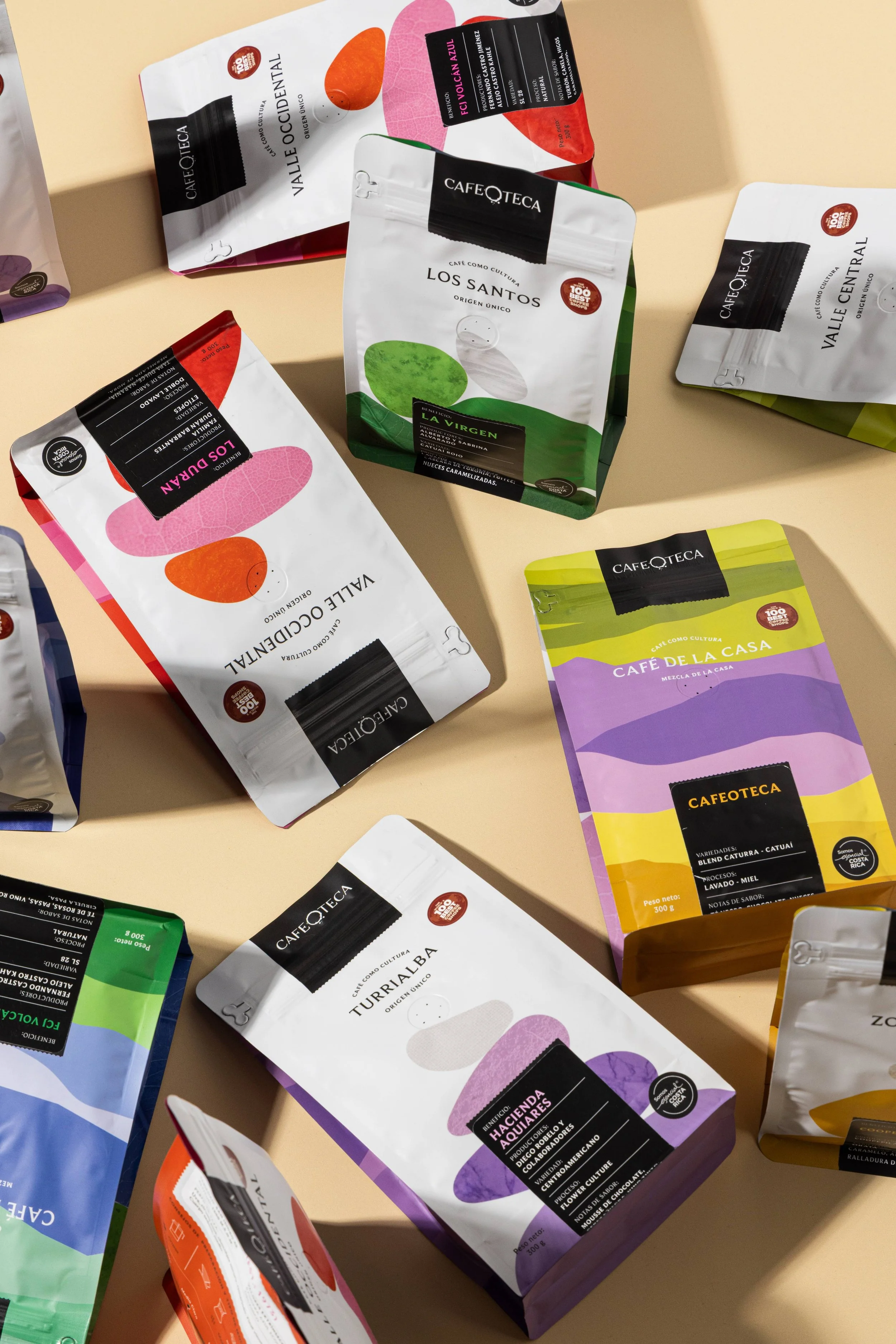
With this design, we wanted to create a packaging system that clearly communicates the diversity, traceability, and educational value of Costa Rican coffee. Each coffee is fully traceable to its specific lot and origin, allowing consumers to understand where it was produced and by whom. The packaging also includes key information such as recommended brewing methods, roast level, and the precise location of the coffee region within a map of Costa Rica, helping guide consumers through the experience of preparing and enjoying the coffee.
Color plays a central role in the design. Each color corresponds to a specific coffee-growing region, following the official regional color system established by ICAFE. This allows the packaging to visually communicate origin while celebrating the geographic diversity of Costa Rica’s coffee landscapes.
The design was conceived as both informative and engaging—an educational tool that helps consumers learn about coffee while keeping the experience approachable and enjoyable.
A key visual element is the image of carefully balanced stones, which serves as a metaphor for the delicate equilibrium required throughout the coffee chain—from climate and soil, to farming, roasting, and brewing. Together, these elements express Cafeoteca’s philosophy: that exceptional coffee is the result of balance, transparency, and respect for origin.
Sustainability is an essential value embedded in the design. The packaging was conceived to highlight origin, transparency, and the long-term relationship between coffee, land, and people.
By assigning a distinct color to each coffee-growing region, the design encourages consumers to recognize coffee as an agricultural product with a specific origin, rather than a generic commodity. This visual system helps communicate traceability and supports a deeper appreciation for the regions and producers behind each coffee.
The balanced stones featured in the design also carry a sustainability message. They symbolize the fragile equilibrium between nature, farming, and human craftsmanship. Coffee production depends on maintaining harmony between environmental stewardship, responsible farming practices, and economic sustainability for producers.
Through this visual metaphor and its emphasis on origin, the design aims to remind consumers that every cup of coffee is the result of a carefully balanced ecosystem that must be protected for future generations.