Sprout Coffee Roasters
Designer | FFFunction studio
Location | Eindhoven, The Netherlands
Launch Date | September 18, 2025
Sprout was already known for roasting expressive, flavour-driven coffees, but the brand itself wasn’t reflecting that same energy, quality or personality. The goal of the rebrand was to create an identity system that made flavour exploration intuitive, memorable and inviting. Both for newcomers and experienced coffee drinkers.
The entire brand was built around the idea that coffee flavour can feel like a journey. From grounded, mellow everyday coffees to rare and experimental flavour experiences.
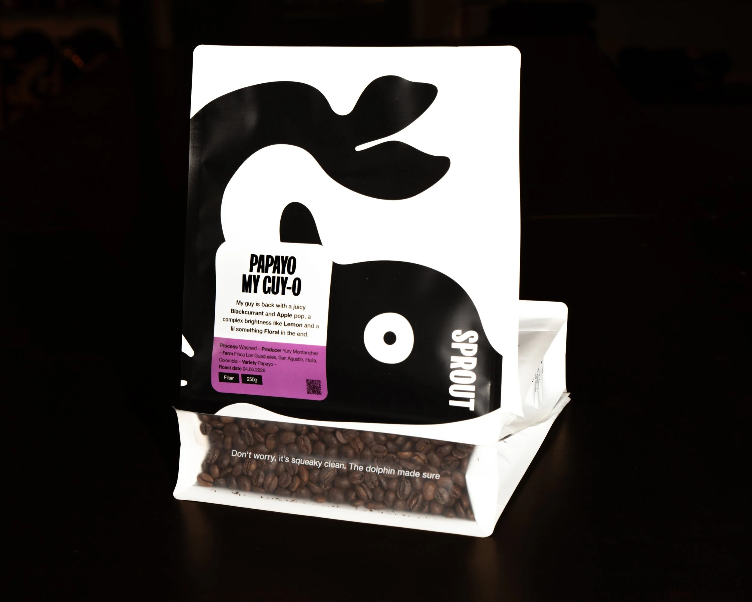
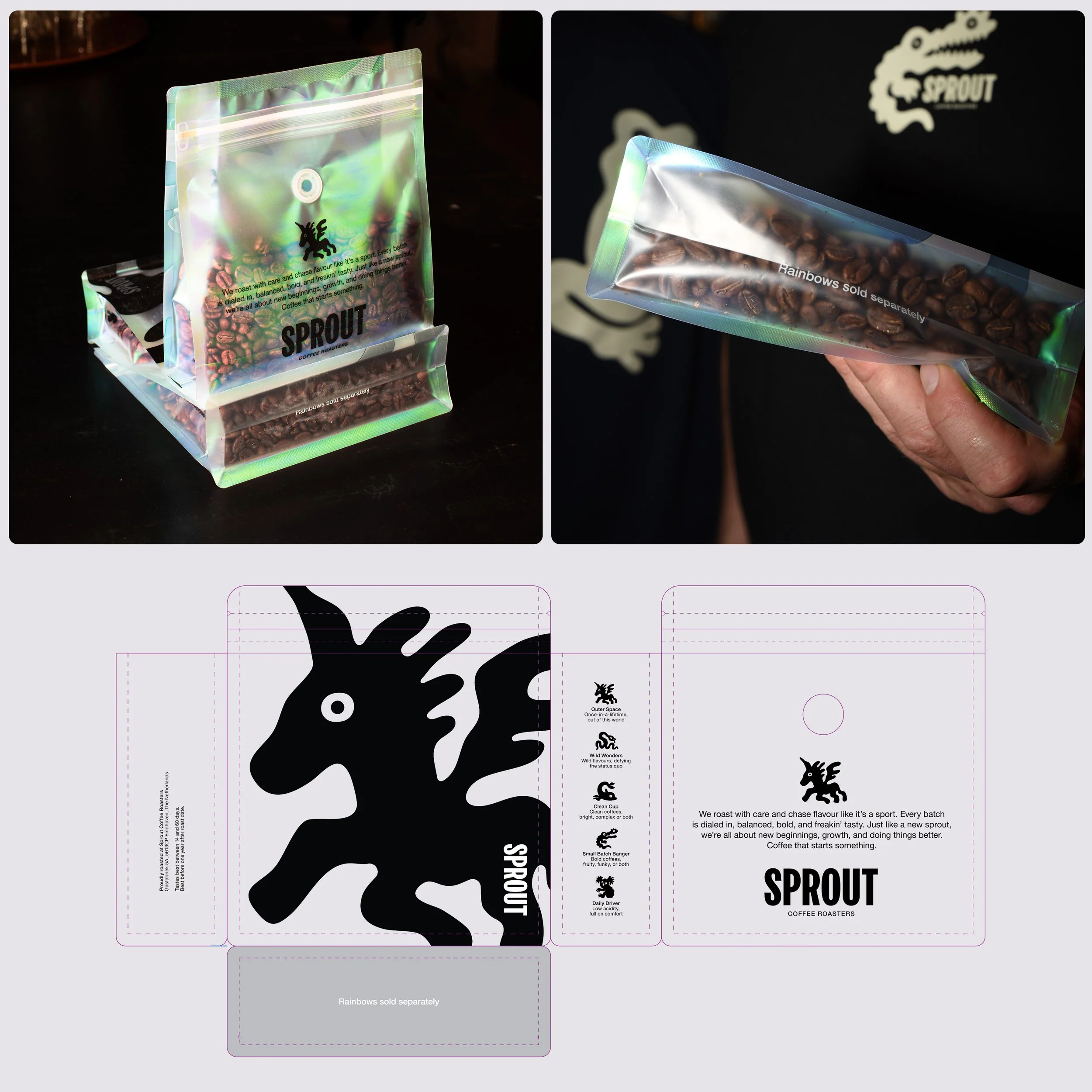
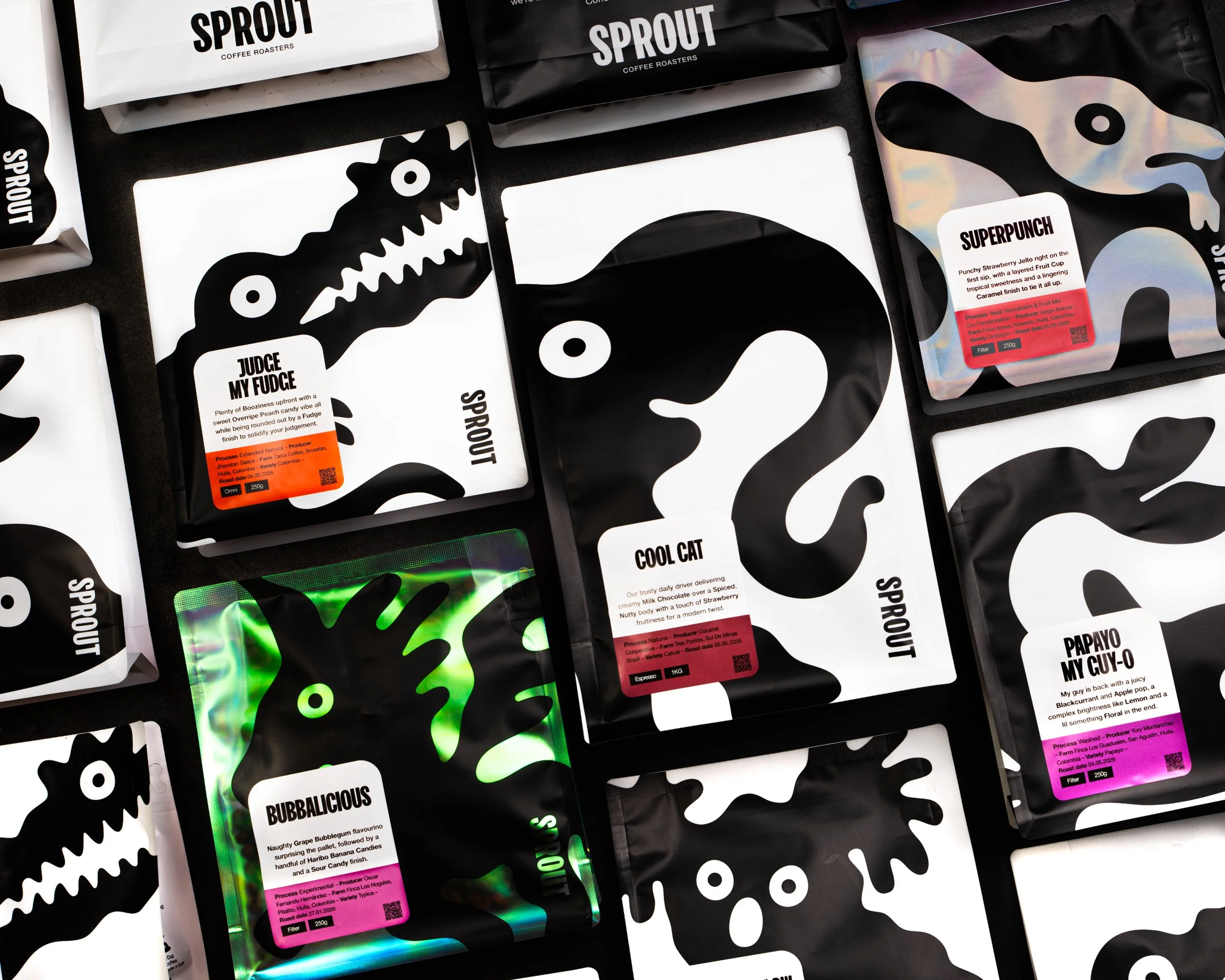
This resulted in a layered flavour system built through bags, colours and illustrated animal characters. The funkier the bag, the funkier the coffee. White bags represent cleaner and more approachable flavour profiles, black bags move into bolder territory, while holographic bags represent the most experimental “Outer Space” coffees. Alongside this, animals like the Koala, Dolphin and Crocodile each embody different flavour personalities, helping customers intuitively understand the coffees.
The identity takes inspiration from the Australian roots and personality of the founders: loose, premium and a little weird. Dreamy illustrations, oversized typography and playful naming systems like “Berry Bomb Bangers” and “Papayo My Guy-o” make specialty coffee feel expressive and approachable instead of distant or overly technical.
During the rebranding process, we extensively researched specialty coffee identities and packaging systems from roasters all over the world. By benchmarking the industry, we identified what works well, what genuinely fits Sprout as a brand, and most importantly, how to make Sprout stand out in a highly saturated market. This helped guide every design decision through a function-over-form mindset — creating a brand that not only feels distinctive on the sh