Rikka Fika
Designer | Scott Chen + Michelle Jow
Location | San Diego, California USA
Launch Date | October 6th, 2025
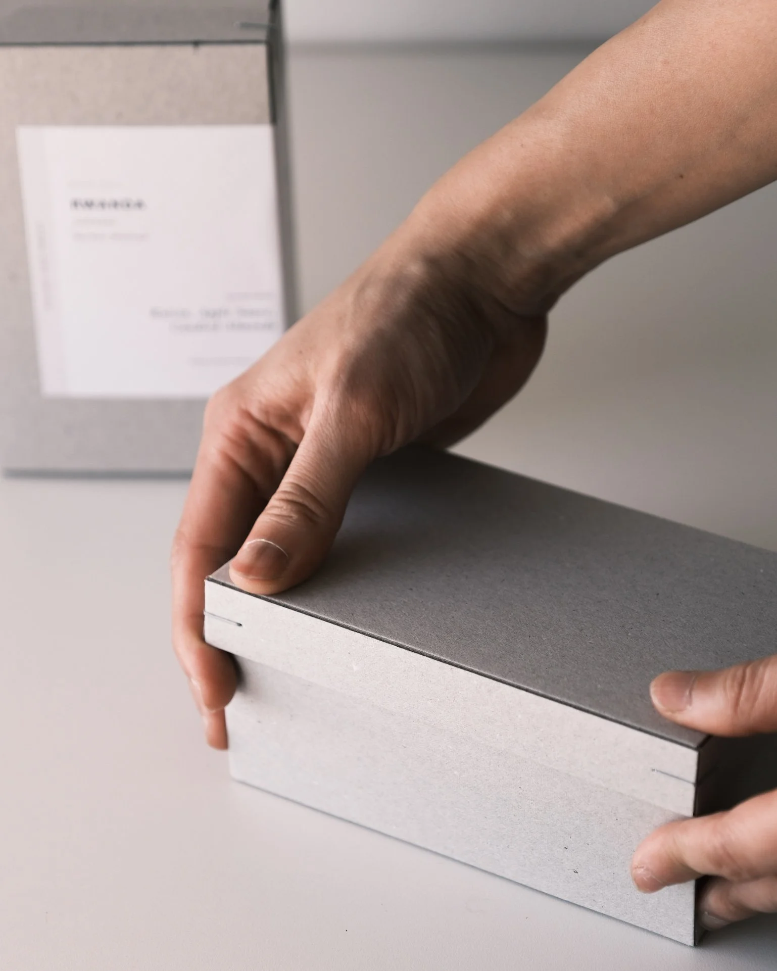
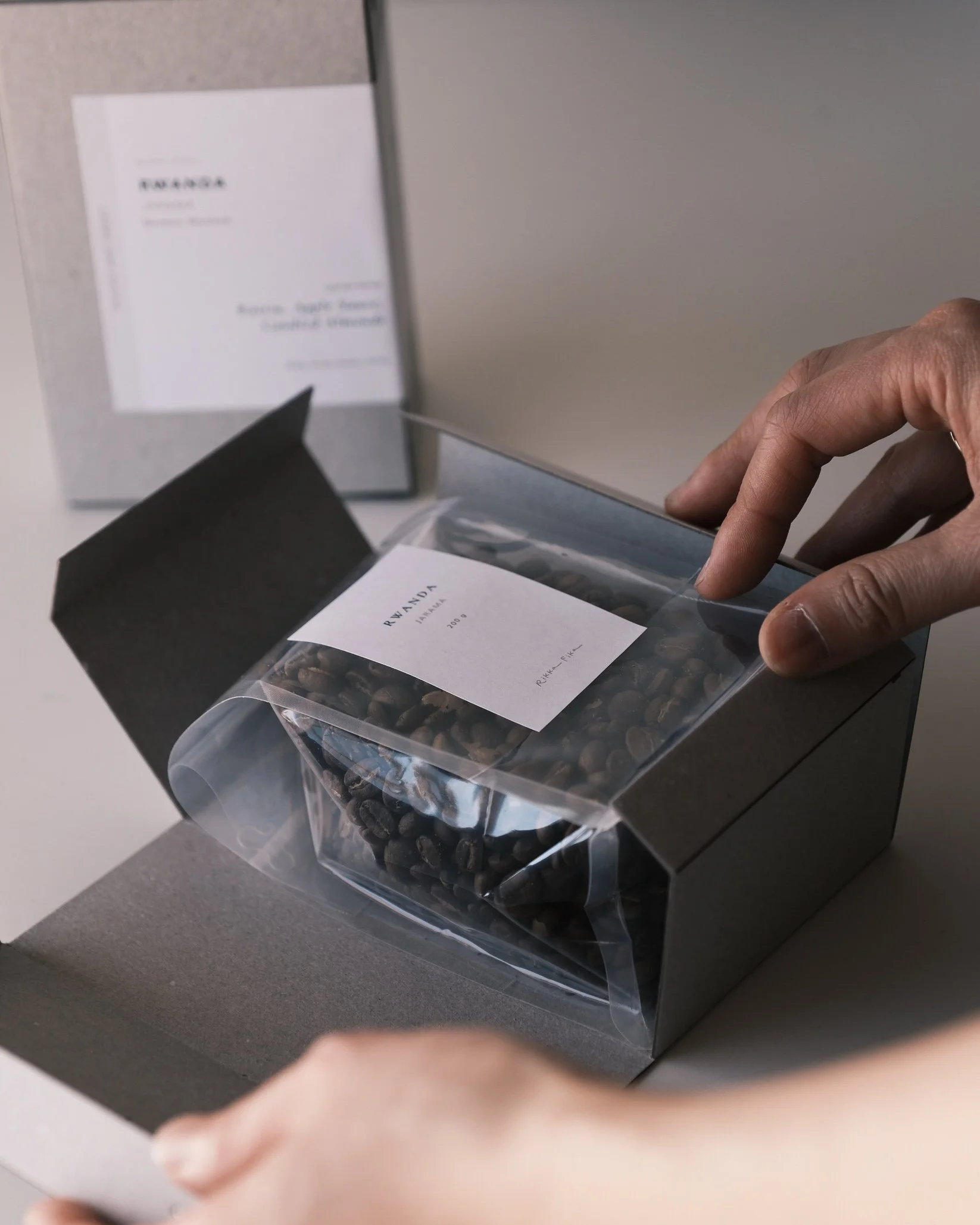
This packaging was conceived with sustainability as the starting point. The structure was designed around a corner-stapled construction, allowing the joining method to inform the geometry, proportions, and overall visual presentation. Visible staples led us to explore references beyond conventional coffee packaging, drawing inspiration from jewelry and stationery objects that feel tactile, intentional, and enduring. The form was approached as a small treasure chest, inviting anticipation and turning the act of opening into part of the coffee ritual.
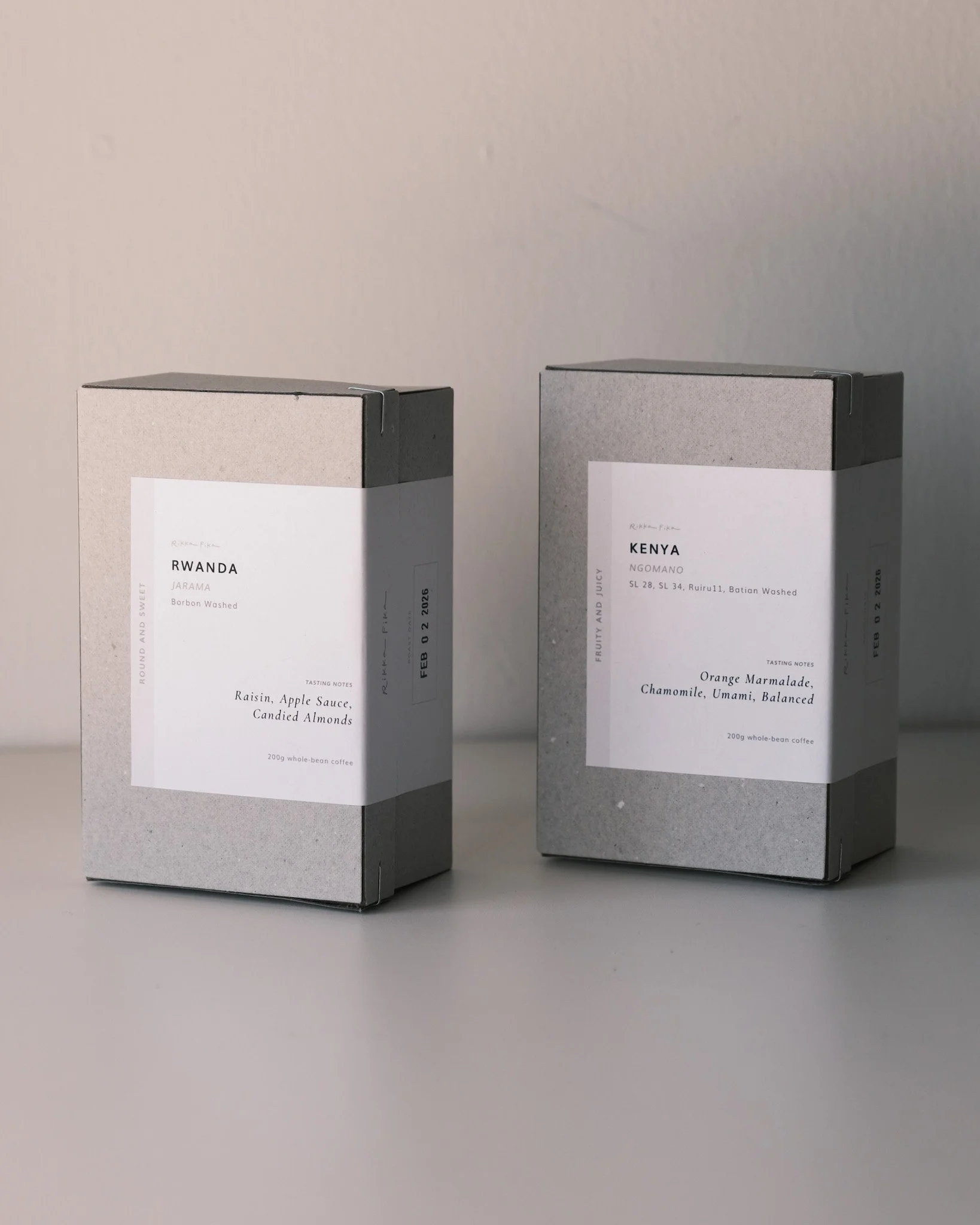
Both the box and label are made from 100% recycled paper, intentionally left uncoated and uncolored. The natural tone and visible fibers are embraced as part of the visual language, echoing the softness and restraint of Japanese washi paper. The result is sophisticated yet calm and approachable, aligned with our broader cafe aesthetic.
The label layout is informed by research-backed user experience principles. Primary information such as origin and lot name is positioned for quick recognition, while tasting notes follow natural reading paths. This structure supports confident selection for both experienced enthusiasts and those new to specialty coffee, making essential information available without overwhelming.
Working closely with our manufacturer, we developed a custom die-cut to maximize material yield and eliminate adhesives. Iterations further reduced assembly from eight staples to two, minimizing material use while maintaining strength and recyclability.
Overall, the packaging is designed to be an extension of our brand philosophy, guided by wabi-sabi sensibility, and intended to deliver warmth, care, and a meaningful moment to whoever receives it.
Sustainability was not applied to this packaging as an afterthought – it was the starting point. Every structural and material decision was evaluated through the lens of waste reduction, recyclability, and production efficiency before aesthetics were considered.
Both the box and label stickers are made from 100% recycled paper, intentionally left uncoated and uncolored. We embraced the natural tone and texture of the material as part of the brand’s visual language, reducing additional processing or chemical inputs.
Working closely with our manufacturer, we developed a custom die-cut structure to maximize sheet yield and minimize production offcuts. The construction eliminates chemical adhesives entirely during assembly.
Multiple iterations refined fold geometry, resulting in a streamlined form that reduces material waste at scale while keeping the box protective strength. Through the iterations, we also reduced the assembly from 8 metal corner staples to just 2. This not only minimizes material use and assembly ergonomics, but also simplifies disassembly for the end consumers to further encourage their recycling practices.