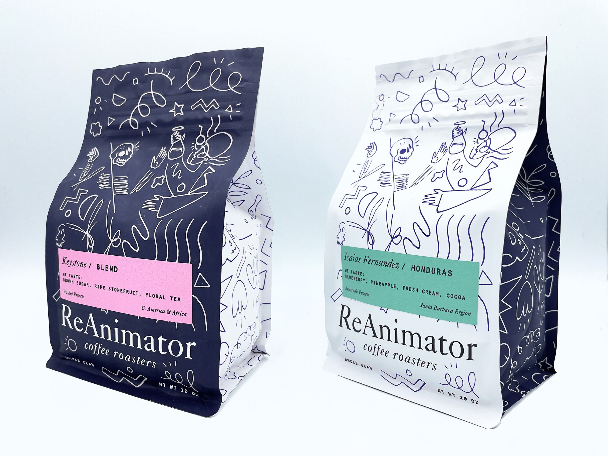
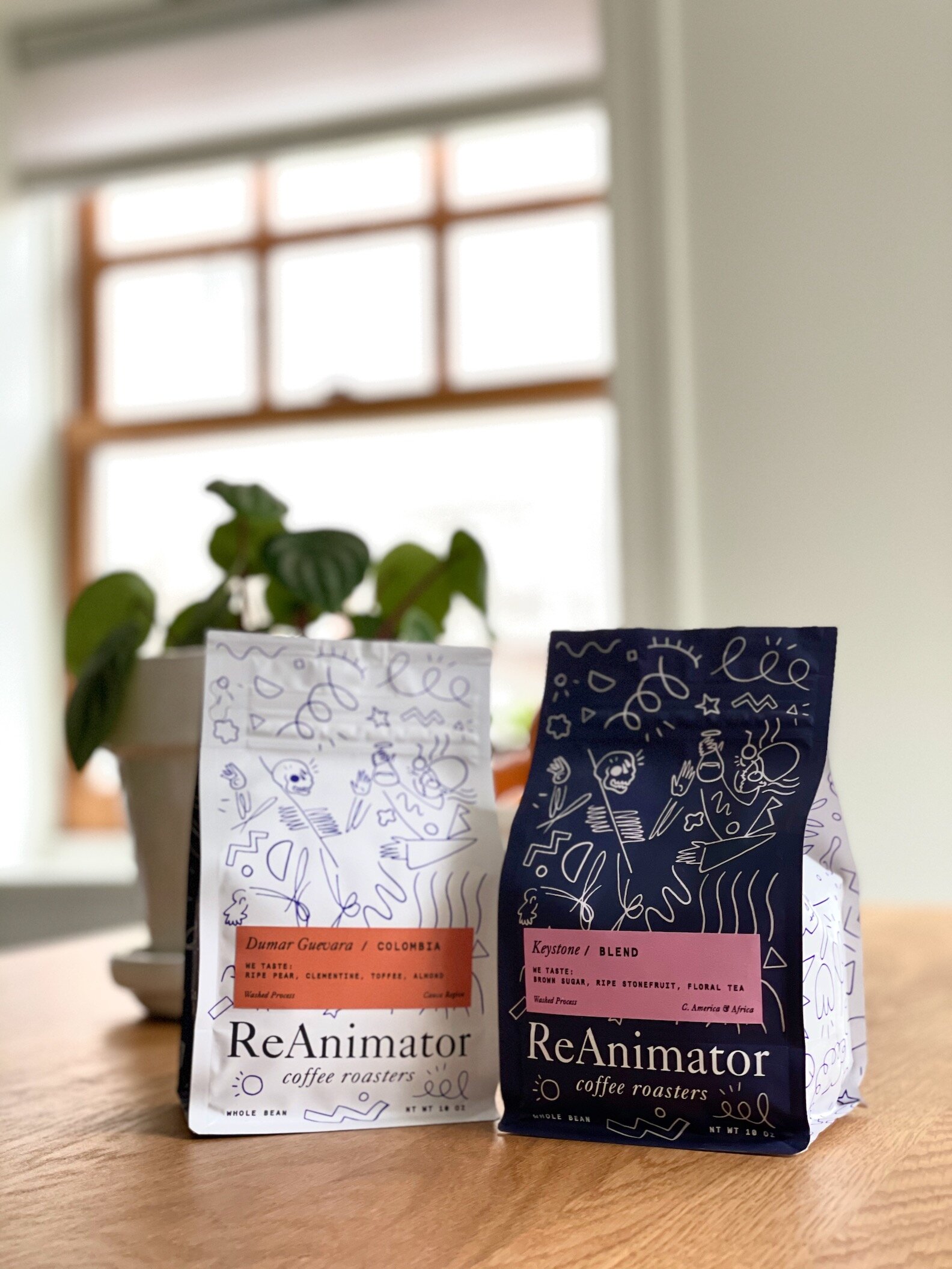
ReAnimator Coffee Roasters
Designers | The Heads of State & Cat Park
Location | Philadelphia, PA, USA
Launch date | January 25, 2021
When we began considering an update to our branding and packaging, we looked at where things had started to naturally evolve over the last few years in our merchandise and special edition blends. We had begun working with a local artist named Cat Park, who has a very modern impressionistic style to their painting and drawing. Cat had provided their own take on our main logo for a one-off tote bag, but we liked it so much, we decided to make it the tentpole for the new direction of our branding.
Once we were ready, we contacted The Heads of State, an incredible design firm here in Philadelphia, and started showing them Cat’s art, and sharing our vision for the bags.
+ read more
First, we wanted to modernize the branding and packaging with our new aesthetic. Second, we needed to address an issue with our previous packaging, in which it was very difficult to distinguish between blends and single origins on the shelf. We had to use a single color for all blend stickers, so a customer would be able to recognize it as a blend. The issue with this system, though, is that all blends then looked identical from a distance. They had no individual personality.
So with the new bags, we have two bag designs with inverted colors. The navy bags are for blends, and the off-white bags are for single origin coffees. This allows us to diversify the stickers for each blend, and give them expressive, memorable personalities that are easy for customers to recognize, and on a macro level, it’s easy to quickly distinguish between blends and single origins when looking at a retail shelf.


