Ojo de Café
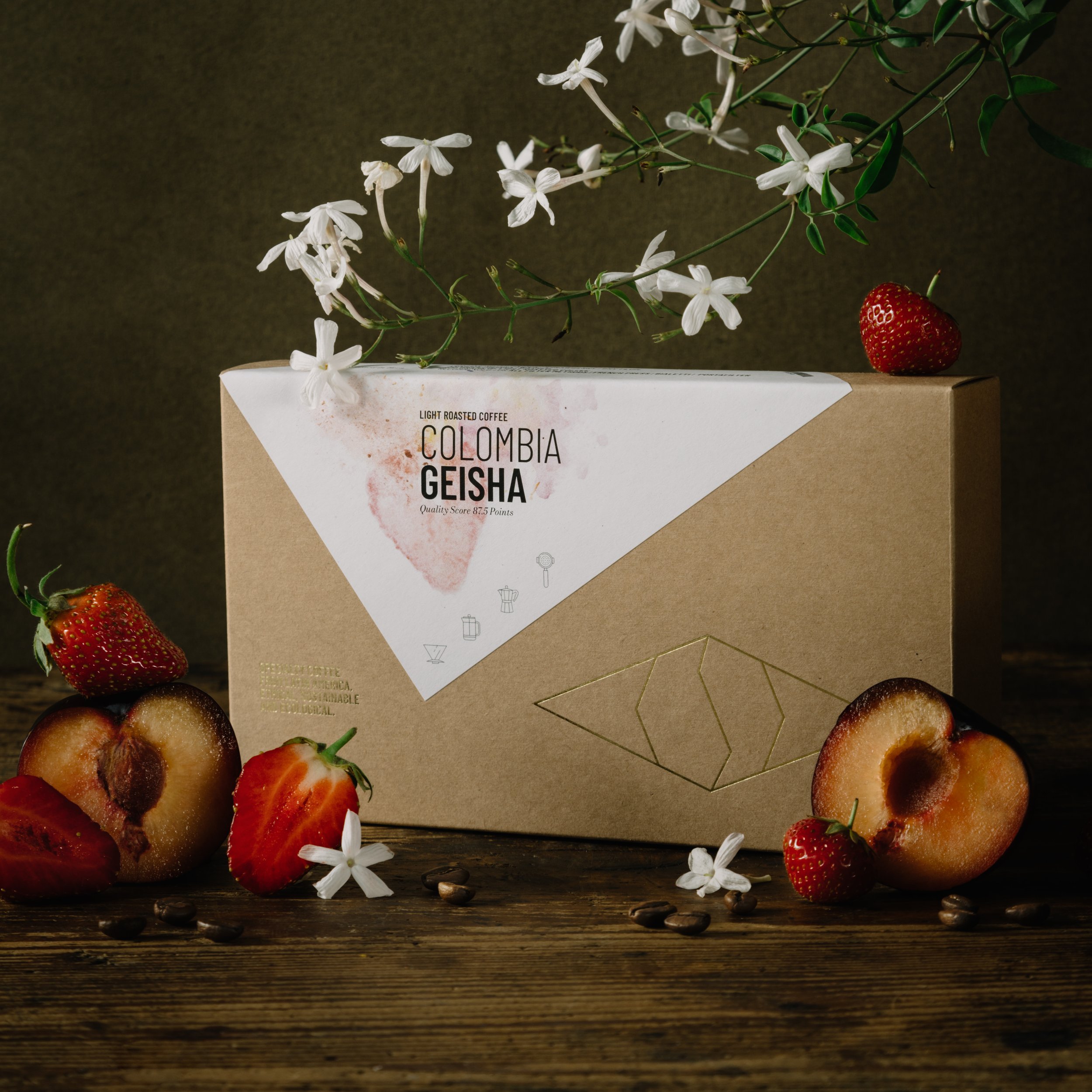
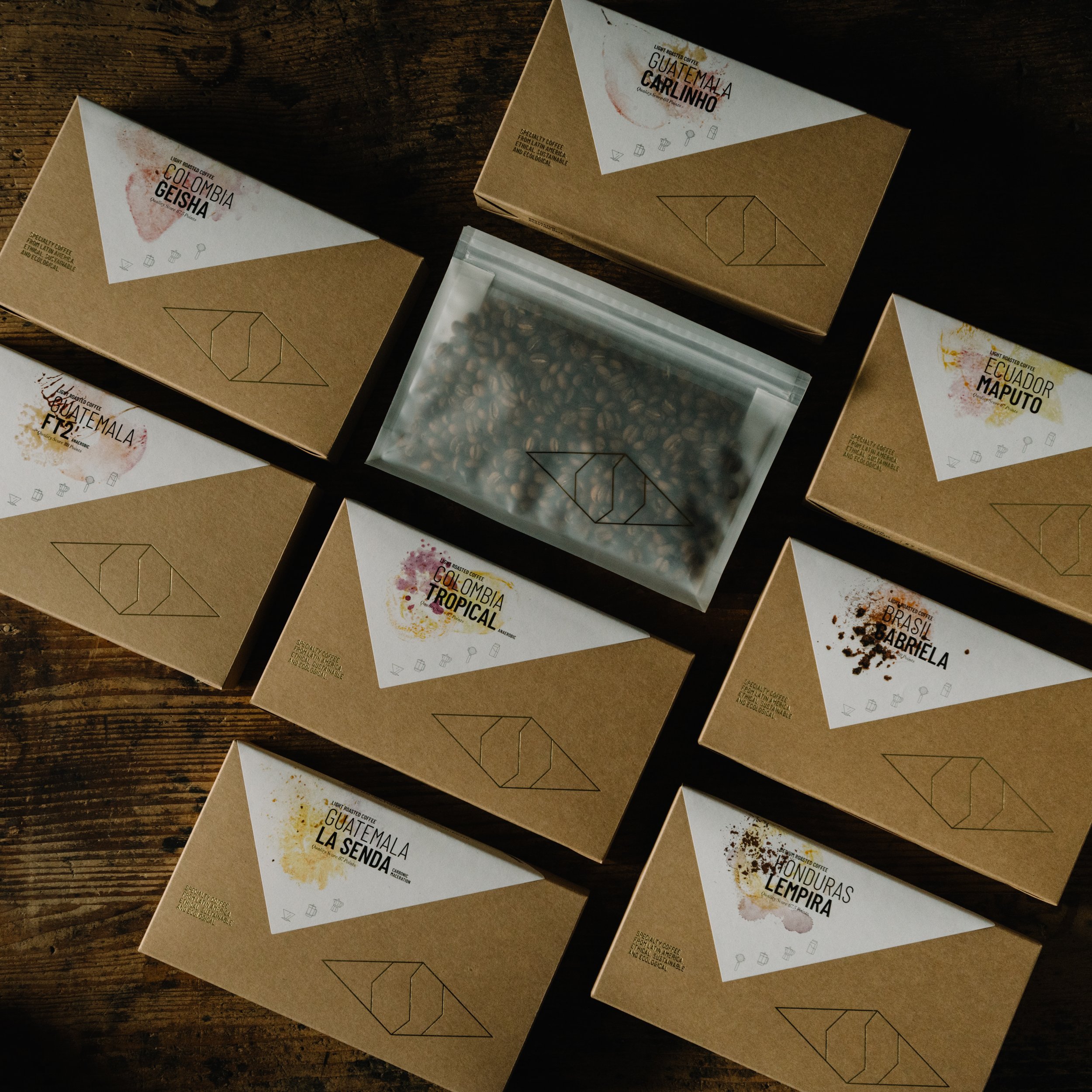
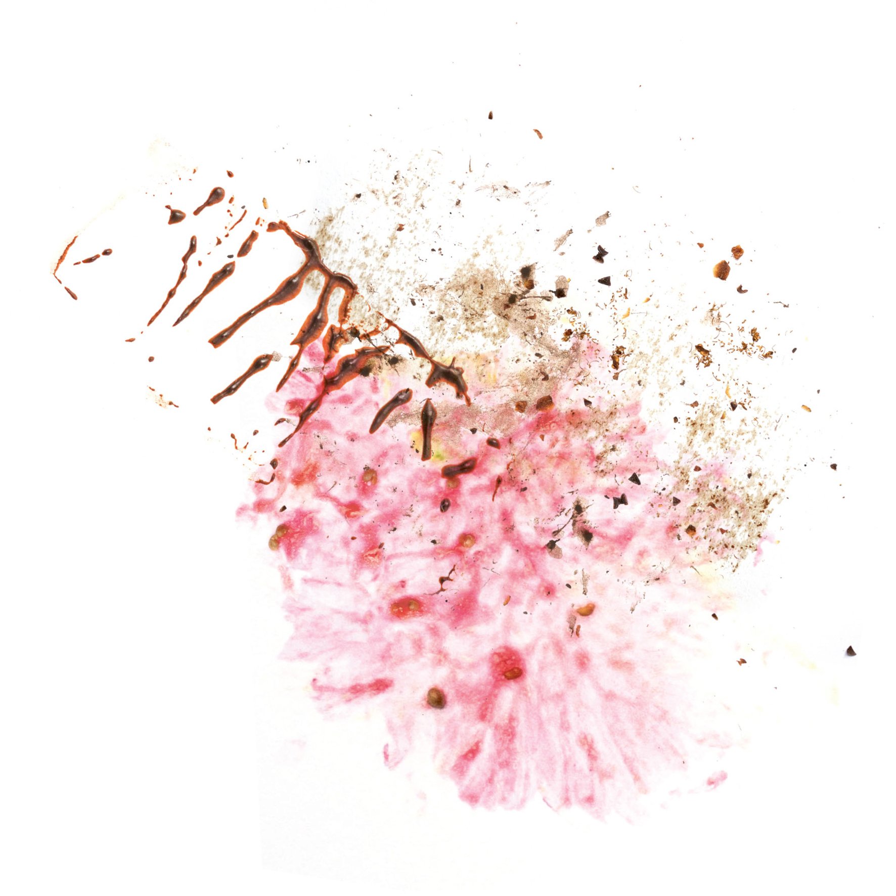
The idea was to create a packaging that matches the content. So that you buy a product because you like how it looks like and then the content matches exactly your expectations how it will taste. In terms of aroma, flavor and of course quality. So I tried to find the look that matches each of our coffees. The value of the product gets represented with the box and the shiny gold. The flavors get represented with the different main aromas shown on the label.
+ read more
For me specialty coffee is a very sensual product. As a graphic designer I really love clean and plain design. But presenting our coffees in this way did not feel right. I did something I usually don't do in design: Using lots of colors! Because my taste sensors are connected to colors and when I drink a fantastic coffee I feel and see an explosion of color aromas on my inner eye. I think showing this in an artistic and subtle way like on our packaging gives the customer a very intuitive chance to choose their favorite coffee.