
Equator Coffees

Designer | Swasti Mittal (core) and various designers (seasonal - AB Design, Wertz Ateria, Brooklyn Bell, Jun Ioneda)
Location | Marin County, CA, USA
Launch Date | March 4, 2024
In the past year, Equator Coffees reevaluated the role our packaging plays in communicating both brand and providing information about our coffees in a way that is accessible to consumers wherever they are in their coffee journey. Through this process, we identified two design approaches embodying our brand's essence, forming the double-helix structure of the brand’s DNA.
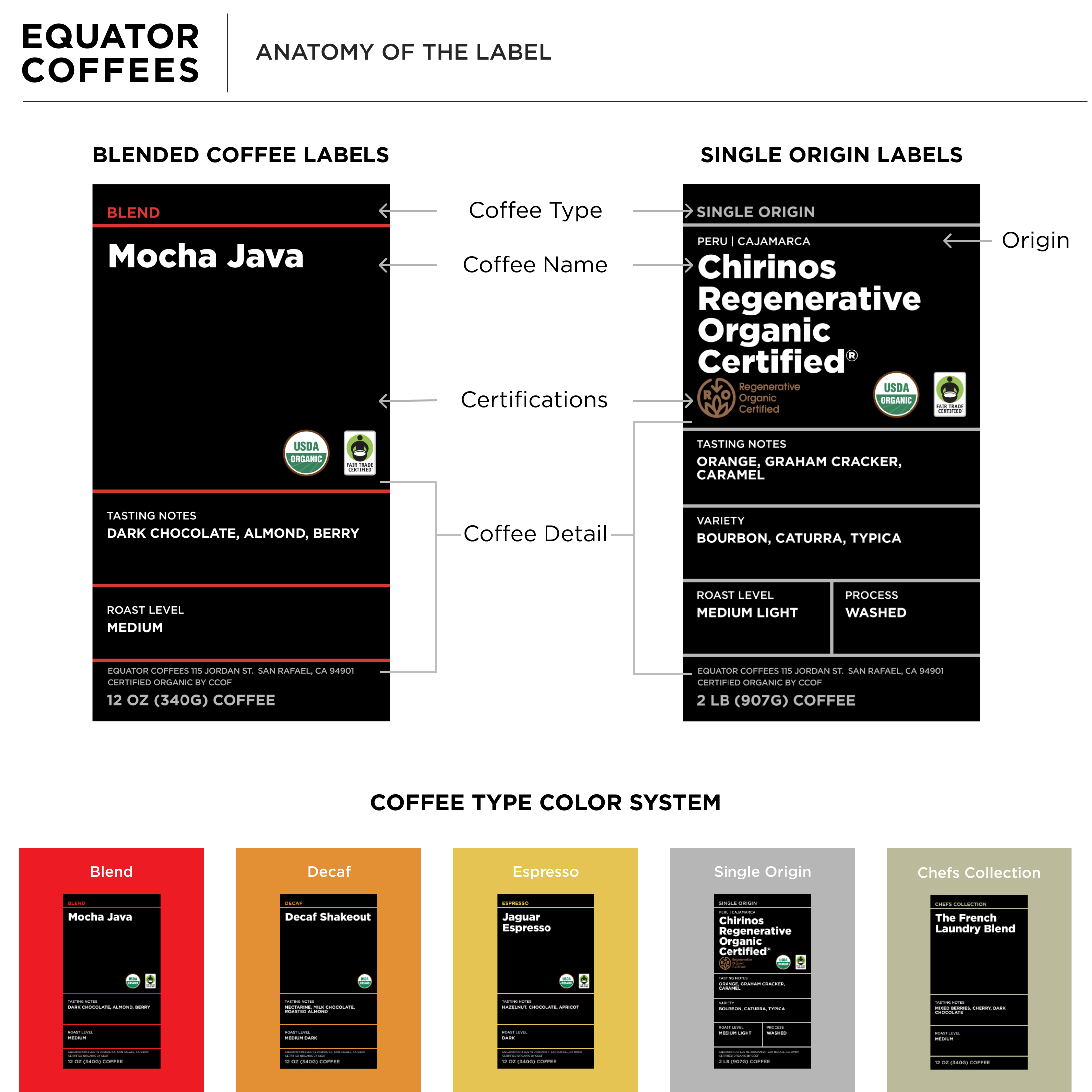
On one side, our legacy shines through in the core packaging, visually portraying key brand elements—bold red, stark black, sharp lines, and the ever-present tiger marching left. At the same time, the addition of sun rays emanating from the center of the pack introduces a fresh vision, reflecting the brand’s sense of optimism and action as we move towards our 30th year in 2025 and beyond. This packaging introduces a new color system and label structure to provide customers with coffee details, catering to both experts and newcomers. Complementing our core packaging is our seasonal design, where we collaborate with artists globally to showcase Equator’s identity as a queer and women-founded, B Corp certified coffee roaster. This deviation from our core palette ignites curiosity and invites customers to explore further. The combination of core and seasonal packaging allows us to convey Equator's story comprehensively, honoring our heritage while embracing what’s to come.
