DABOV Specialty Coffee
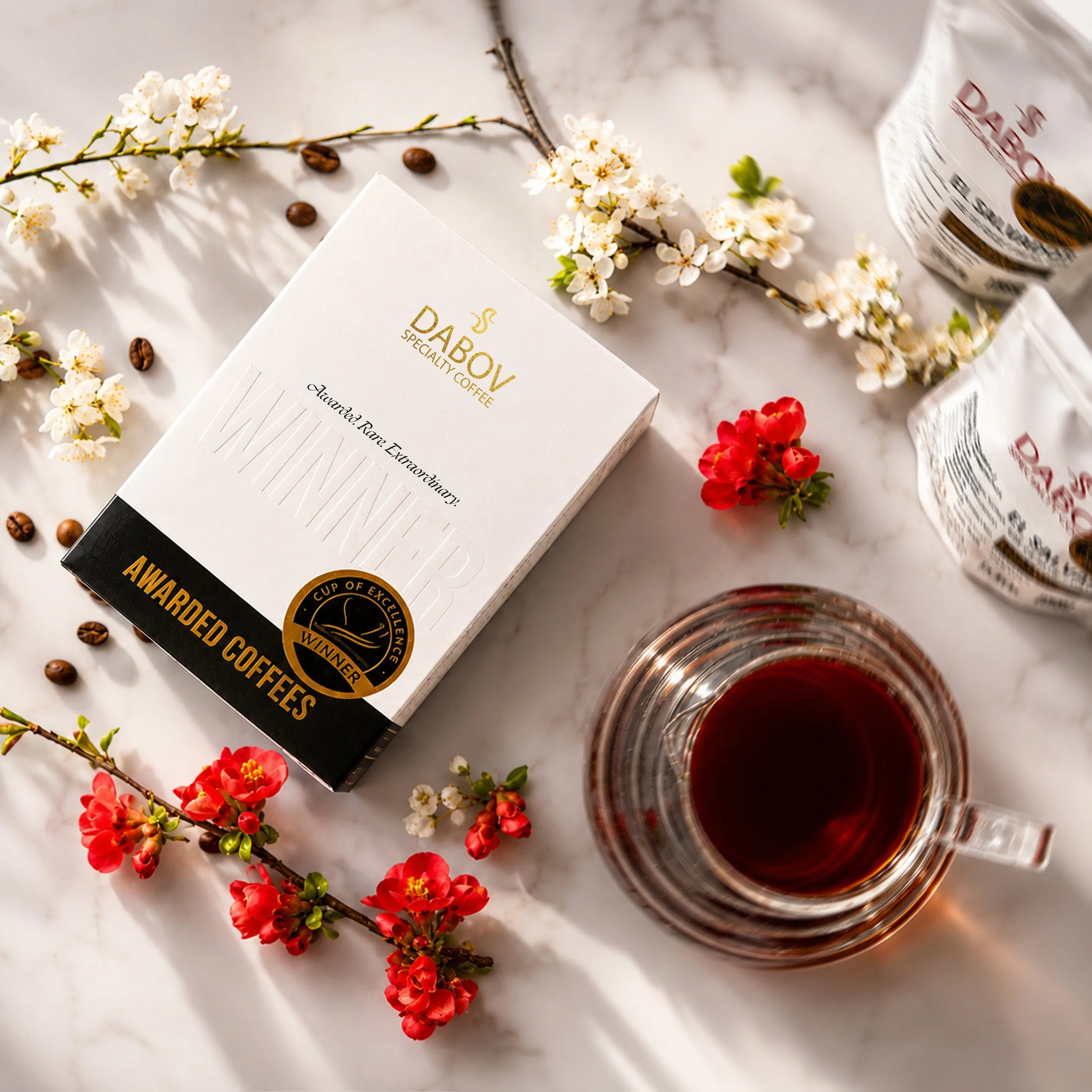
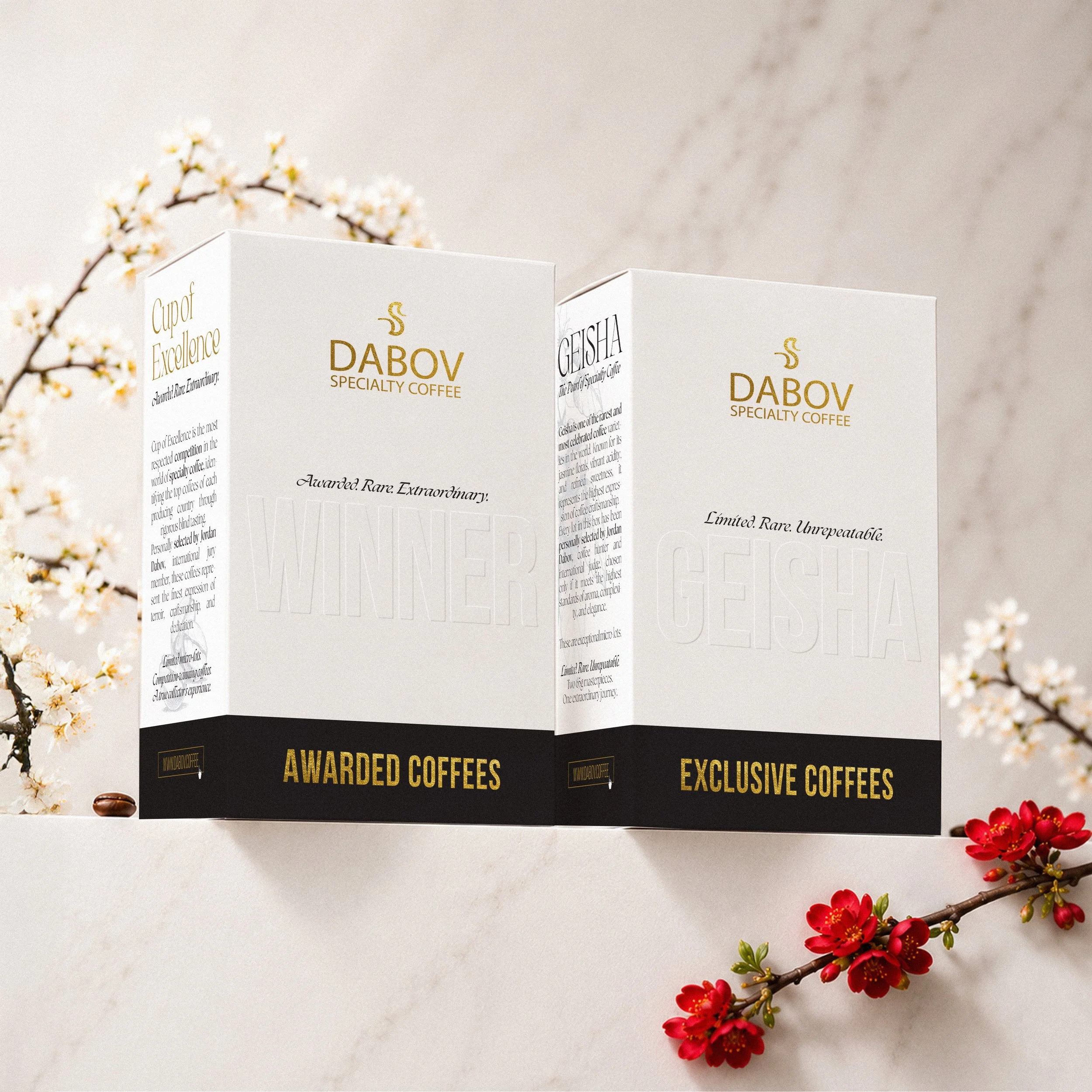
What we wanted to achieve with this design was to elevate specialty coffee—especially Cup of Excellence winners and rare Geisha coffees—from a consumable product into an object of value, recognition, and emotional connection.
These coffees represent years of dedication, risk, experimentation, and precision from some of the world’s most exceptional coffee farmers. We believed the packaging should reflect that same level of excellence and respect.
The design was inspired not by traditional coffee packaging, but by luxury collectibles, award objects, fine fragrance packaging, and ceremonial presentation boxes. We wanted the customer to feel that they are not simply buying coffee, but opening something rare and significant.
The minimalist structure, restrained color palette, and gold award elements were intentionally chosen to communicate prestige without excess. White symbolizes purity and transparency, black adds depth and authority, while gold directly references achievement and awarded quality.
Another important goal was to shift perception: from “daily coffee” to “coffee worth appreciating.” We believe consumers play an important role in supporting excellence in coffee. By presenting these coffees with greater visual and emotional value, we aim to help customers better understand the extraordinary effort behind every Cup of Excellence and Geisha lot.
Ultimately, this design is also a tribute to the farmers. It is our way of giving visibility and respect to the people whose work elevates coffee to an art form.