CODOS COFFEE
The new CODOS coffee packaging reflects who we are as a brand: warm, thoughtful and quietly bold. Designed in collaboration with brand designer Carla Palette, the system introduces a refreshed visual identity while staying true to the essence that has defined CODOS since 2014.
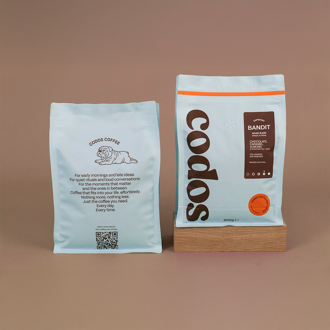
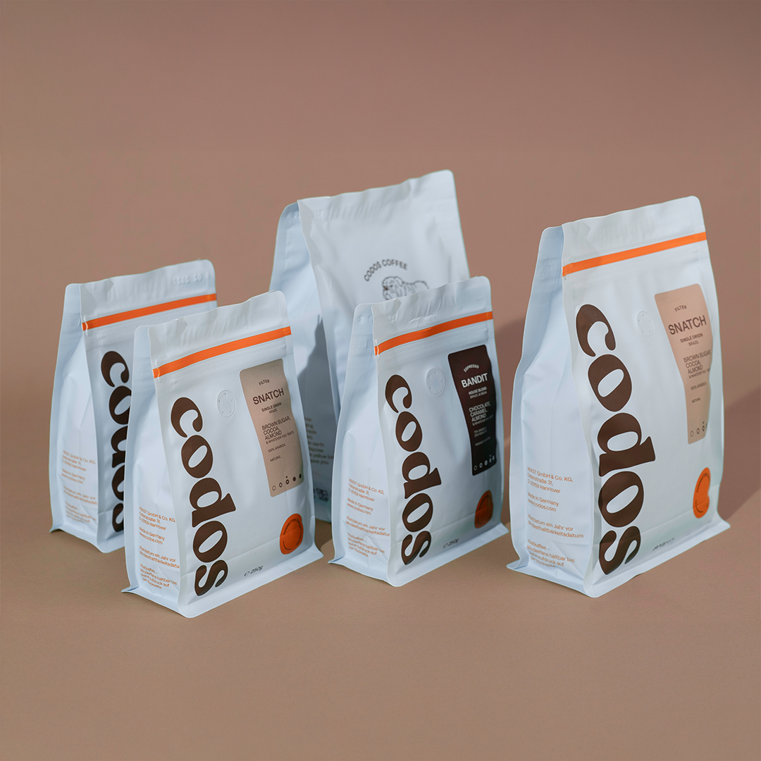
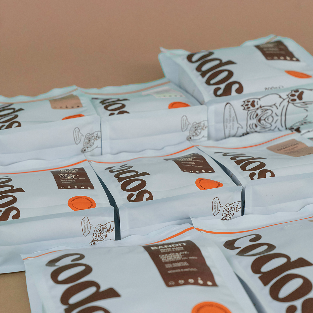
At the center of the design is a strong vertical CODOS logotype running from top to bottom along the bag. The large-scale mark creates a striking contrast against the soft Codos Blue background, making the packaging instantly recognizable on shelves. The logotype is kept in deep CODOS brown, continuing the brand’s signature blue and brown color combination.
Placed directly next to the bold logotype is the coffee valve, intentionally positioned on the front of the bag so the aroma of the coffee can be experienced instantly. Running parallel to the logo, a clear vertical information label presents the essential coffee details such as origin, roast profile and taste notes in a simple, approachable format.
A bright orange zipper line cuts across the top of the bag, adding a functional element and a moment of contrast. This is echoed by a round orange element on the bottom corner, carrying the tagline “CONNECTION, COMFORT, COFFEE” and symbolizing the spark of everyday coffee rituals.
On the back appears Snatch, the CODOS mascot and beloved bulldog of our founders, while a small hidden detail on the bottom reveals a playful message.
To emphasize on the recyclability of the bag, on the side of the bag it specifically states: "Good to know: This packaging is actually made to be recycled. So, do mother earth a favor and dispose this bag in the yellow bin. After all, she gave you this coffee!"
By communicating this message directly on the packaging, we encourage conscious disposal and make sustainability easy and understandable for the customer. The goal is not only to use recyclable materials, but also to actively guide people to recycle them correctly, reinforcing CODOS' commitment to responsible practices and thoughtful design.