CarmoCoffees
Designers | Rafael Melo and Zeca Gialaim
Location | Carmo de Minas, Brazil
Launch date | June 3, 2021
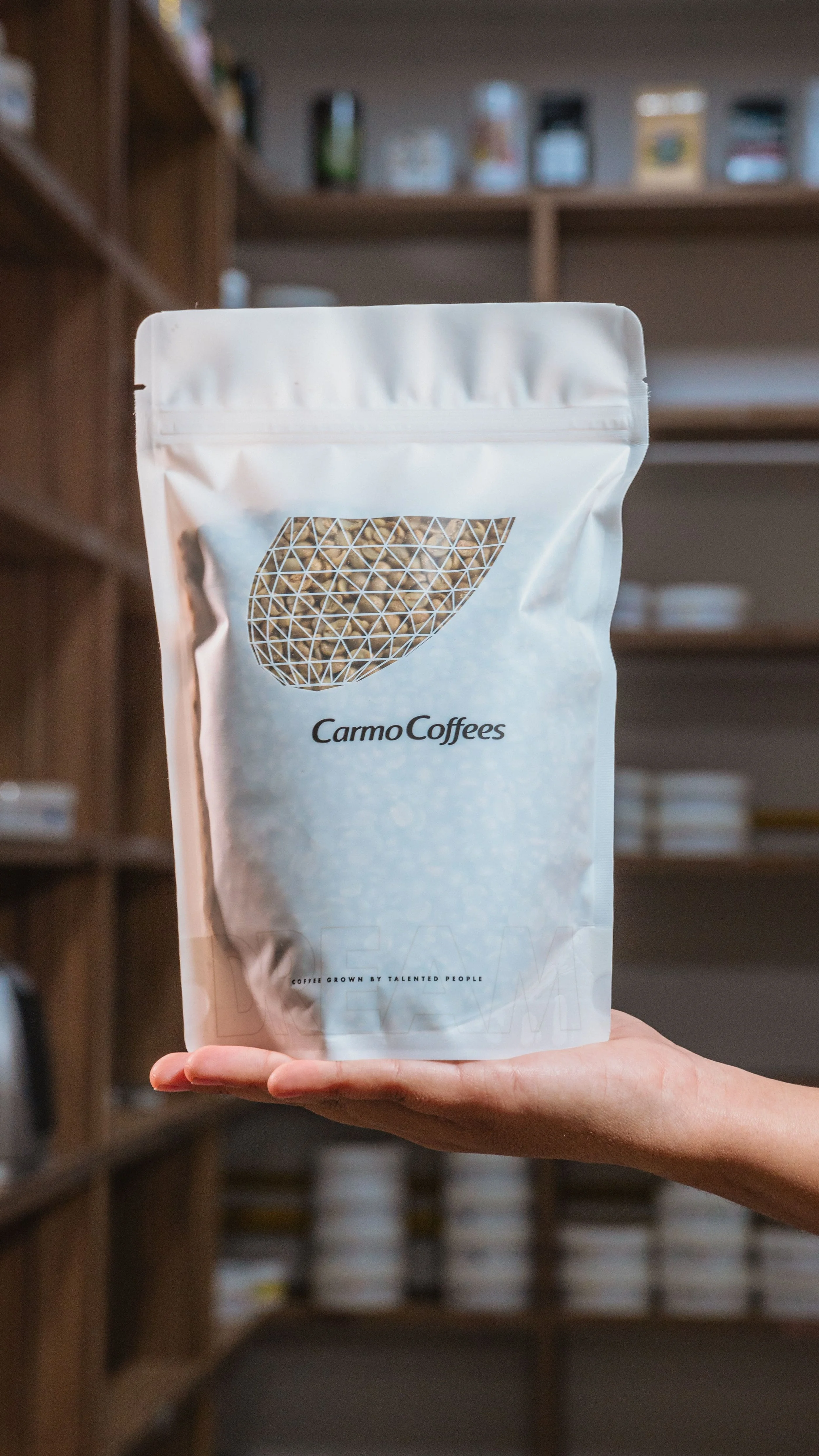
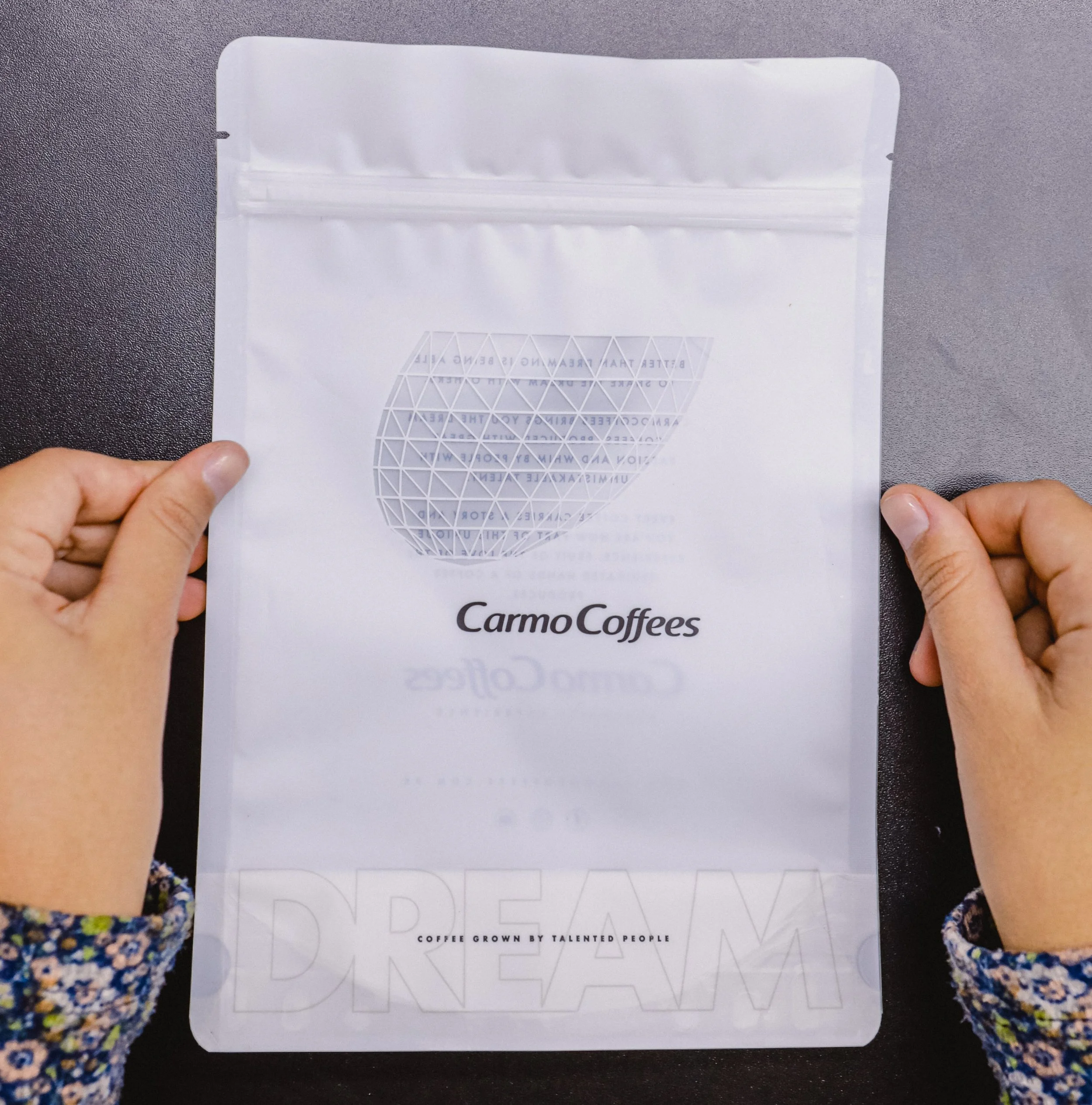
From the beginning of the project, the idea was that it was a way of conveying the image of the company's new warehouse, which was designed by award-winning Brazilian architect Gustavo Penna. The project has a rectangular facade and a glass bean, 12 meters high, which symbolizes a bean going out to travel the world, just like the cafes in our region. In designing the packaging, we wanted to bring the same concept. The grains are traveling the world in there, but then what needed to be pictured was the warehouse. Then we thought of a minimalist project, with space to paste the labels with the information of the coffees, the beans and the message that the company has always carried, to seek to offer the coffees of dreams to our customers and partners. The clear reference you can find on our website: https://www.carmocoffees.com.br/ We did production tests and discarded several variations until we got to the final product. On the front, it has space for the label and on the back, it carries some of our purpose written in words.


