
Shore Coffee Roasters

Inspired by the resilience and dynamism of our coastlines, we wanted our branding to reflect the spirit and movement that coffee represents. Throughout history, waterways have served as vital routes to transport coffee from farms to shores, and shorelines are among the most ecologically significant spaces on our planet. The shore symbolizes strength and inspiration, guiding SHORE Coffee Roasters in nurturing and supporting our community. Through coffee, we aspire to make a meaningful impact with every sip. In essence, the design of the SHORE packaging captures the spirit of our coastal community, the history of Southern Shores, and our dedication to making a positive impact through coffee.
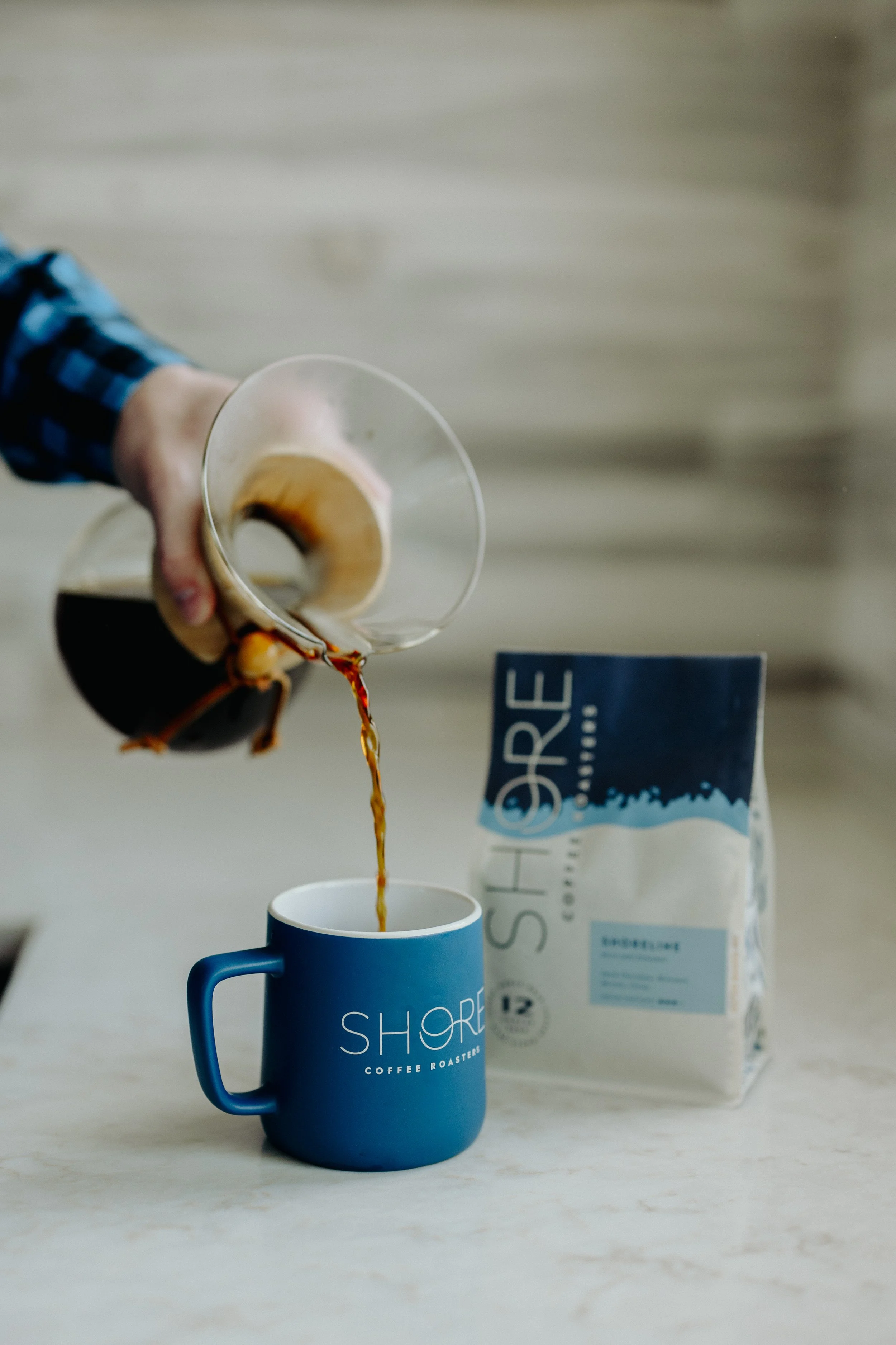
· The shoreline illustration pays homage to Southern Shores - situated between the Atlantic Ocean and Currituck Sound on the Outer Banks. This illustration represents the unique geography and topography of our coastal area, including the water, waves, coastline, and shore. When bags are placed side-by-side, the design creates a larger coastline, symbolizing the unity of our community and the impact we can make together.
· The Flat Top icon in our logo is a tribute to the rich history and dynamic spirit of Southern Shores. This design is inspired by the signature architectural style of cottages created by artist, modernist, and conservationist Frank Stick. More than just an emblem, it serves as a guiding principle that reflects our commitment to honoring our heritage while contributing to the community’s future.
· Coastal elements highlighted in our side gussets are open to interpretation, allowing each person to connect with their own memories of the beach, coast, and coffee. Whether you see a coffee blossom, sea star, juniper, seaweed, sea oats, or coffee beans, the design aims to evoke a sense of discovery and personal connection, making you feel a part of our story.
· Through coffee, we aspire to make a meaningful impact with every sip. A QR code on the side gusset guides customers to learn more about how their purchase directly impacts hard-working Outer Banks nonprofits.
· The packaging uses two colorways, one for blends and when inversed, they signify single origins. The aim is simple and clean, but also continues the design’s intentional sense of discovery.
