PERC COFFEE
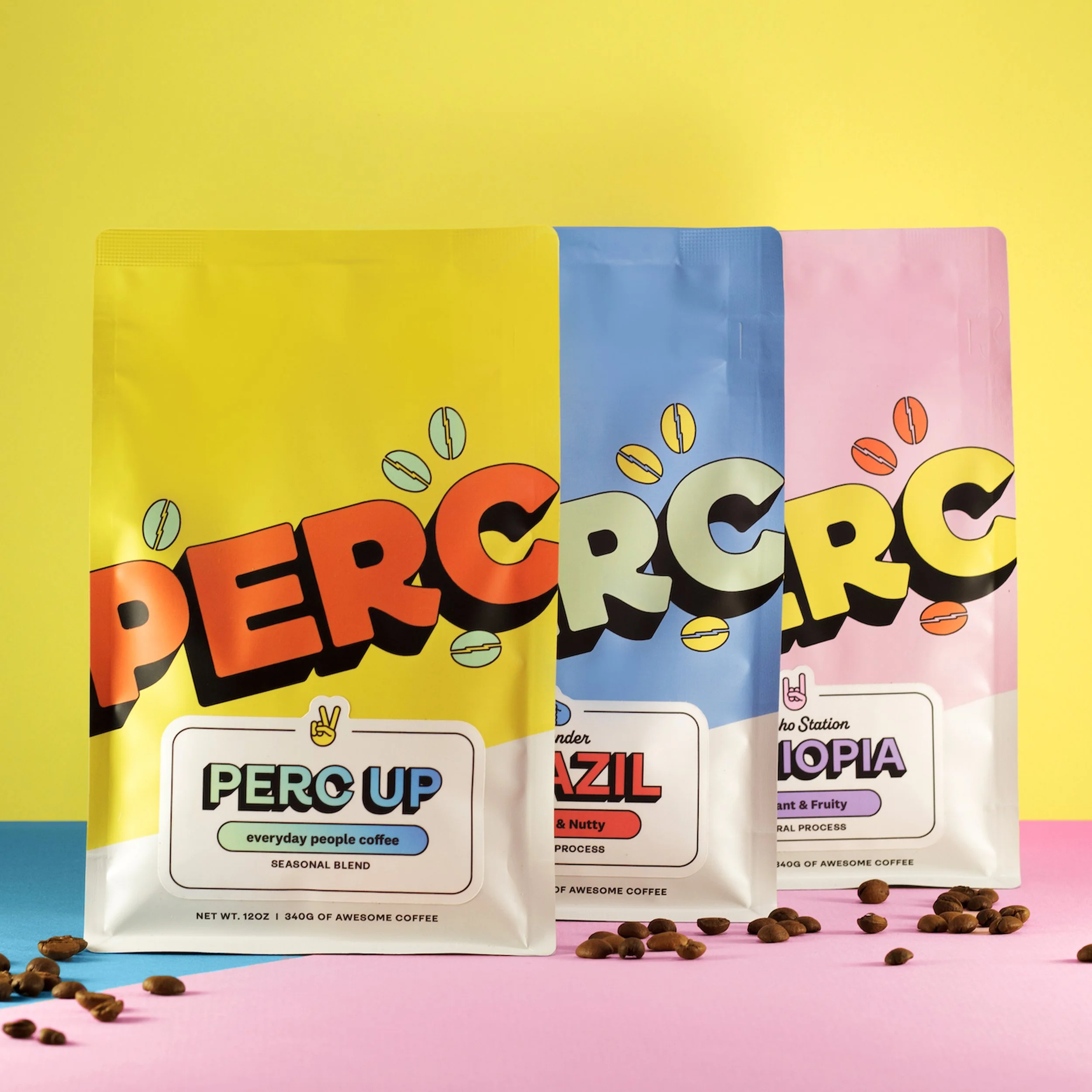
Creating the perfect coffee bag is no simple task. First and foremost, the bag should look awesome. We want it to be fun and inviting, without a whiff of snobbery. We also want an inclusive system that speaks to everyone from coffee pros to the craft-coffee curious.
We started by creating categories for folks with different vibes. The vibes are: wild, balanced, and mild. Next, we assigned colors, illustrations, and icons to each vibe. The wild bags are pink, with a rock finger icon and a panther. The balanced bags are yellow, with a peace sign icon and a peach. Finally, the mild bags are blue, with a thumbs-up icon and a mellow octopus.
We want folks to get a look at the coffee inside. So we made see-through windows on the sides of the bag. This allows people to get a sense of the roast profile. Finally, each bag has a unique pattern with the words "stay wild, be balanced, and get mild" that further communicates the vibe.
Each bag gets a label with details about the coffee inside. The labels contain a vibe icon, the country of origin, the farm name, the processing method, and flavor descriptors to describe how the coffee tastes. Lastly, we include a QR code on the bottom of the bag that takes you to our website, where we have all the nerdy info you need.


