Boomtown Coffee

Designers | We are lucky enough to have plenty of creative talent at our roastery, with the handful of us here benefiting from education and practical experience across the fields of art, architecture, graphic design, marketing, and photography. We ended up designing them together in house, with graphics produced by our own CEO.
Location | Houston, Texas, USA
Launch date | November 29, 2019
The main problem we identified with our old packaging, and with a lot of coffee packaging on the market, was how much of an conceptual barrier was created for specialty coffee novices by the packaging itself. Supermarket coffees and café chains typically identify coffees by roast level and highly recognizable flavor additives. The specialty coffee paradigm – a paradigm with which we subscribed for many years – defines coffees by origin, process, altitude, and often subtle, complex flavor notes. This is great for the initiated: it drives the experienced coffee drinker to excitement over the rare origin, uncommon process, or unexpected mix of flavors present. However, for the beginner, we realized we were presenting our coffee in an unfamiliar, and often intimidating, product language.
+ read more
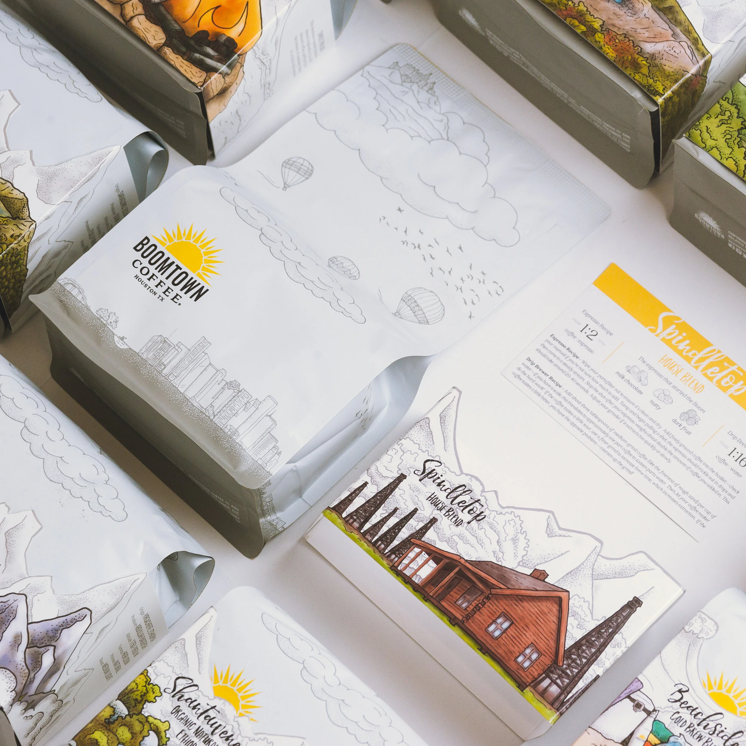
If we close our eyes and visualize the industry standard packaging, we imagine a beautifully patterned bag adorned with a color-coded label, the name of a farm or washing station followed by an origin country, a list of growing and processing details, and a trio of flavor calls.
To us in the industry, we rarely need any more information than this to know whether we want to try a coffee. Show the same package to a novice, however, and they might assume that the honey process has actual honey added. “Natural” might simply suggest non-artificial, and labelling a coffee as washed has, in one very unfortunate circumstance, led one of our guests to believe the bag contained a cleaning agent to wash a brewer. We’ve lost count of how many times new customers looked at our flavor notes and assume we were adding flavors to our roasted coffee. One of our guests was deathly afraid that her coffee contained chocolate, as she was highly allergic.
These misunderstandings are easy enough to manage during personal interactions, but we don’t always get the chance to be nearby when a customer experiences our packaging for the first time. While we relish the opportunity to educate new customers, we realized that we can communicate the characteristics of the coffee in plain language rather than requiring them to speak like we do. We wanted to create packaging that helps translate our industry verbiage into something understandable by the average person while still providing all the vital data to the coffee experts among us. With our new packaging, we focused on creating a less technical – and more emotionally driven – product language. We wanted to create a connection between our roastery here in Houston and the producers from which we source by not only defining our coffees by origin, but also letting them define a destination. The coffee specifications are there, but they take a back seat to the journey from our hometown depicted on each bag to the beaches of Costa Rica, the peaks of Ecuador, and the savannas of Ethiopia depicted on our sleeves. Even if someone doesn’t end up taking our coffee home with them, we hope our packaging can help cultivate an understanding that our coffee comes from all the same places that we dream of travelling, and break down the barriers that stand between specialty coffee and the less experienced consumer.