Atlas Branding x MudPenny
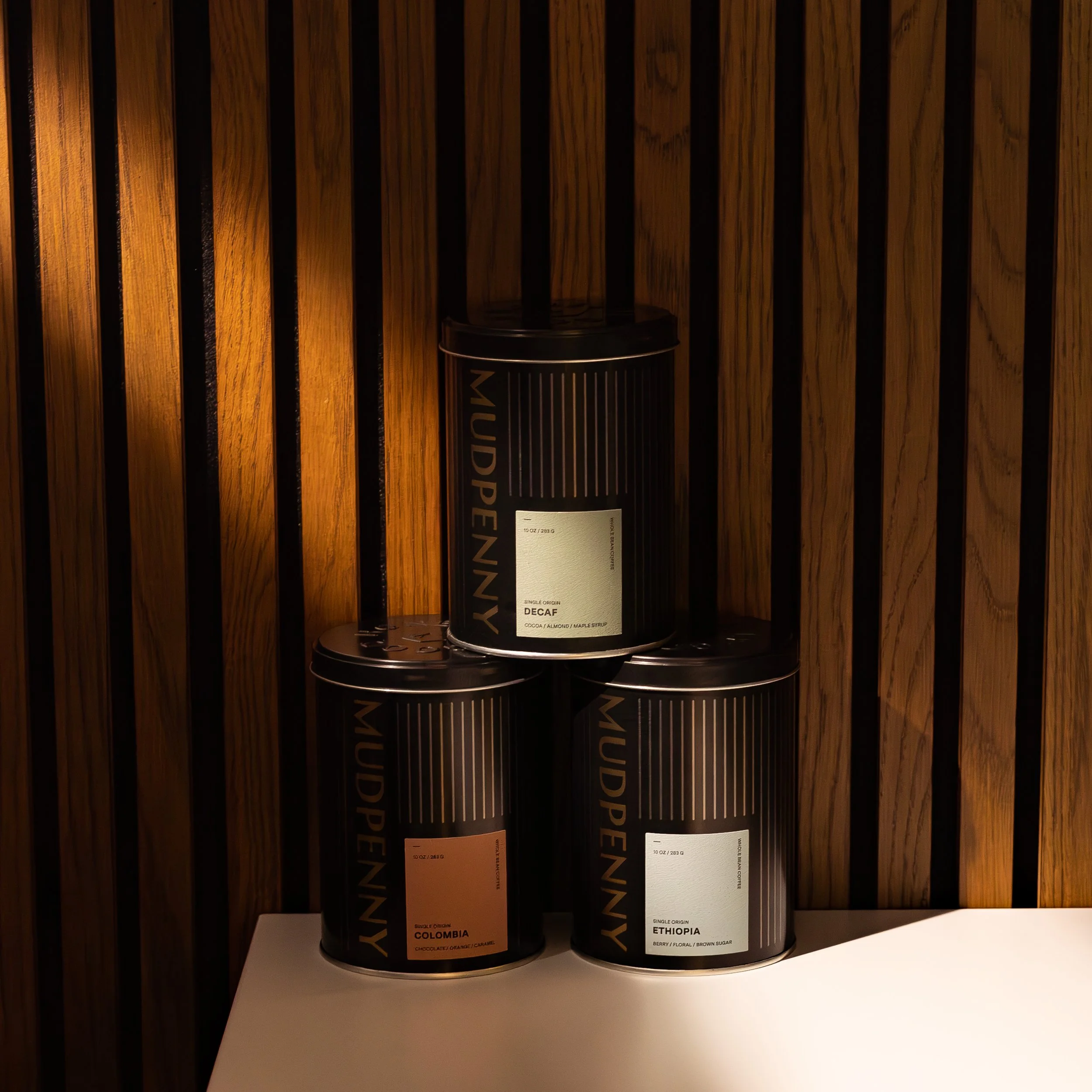
MudPenny, the specialty coffee roaster and restaurant, wanted to launch an exciting expedition to enhance the essence of its brand by upgrading its coffee packaging. MudPenny was looking for a new strategy that harmonized the premium quality of their specialty coffee with an elevated packaging design. Designed by Atlas, the coffee tins balance magnetic typography, complemented by an elegant black embossed lid that begs customers to embrace the sensory pleasure of holding the product. Each tin boasts a vertical metallic logo and sophisticated, muted tones on the coffee labels, adding an extra layer of sophistication to the overall design system. The archival paper label is reminiscent of beautiful wine labels and brings a softness to the high contrast, modern design. Sustainable packaging design was important to MudPenny, so the packaging eliminated plastic, was manufactured in the USA, and 95% of the water used was cooled and cleaned before returning it to the source. Customers can utilize and enjoy packaging that can be re-filled, reused, and recycled.


