Archers Coffee
Designer | Jocel Renee Flores and Archers Coffee
Location | Sharjah, U.A.E
Launch Date | September 19, 2022
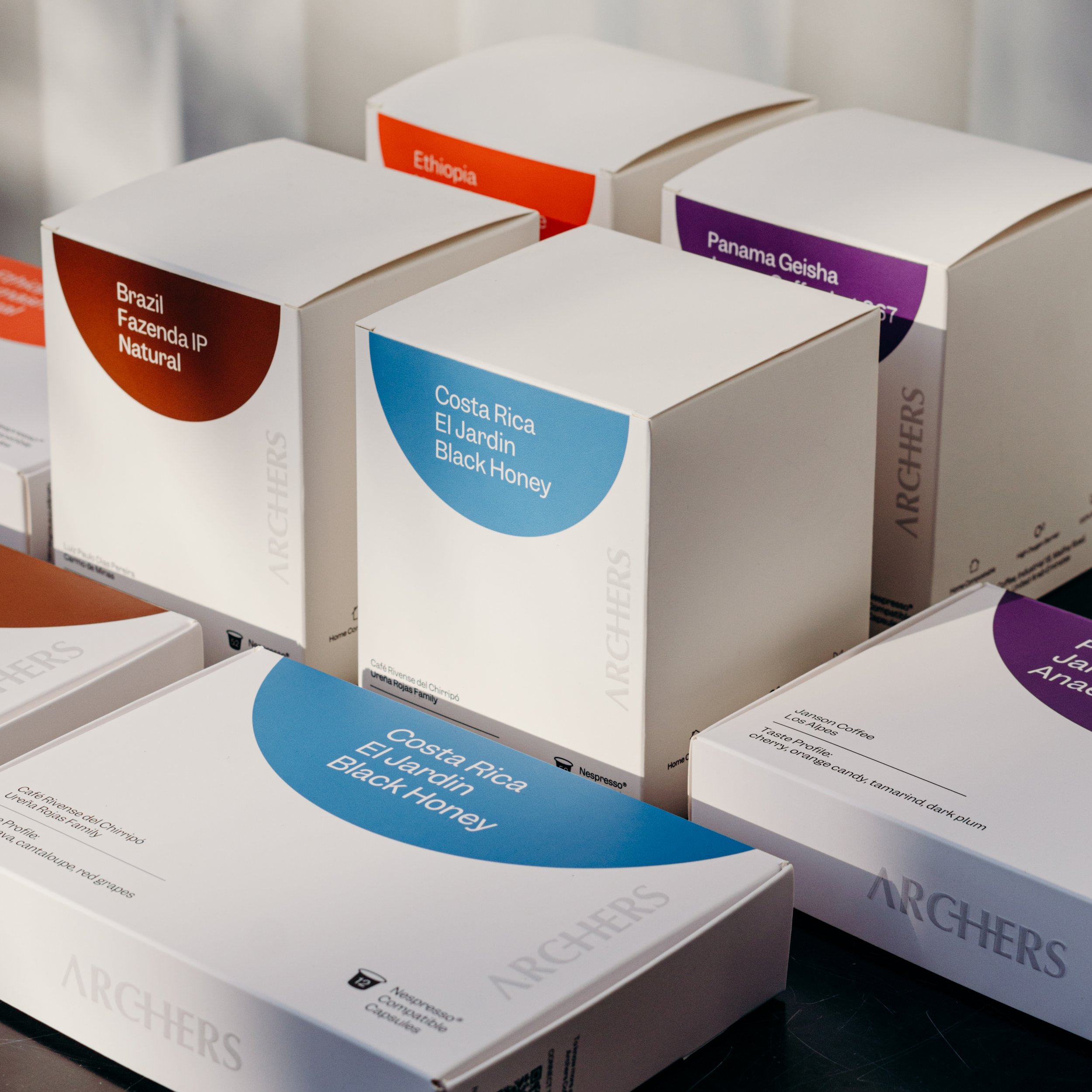
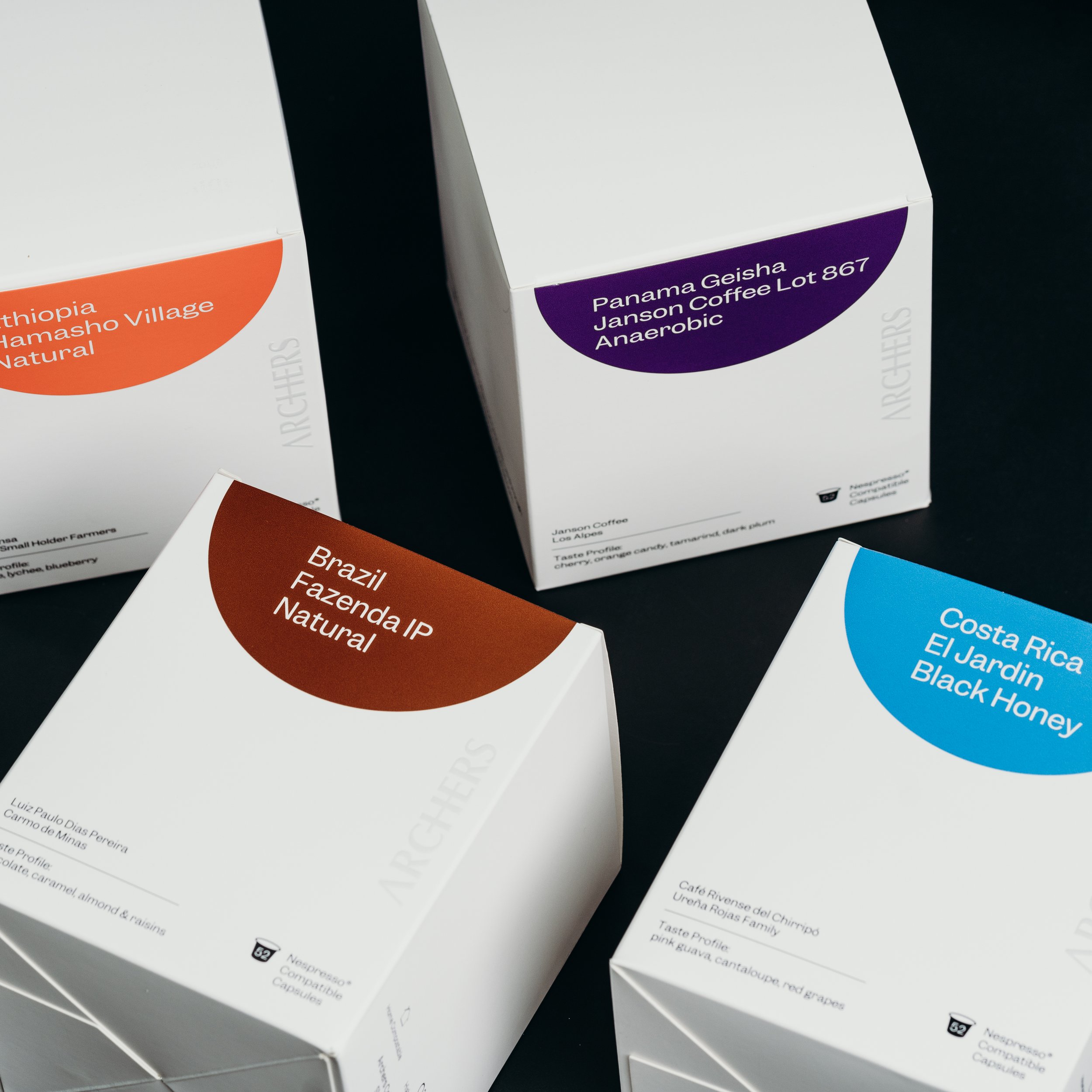
The inspiration for the Archers coffee capsule packaging was the shape of the pods. We used the circular silhouette as the key visual element, but stylized it as a half-moon at the top, front panel of the boxes (the display side), giving it a distinctive, modern look.
With this, we achieved what we primarily wanted, which is for the customer to immediately, upon sight, associate this key visual element with the product.
We also wanted customers to recognize Archers’ brand personality — minimalist, clean, and relatable — and ensure they experience the brand promise of quality throughout their interaction with the visual and tactile elements of the packaging. So, we kept to a minimalist aesthetic and structured the box in such a way that merely handling it would feel pleasant.


